Brianna & Joel
Topic: Motion Capture
Q:If you were to freeze the action of a dancer your shutter should be between?..
A: 1/500 or faster
Robin Michals | COMD 1340 Photography 1
Brianna & Joel
Topic: Motion Capture
Q:If you were to freeze the action of a dancer your shutter should be between?..
A: 1/500 or faster
What are the 3 components of Exposure?
ISO, Shutter Speed & Aperture
The Lams of Ludlow Street II
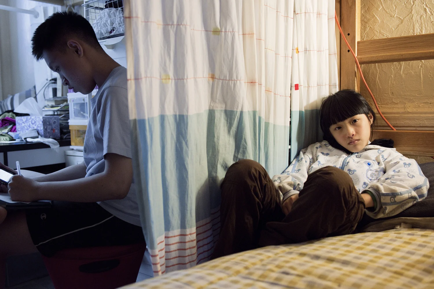
The photograph I chose was taken by Thomas Holton, called The Lams of Ludlow Street II. This one in particular stood out to me because of the contrast and how even though it’s one picture, it tells two stories.
In this piece, there is a girl and a boy. Looks like they are both siblings. The right half of the picture is the younger sister lying in bed and staring at the camera. Meanwhile, the brother, who is clearly older, is studying at his desk. The contrast between the light and dark background kind of forces us to differentiate the siblings by showing a glimpse into their daily lives. There is a clear sign of diagonals from the bed to the curtains. There are also patterns and repetition on the bed and curtains as well. The sister looks a bit sad, could be because she wants to play with the brother but the brother is busy. There is a sense of strong emotions involved. The photo depicts great defeat and seriousness.

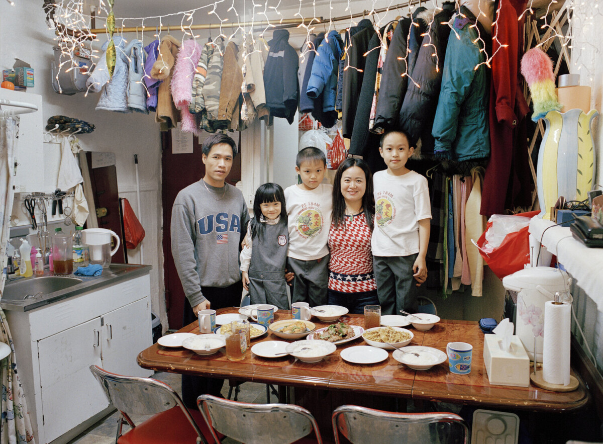
The Photographer I have chosen is Thomas Holton. I chose the Family Portrait photo, because it really connected with me. Growing up in an Asian Household, I come to realize that Asians make the best of what is given to them. In the Photo, the family of 5 stood tall, in front of their kitchen table as they were surrounded by coats in a seemingly small space. Holten does a really good job of not only focusing on the family but, as well as the environment. This really changed the story of the photo as it revealed much more than a typical family of Five.
In the Photo, Holton uses a technique called leading lines. He placed the subject in the center of the photo and took it at an angle in which the window sill created a line that led to the center of the photo. Holton also uses diagonals in the photo to create a different viewing aspect for viewers. The Clothesline running across the top of the image added a different dimension. Lastly, Holton uses patterns in his photo to really elevate his photo. The light string and coats created a pattern that catches viewers attention. Overall Holton does a really good job of incorporating different compositions to his photo.

The image that I choose was “The Lams of Ludlow Street” “Drying laundry” image as it really stood out to me with all the colors and the sky with the background of New York City. The image shows clothes being hung on a rope getting air dried with a view of the city, the hangers are only red and pink, this could be the owners favorite colors. The purpose of this photograph could be that drying your laundry doesn’t always have to be in the machine, but it could be with a cool view of New York City on your roof. The image also feels like that New York City is his background and that air drying his clothes on his roof is something that he has always been doing and nobody can tell him anything. The mood/ feeling of this image is giving chill vibes, once you put the clothes to air dry you can sit back crack a cold one and admire the city view as your waiting for the clothes to dry, you could even fold the clothes up there too! The first formal element that I choose to describe this image is “Rule of Thirds” because when you put the lines in the image it points on the rope being used to hang the clothes and the buildings in the background. The second formal element I choose was “leading lines” as it can be seen in the rope that is holding the laundry in a straight line from left to right in the image. The third formal element I choose was “symmetry”, the hangers were all lined up and it looked satisfying to the colors of the hangers all going down in a line. Another element that can be seen in the photograph is “pattern” with the hangers that go from pink to red hung on the rope.
© 2024 COMD 1340 D085 Fall 23
Theme by Anders Noren — Up ↑
Recent Comments