I think the use of type on a path works because the type flows well along with the image of a fingerprint it is portraying. The type is simple to read since it flows with the shape of the image and isn’t random.
Category Archives: Student Post Type Talk
Chin Nadia Page Margins
Ni_Wei_TT_Felix
TT Felix
Jiang Hailey_Felix
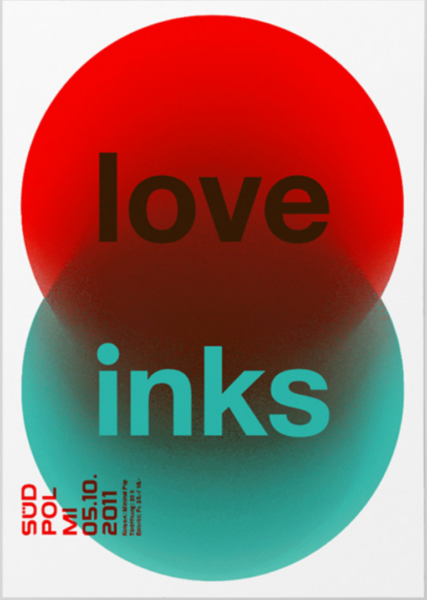
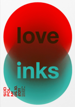
In this poster, Felix builds a strong hierarchy with scale and arrangement. ‘love’ and ‘inks’ are the largest and was placed in the center of this poster which drags viewers’ attentions. All the informational texts are legible in its size and style.
Colors also play a important role here. By using complementary primary colors like green and red, black and white. It creates a high contrast and a lot of visual vibration. Which is visually appealing to the viewers.
Rojas Jesus Felix
Williams Kayla Felix
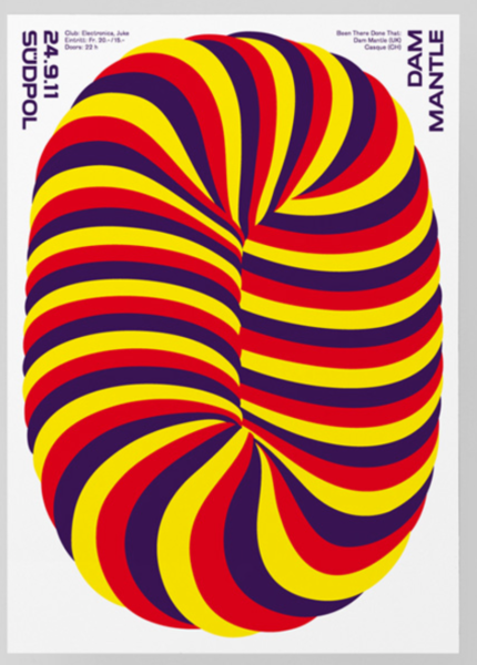
This design works best for me because the colors and picture catches my attention and the lettering is easy to read unlike with other posters that caught my attention, but was a bit difficult to read. However, in a way if someone was passing by those other posters and was not in a rush to go anywhere, then they could really stop and try to figure out the other posters. But this one was more easy and still caught my attention.
Domena Jasmine Felix
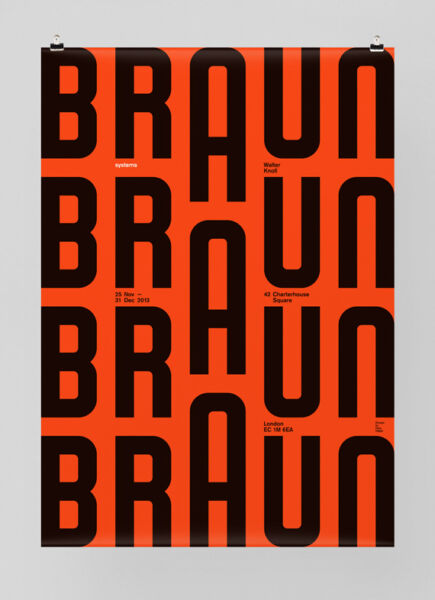
This work is the best to me because the A being a larger point size than the other letters and not being aligned to the baseline of the word braun creates movement in the poster to me.
Hernandez-Garcia Yamileth Felix
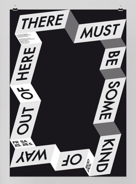
Type Talk 11/2
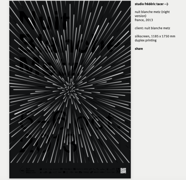
Ni_Wei_dynamic typographic poster 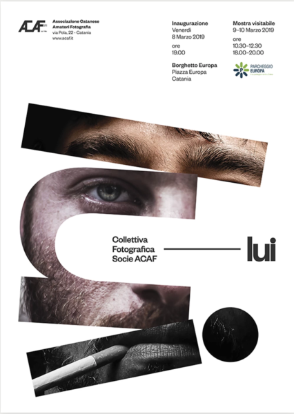
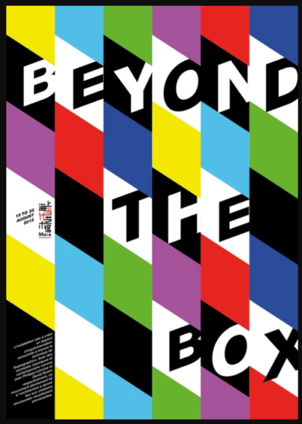
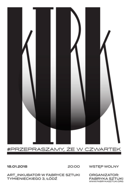
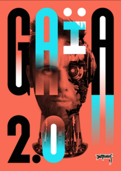
Rojas Jesus_TT_AK
Consuegra Pamela _Scher

The Most impressive design in the documentary to me was the citi bank logo. I have had this bank since I was taking my first design classes and always noticed the simplicity of the design and the resemblance to an umbrella. It was really cool to find out why the umbrella was incorporated into the design and also to see how the logo changed and became more inviting and modern.
Consuegra Pamela Path
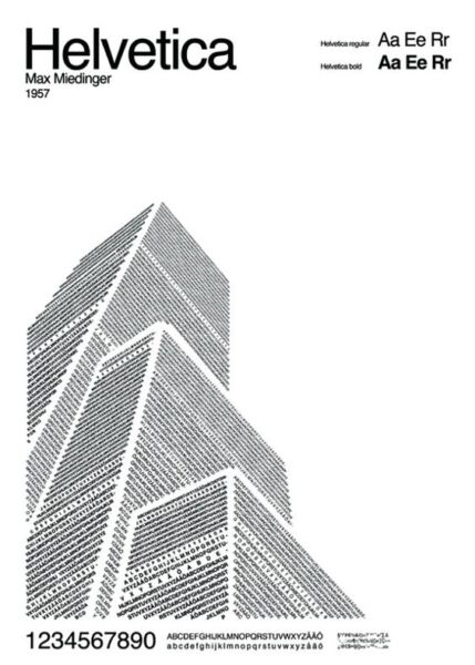
I feel that this poster works the best because it is very creative yet simple. The black and white doesn’t overwhelm the reader and the different facing text makes the lines look very clean. I appreciate the minimalistic vibe of this design and the clever design is impressive.
Consuegra_Pamela_TT_RP
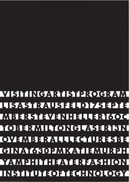
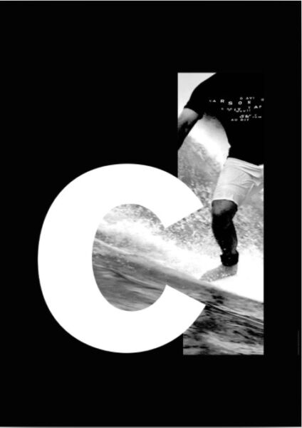
The first image does not work because the letters are blending into the background and are too simple and spaced out to read separate letters. This design looks like an eye exam instead of something you can actually read. The second design works well because the thick letter is used to contrast the graphic image. The framing of the letter and the filling in is a very smart decision and really catches the eye.
Desantis_John TT Depero
Barshtein_Andrew_TT_Depero
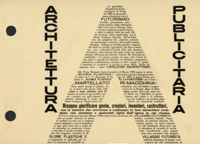
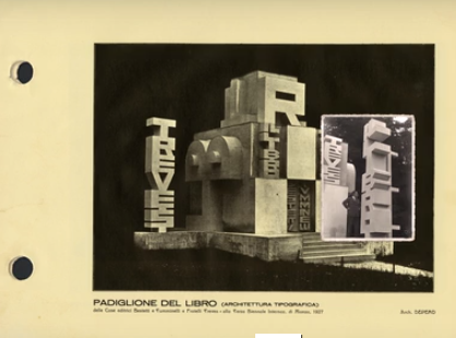
What I like about these is just how much the text forms into a cohesive structure. The first one uses various fonts and weights, the bolder weights acting as more of a skeleton for the lighter weights on the outside. For the second one, I like the way the text wraps into a sort of triangle or pyramid, pointing to the text on the left. The text on the left is also laid out very neatly into columns. The word “meccanici” acts as a sort of support or rest for the list of words to the left of it.
Williams_Kayla_TT_Depero
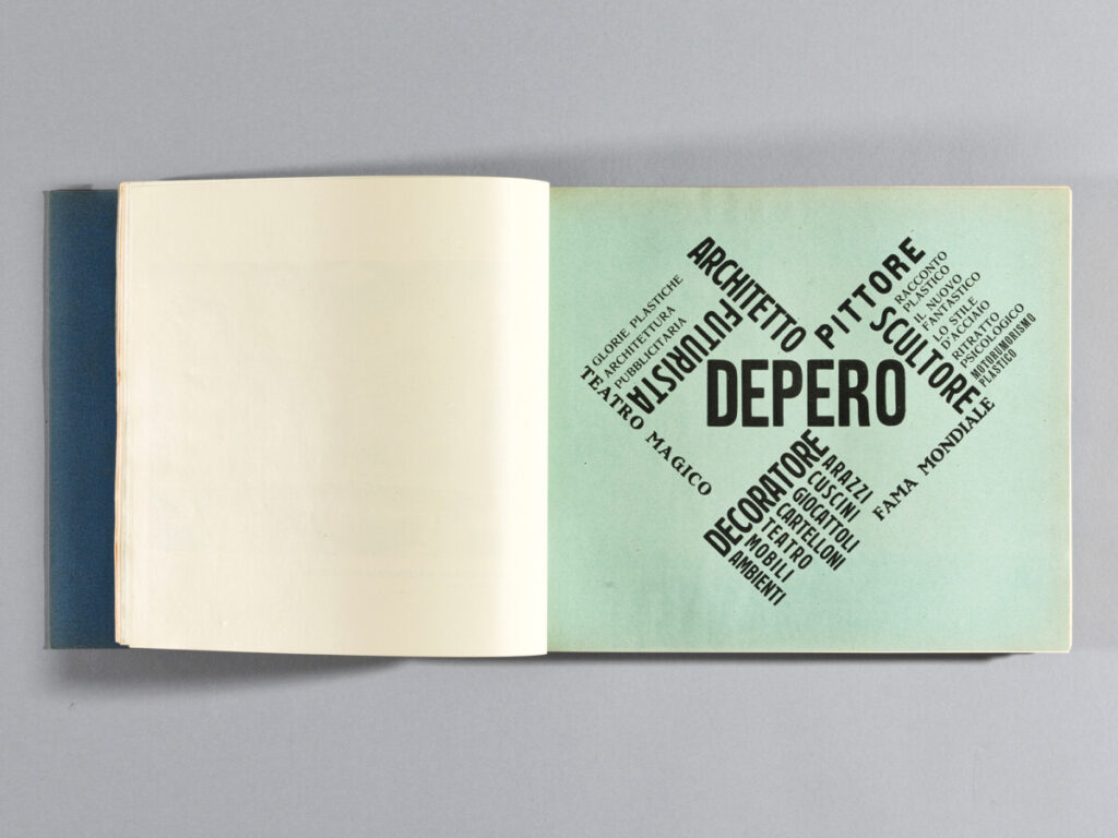
I really enjoy these pages. I like how the words in the first page kinda goes along with the image on that sent at the top. And it just seems like typeface used works so well with the image. For the second one, I enjoy the simplicity of the typeface, how it was sans serif and bolded, yet put onto a full blue background. It’s so simple, yet it makes the page more easier to read and understand.
Jiang Hailey_TT_Depero
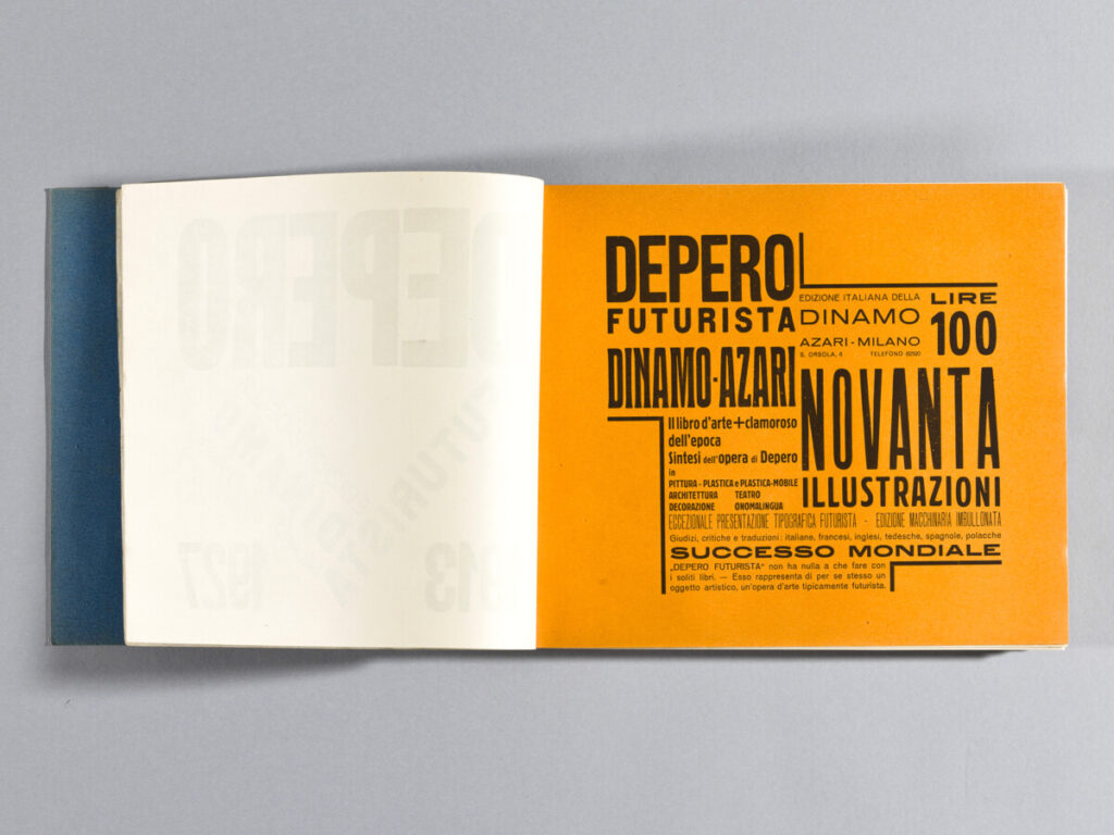
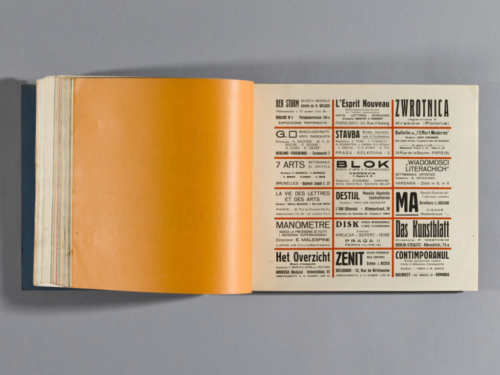
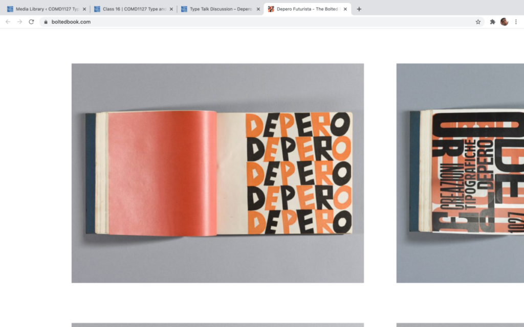
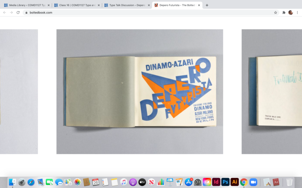
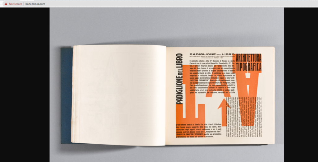
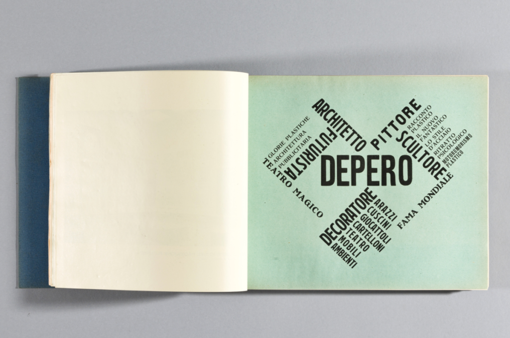
I like these two pages because they both show a great hierarchy and also dynamic. Depero used different scales and type families to show hierarchy. And, he worked with the grid and arrangement to create a movement and so the viewers follow it. Depero also likes to use bright colors to drag viewers’ attention to what he wants the viewers to see.
