The First image places the words in an eye catching shape. This secures the attention of the audience and is a very creative way to use type. Technically it is a type within a type. The second image uses overlapping layers to contrast letters and different colors helps to differentiate between the background and overlaying text. While one of these is neater than the other I feel they both work in terms of aesthetic and uniqueness.
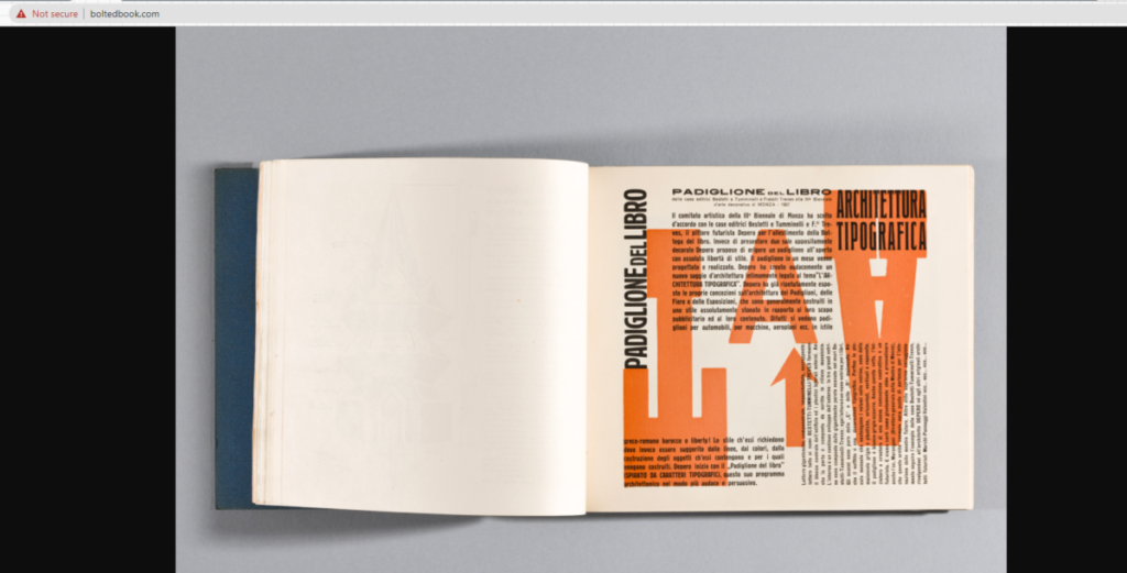
What I like about these is just how much the text forms into a cohesive structure. The first one uses various fonts and weights, the bolder weights acting as more of a skeleton for the lighter weights on the outside. For the second one, I like the way the text wraps into a sort of triangle or pyramid, pointing to the text on the left. The text on the left is also laid out very neatly into columns. The word “meccanici” acts as a sort of support or rest for the list of words to the left of it.
I really enjoy these pages. I like how the words in the first page kinda goes along with the image on that sent at the top. And it just seems like typeface used works so well with the image. For the second one, I enjoy the simplicity of the typeface, how it was sans serif and bolded, yet put onto a full blue background. It’s so simple, yet it makes the page more easier to read and understand.
Discussion, comments, critiques, opinions on type Throughout the semester typographic works related to projects and assignments will be posted. Students will comment in live synchronous class discussions to try and identify or answer questions related to posted content. Can also be assigned as homework assignments. This is part of class participation grade.
Learning Outcomes
Students will reinforce the typographic principles of the course through observation and critiques of current work examples in typographic industry.
Students will develop a sense of current typography trends and be able to discus them with relevant terminology
Instructions
“Depero Futurista” Published 1927 Known as “The Bolted Book” because of its binding By Fortunato Depero, Italian Futurist artist/designer
Select the two pages from the book you feel have the most dynamic use of Typography usage, page layout, color
Save images as: “lastname firstname_TT_Depero. jpg”
Insert images into the gallery below Comment: Which do you feel works better in terms of dynamic use of letters and layout
The Bolted Book is filled with ground breaking typographic experiments and bold explorations in nearly every art and design medium, including advertising and the form of the book itself
Due Date(s)
Due during class sessions or by class meeting time as indicated.