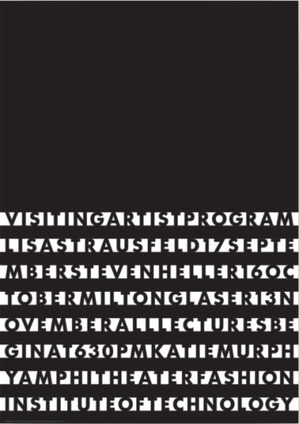
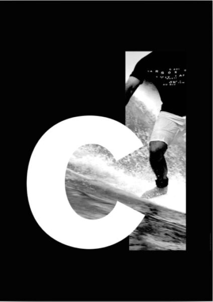
The first image does not work because the letters are blending into the background and are too simple and spaced out to read separate letters. This design looks like an eye exam instead of something you can actually read. The second design works well because the thick letter is used to contrast the graphic image. The framing of the letter and the filling in is a very smart decision and really catches the eye.
Consuegra_Pamela_TT_RP
Leave a reply

