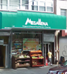
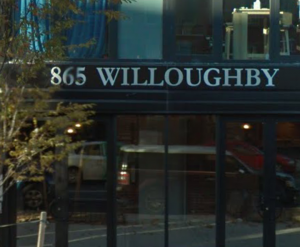
The typography of my neighborhood shows that things are constantly changing and I feel that my neighborhood is entering the modern times. These three pictures are proof of that especially the one that says 865 Willoughby, which is a new apartment building that was built a year or two ago. The typography on the building shows that Bed-Stuy is getting a whole new look to it and welcoming new people into our neighborhood. I’m glad to see that Bed-Stuy is changing because once in a while there are things that need to be renovated. That way people can have an easy shift when visiting Bed-Stuy, either to shop here, eat here or live here. I can’t wait to see what else Bed-Stuy is going to add to the neighborhood.
Day: February 13, 2017
 Updates from Smash Magazine
- The Digital Playbook: A Crucial Counterpart To Your Design SystemDesign systems play a crucial role in today’s digital landscape, providing a blueprint for consistent and user-friendly interfaces. But there’s another tool that deserves equal attention: the digital playbook.
- Transitioning Top-Layer Entries And The Display Property In CSSIt’s not always the big features that make our everyday lives easier; sometimes, it’s those ease-of-life features that truly enhance our projects. In this article, Brecht De Ruyte highlights two such features: `@starting-style` and `transition-behavior` — two properties that are absolutely welcome additions to your everyday work with CSS animations.
- Svelte 5 And The Future Of Frameworks: A Chat With Rich HarrisAfter months of anticipation, debate, and even a bit of apprehension, Svelte 5 arrived earlier this year. Frederick O’Brien caught up with its creator, Rich Harris, to talk about the path that brought him and his team here and what lies ahead.
- Navigating The Challenges Of Modern Open-Source Authoring: Lessons LearnedAlvaro Saburido delves into the current state and challenges of Open-Source authoring, sharing lessons learned from both community- and company-driven initiatives.
- An Ode To Side Project TimeA once-revered perk of some tech workplaces, the status of ‘side project time’ seems to have slipped in recent years. Frederick O’Brien believes it deserves a comeback.
- On-Device AI: Building Smarter, Faster, And Private ApplicationsShouldn’t there be a way to keep your apps or project data private and improve performance by reducing server latency? This is what on-device AI is designed to solve. It handles AI processing locally, right on your device, without connecting to the internet and sending data to the cloud. In this article, Joas Pambou explains […]
 How Design News
- An error has occurred, which probably means the feed is down. Try again later.


Recent Comments