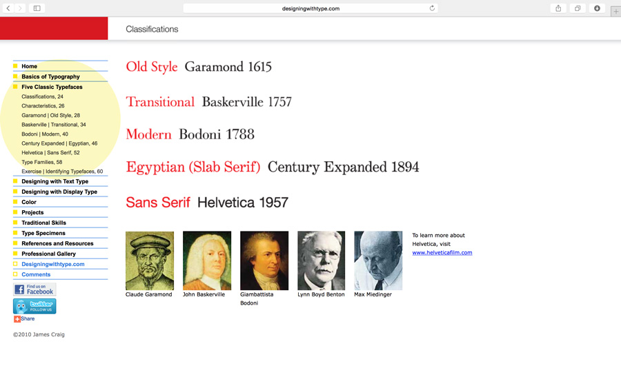
The main topic of the discussion was kerning, tracking and letterspace. We also did an introduction to the InDesign workspace. As a review of the Five Families of Type, here’s a link to an added resource. Navigate through the links highlighted in yellow: Designing with Type

Kerning vs Tracking
Do you know the difference between kerning and tracking? You need to make sure you understand.
kerning = adjustment of the space between two letters to improve the appearance. Kerning is more specific than tracking. Kerning becomes more important with large or display type.
tracking = adjustment of the space between letters for the a whole word, sentence, page or document.
Other Terms We Covered
- points – unit of measurement in typography: 72 points = 1 inch. All type is measured in points.
- pica – typographic unit of measurement: 12 points = 1 pica; 6 picas = 1 inch; 72 points = 1 inch.
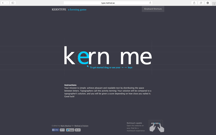
To help with the concept of kerning, we played The Kerning Game online. If you didn’t get a good score during class, give it another try: www.type.method.ac

Videos That We Viewed in Class
InDesign: Type Anatomy and Terminology
Anatomy: Parts and Shapes of Type
Typography Tutorial: Kerning and Kerning Pairs
Homework Due – Wed (2/8/17)
- Reading Assignment in textbook: 102-117;
- Finish the letter tracing assignment:
On 1 sheet of tracing paper, with a pencil, lightly draw a baseline and trace a letterform over and over until you get the hang of tracing and can produce a neatly traced letter; on another sheet of tracing paper, lightly draw a baseline and make a 3-4 letter word by tracing. You must pay attention to your tracking and kerning. This should all be done a neat as possible.


Leave a Reply