Gotham is a typeface that is all around you every day. You’ve seen it but probably didn’t notice it. That is one of the things I like about Gotham. It has a strong, clean and simple design that is not over powering. Gotham happens to be one of my favorite typefaces to use—that is really an understatement. I use it on ALMOST every project I work on. I came across this quick video about the creators of the Gotham typeface and thought it might interesting for you to see the real faces behind some of the fonts you see everyday.
Tag Archives: typography
Five Families of Type
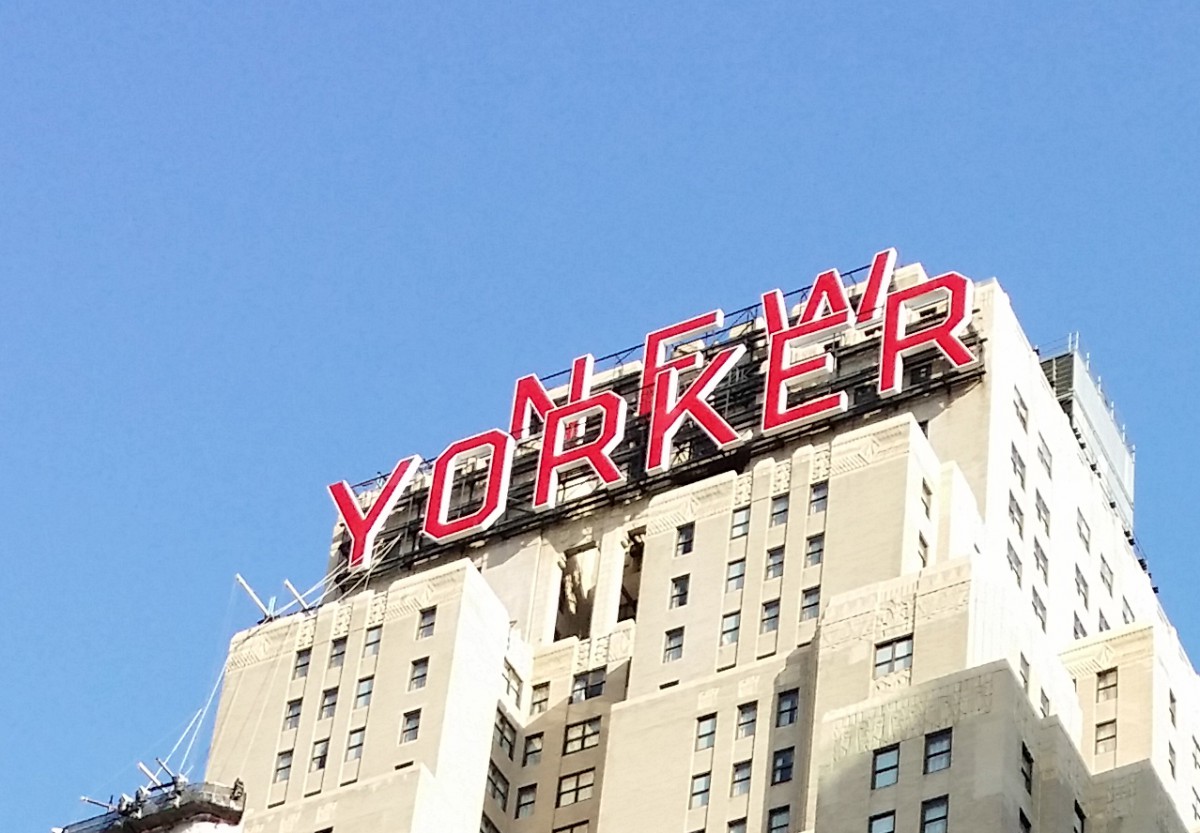


Typography Jackson Heights
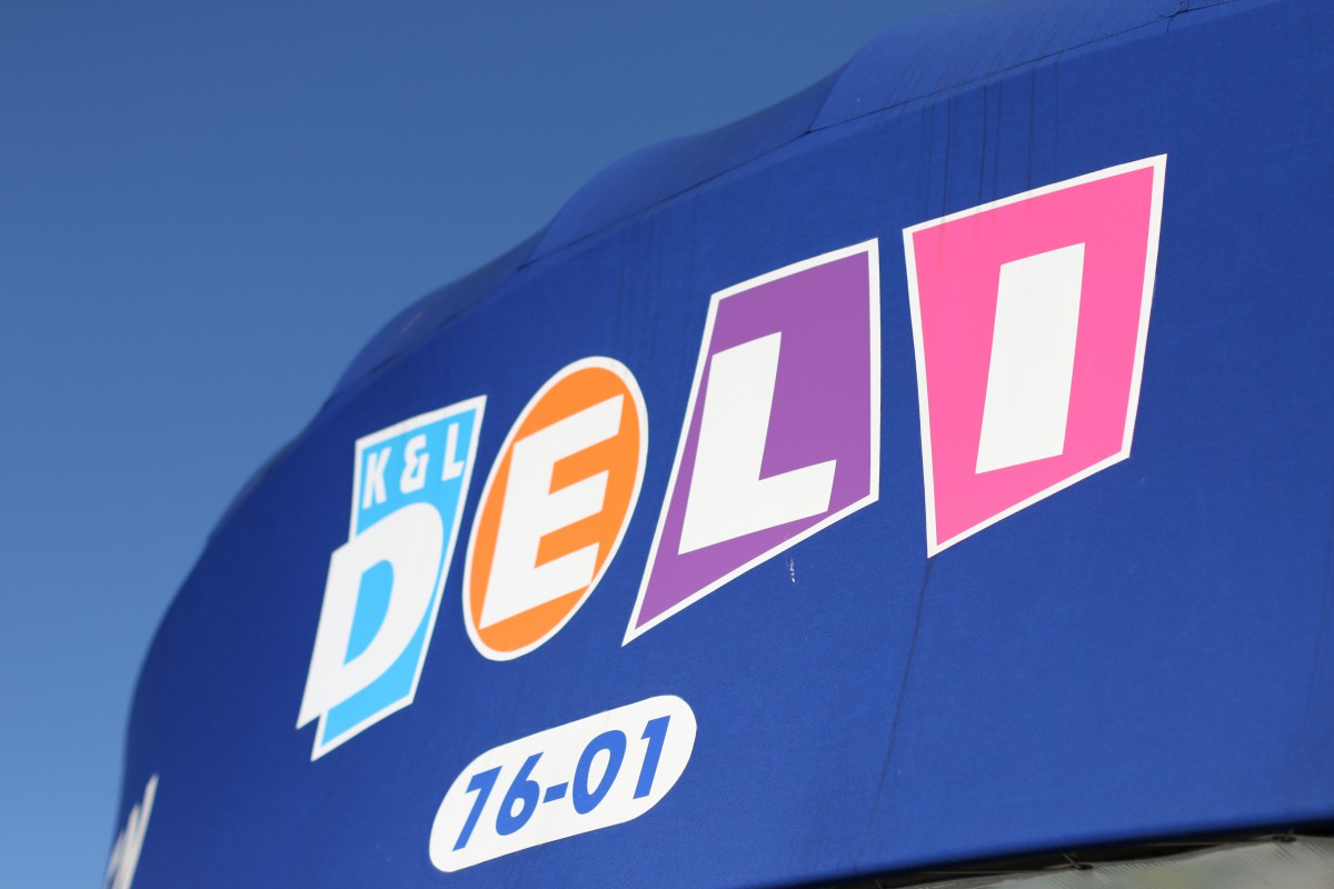

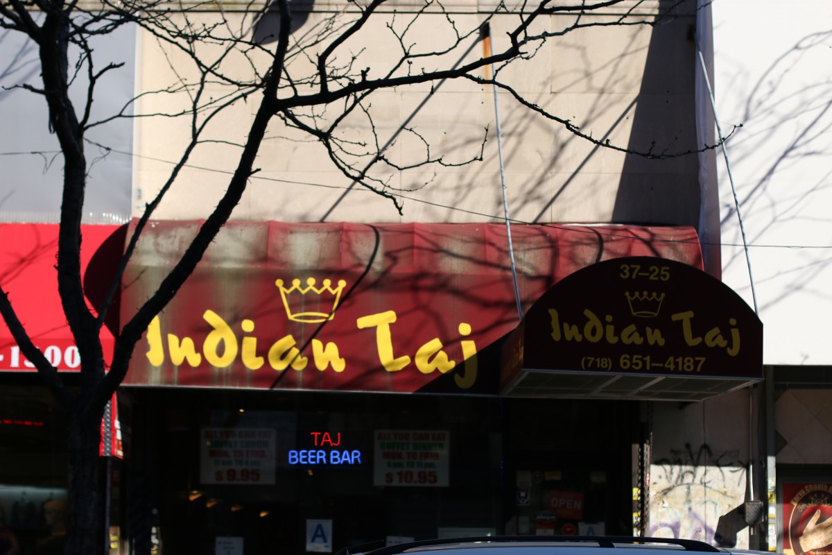
Jackson Heights is a diverse neighborhood in Queens. I could consider Jackson Height a small melting pot of a variety of many different cultures from Eastern Europe to Asia. Typography is everywhere you go walking out to school or work. In Little India, most stores and restaurant has stylized type fonts plastered in front of the door. 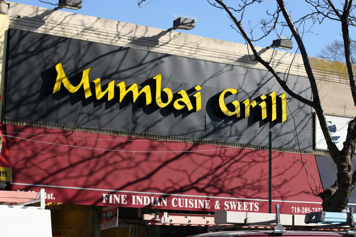 These fonts are stylized where it replicates the Hindi letters while still be able to read in English. My local deli and supermarkets are the most noticeable that stands out from the other nearby businesses because of the use of bright colors and using large bold fonts. Graffiti is fairly uncommon, well at least the part of the neighborhood I’m currently living. There is nothing else much to say about my neighborhood besides being bland and clean on the most part of the neighborhood. Some mom and pop stores I’ve walked by everyday use those generic white fonts found on the computer (eg. Comic Sans, TImes New Roman.). Jackson Heights is not a boring neighborhood to be around, it’s just not the kind of place you find anything artistic or appealing.
Class 1 – Introduction & Letterforms
The purpose of this course is to introduce the student to typography, it’s principals, terminology and it’s relationship to the world of graphic design.
During the first class we discussed the history of the letterform and the evolution of the alphabet. You may download the slides from that presentation here.
If you need to replace your syllabus for the semester, you may download a new one at any time from here.
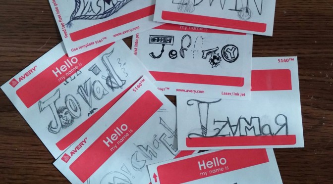
In Class Exercise
As an exercise in using type as a way visualizing words, students were asked to pair up and interview each other. From the information they learned about their classmate, they created a biographical name tag. The name should be lettered in such a way that it served as a visual description of the person interviewed.

Homework Assignment
- Take at least 20 photos of typography or lettering in your neighbor.
- Write a one page paper (typed and double-spaced) on what that typography tells you about your neighborhood, and add it to your Journal.
- Save the photos for a later project.
Additional Resources

