
While creating this ligature, I wanted to create something personal by making it look like a signature. I used two different typefaces which is suppose to give off the sense of change, since I have went through some dramatic changes in life. Throughout all of my possible ligatures, this was the only one that spoke to me in the sense of personal relations. As an individual, I see myself very bold and professional. My signature speaks a lot for me, which is interesting because in the typeface I used for the rest of my name emphasizes the X and in my actual signature I too emphasize the X. Eventually, I believe in the future I will change it to actually be my handwritten signature.
ligature #3
 For this ligature this visual doesn’t really show off anything specific. It could represent organization.
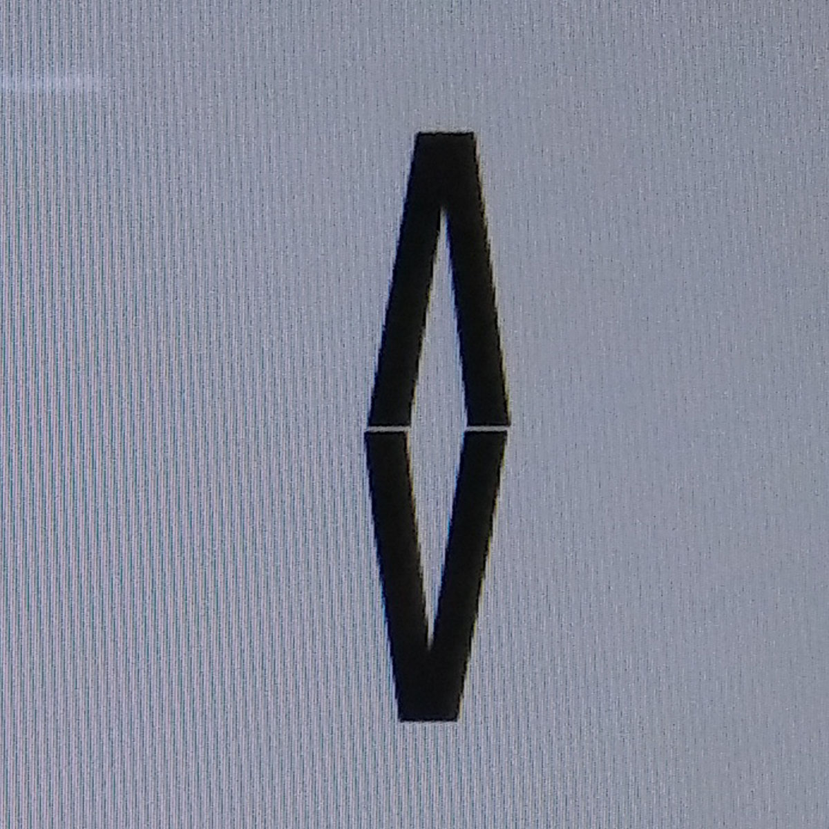
I got inspired by the simplest form of my initials. both my initials remind me of triangles and both also can be represented by just using two V’s like it is in this picture.
This design does not work. It doesn’t really represent anything about me. It is not easily readable. Definitely would be confusing for many. When you look at it, it reminds me more of a diamond. Not a positive symbol because it feels as if the person being represented is confined in a small space. Overall, this design is not effective.
Ligature #2
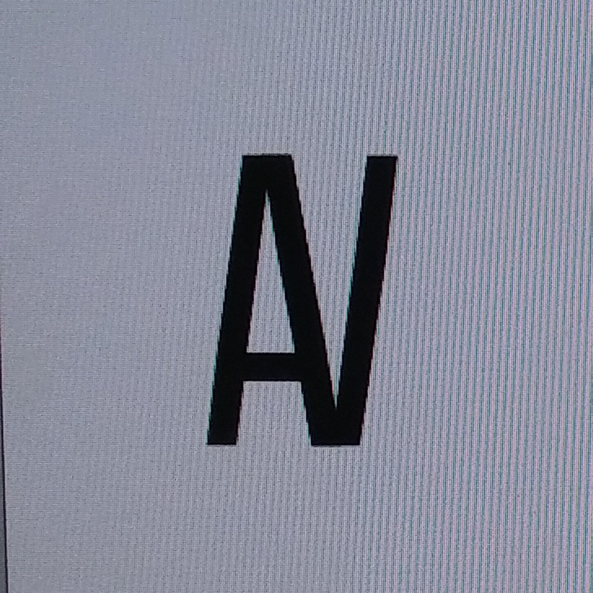 For this ligature, I have my first and second initial fused together by their sides. It represents boldness, structure and simplicity.
Looking at both initials, I realized that the A has an intersection at the top of the letter and the V also has an intersection but it is located at the bottom of the letter. Observing them, I thought that they would fit hand and hand with each other with a typeface bold enough to hide the others stem.
This design is successful because the consistency of the strokes in both initials made it easy to fuse together. The initials used are clearly seen . I do have doubts about it because when looking at the ligature you see the A and V but together it does look like a N. I am unsure if people will get confused with that.
Ligature #1
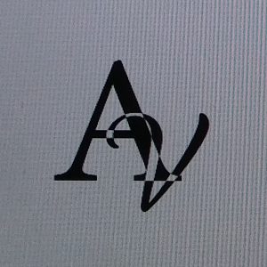 The concepts I was trying to illustrate was the transition that I have went through as a person in college.
I created a sketch of my initials in a fancy complicated line design. Ligatures should not be complicated when looked at because then they could be misinterpreted for another letter all together.
This design works because the intersections between the two letters are changed to white to further show that there is two different letters coming together as one form. This design is clear because you can tell what letters I have used. It definitely reflects the journey I have taken to get to where I am today

