Monthly Archives: January 2015

Khyriel Palmer: Advertising Campaign Analysis

698_13060 698_13058698_13059


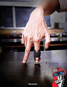
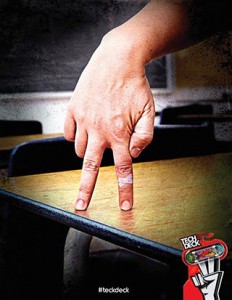
Phillip Roston did a campaign on Tech Deck the finger skateboards using hands in a standing position with very few props. I feel like the message in this campaign is that playing with Tech Decks aren’t just for kids. Its a serious toy for people of any age. Just like how anyone can skateboard if they want. This ad campaign is trying to sell a lifestyle that you can take anywhere sine skateboards cant be used in anywhere but the streets and skate parks. They are not limiting the product to just any specific age rang either. Whoever has a passion for it is welcomed. As someone who enjoys the sport, I’m sure i would actually buy the product because it is speaking to my demographic. All three of these images are at eye level with the viewer. Each photograph was taken with direct lighting with a very faint shallow space. The High contrast in these images helps display that this is a toy based upon a serious lifestyle of dedication to get better. It is also has a soft focus with an emphasized texture that looks similar to the marks on a used skateboard that grinds often. These images also feel balanced equally, none of them feel heavier than the other.  I believe that these images are mirrors. They display trial and error of skateboarding as well as the image people depict about it. You can notice that from the bandage on the finger that is standing on the desk. Then there is a finger which has a brace on it. Which it probably got from landing a trick the wrong way. And lastly the one is different from those two because it just has a tattoo. It could be a symbol meaning that they endure pain which is true. Overall this piece is a mirror because the hands represent people who love skateboarding. I’m pretty sure if you ever tried skateboarding you would be able to relate to this campaign.


Peter Conquet HW 1

d wade serena

The intended message that Gary Land is conveying is that Gatorade fuels you and helps you perform to your best ability. The denotation of both photos is that when playing a sport you tend to sweat and give it your all, and how Gatorade is suppose to help quench your thirst and replenish you. In contrast the image doesn’t really convey to buy Gatorade or give you the feeling of wanting to buy the product. The connotation of the photos is that Gatorade is there to replenish you when you need it most. It is the drink of champions as we can see how the sweat creates the trophies for each sport. Gary Land uses a lot of key elements to create the same feel for both photos. The photos are back lit, create color contrast, have selective focus, and appear to be eye level view. Even though both people play different sports and area  male and female, the cohesive use of the visual elements creates the same feeling in both ads. I feel these photos are mirrors because they are trying to connect to you emotionally. We all know drinking Gatorade wont make you sweat a trophy design on your shirt. The metaphor that they are using appeals to the audience they are targeting and creates the want for the product.

MIkhail Reid Mirror & Window

In the first picture Mirror is taken place by the women looking at her reflection of her daughter, which is in the vehicle. The photo has an overall dramatic feel to it, just by the way the mother looking at the daughter with disappointment. The lighting also gives that dramatic feel which comes from side; shadows casts to side with mostly light tones.

The second picture also show mirror which show emotion of the child, and it shows the distance of the two children from each other in the garage showing depth. The first child seems to be eager to look for someone.

Josh Rojas Mirrors and Windows

COMD Advanced Photography


Josh Rojas


1/28/15


The Szarkowski’s Mirrors and Windows thesis is comparing the way a person views a certain idea versus the way it actually it is in the real world. Both of the photos are set in some type of suburban area. The main focus of the photos is children although there is a large age gap. The first photo is very detailed I think every thing placed in the picture has a purpose. The background is very dark but the car lights are pointing at the girl on the lawn. The second photo is very dull and empty but the child in white draws your attention. The artist may be trying to depict how they feel about growing about in the suburbs versus the way the world views it. The first photo is the mirror and the second is the window. The first photo shows a lot more emotion in the faces of the subjects the second doesn’t show much emotion but shows this is what it is.

David S. RR1- Mirrors & Windows response

What I think mirrors photos mean is something that you can relate to and be experiencing at the same time. Such as in Crewdson’s photo, the high contrast from the headlights of the car in the middle of the night glaring at the daughter standing in front of the car gives it a very dramatic affect. With her mother standing aside her car with a very distinct look on her face gives an emotion the expresses anger and the way the daughter in her underwear shows shame in the way her body is slanted over like if she has done something wrong. Crewdson’s photo shows emotion and meaning that would clarify it as a romantic photo.

In Winogrand’s photo can also go for a mirror photo because it kind of does give emotion. The photo looks very gloomy and sad. The photo looks very sad, the two boys look alone, stranded in the middle of nowhere, giving it a very gloomy depressing look. the two boys give has a sad expression on there faces like if they are looking for someone to comfort them but no one is around.

Crewdson’s photo is more high contrast while Winogrand’s photo is more full scale.

Both photos has a feel of depth


Tera Cunningham Mirrors & Windows Response

Mirrors is more of an eviction of emotion from the photo. It is more intimate and your personal view of things. Where as Window is more of a realist way of looking at things. It shows that there is a world out there with different views other than your own. The Crewdson photo is a mirror and the Winogrand is a window. Crewdson is a mirror because it evokes emotion. It shows more feelings and gives a more intimate view with the viewer. From the anger on the mothers face to the shock on the daugheters face. There is body language from the half naked girl standing with her head hung low in sadness or disappointment. The Winogrand is a window because it shows things in everyday life. It doesn’t give off emotion, it’s showing you children in a drive way. It makes you think about why the kids are outside, what were they doing, it has interesting scenery in the background. Theres no just one point of focus like the Crewdson. In the Crewdson the lighting is frontlit where as the Winogrand is diffused light. The tone in the Crewdson is high key and the Winogrand is high contrast. 

Mirrors and Windows ( Antonio Griffith )

Robert Frank meaning on the mirror idea means that people are going to experience different outcome on the same life situation. Not everyone is going to experience how to tie their shoe, or how to drive a car. We all have different people and things we interact with so we will definitely experience things different. Even though we have different experience we can still relate to the problem. Basically what I am trying to say it that the mirror concept in photographs will have something that is always going to be reflected back into our idea of life. As for the meaning on the window concept from Robert Frank it means that idea of freedom and endless possibilities.

Crewdson

In the photograph with the three females, the mom and her two daughters is a mirror concept from Robert Frank because he is creating a story that is in his head. He created a real life conflict with mom and daughter. Robert is basically making a mirror image on life that could possibility happen to you or not. I would say the mirror concepts are situations that make the viewer stuck on that one area on the photograph as for the window concept it have you wondering about every other subject matter in the photo with a sense of freedom.

 Winogrand

In the photograph with the baby running out the house garage is a window concept from Robert Frank before this idea is like you looking out the window and seeing what is real. This window concept is not planned as much in his head. The window concept you can say is him capturing life or things as it is already without much planning and it still have you thinking what is going on. From the images I have seen today from Robert his window images always involve scenery landscapes with a subject matter. The scenery landscape style gives a sense of freedom to the point you wonder what is beyond life in the sky. Robert two window concept  photographs I have seen is always giving me perspective and a sense of freedom. It gives me a sense of free thought to analyze the photo any how I want. As for a mirror concept you get one or less possibility on what you can say is going on because most things are planned.

Mirrors and Windows

I think that Crewdson’s photo can be defined metaphorically speaking as a mirror; since there are emotions that the author want them to be expressed through the photo such as:the embarrassment that we see in the girl that is almost naked. if we notice it , Crewdson use a lot of darkness around of the subject trying to pointed her out.

The Winogrand photo is the windows since it shows the reality of the moment; he didn’t manipulate the scene for this photo, it was a moment that he captured.

Mirror & Windows_Khyriel Palmer

I believe that Szarkowski’s Mirrors and Windows thesis is based on comparing your life to someone else’s. The mirror is just a reflection of who you are and or who you are trying to become. It’s like an inside view on the way that you view the world. I also see it as being a creative individual. Windows are the opposite, it displays the way that the world sees you. Broadcasting what is the norm. Showing what is expected based on what we have come to accept in society today.

In the Crewdson image, i see this one as a mirror, because its something that you don’t see very often. The mother is proof of that because she in a state of either shock or disgust thanks to the grocery bag on the floor next to her. This image has a High Contrast thanks to it being taken at night time. Its sharp overall with very light depth of field. It is has a heavier balance than the other photo thanks to the suburban background. The subject is also side lit from the way the car lights and the street light shine on her.

In Winogrand image, i see this as a window because this is what most people except to see in a normal middle class family. Nothing here is out of the ordinary its basic in a way. This photo has full scale tone and contrast in the background and also in the garage. It is also soft focus because the whole image isn’t sharp. The child has direct light shining on her thats why she pops out of the garage while the boy in the back has directional diffused light on him.

Marielos Osorio Mirror & Window Assignment.

I think that when a photographer takes a Mirror image, they are focusing on emotions. The photo has a meaning. Usually, it is referring to the way the photographer feels about something. These images has a romantic feeling. On my opinion, I do believe that the photo tells a story when it is meant to be a Mirror image because I reflects emotions. The story can be about the person who took the photo and his or her emotions, and feelings towards something. on this photographs you can see passion.

If we talk about Window image, I think the photographer is focusing on the possibilities one might have or face in a close future. Meaning that the image do not necessarily has a story or emotion to tell. The image is there for you to see what is out there and its open to opinions. The image becomes a window of possibilities. In other words, these photos can be realistic and about real life events or settings.