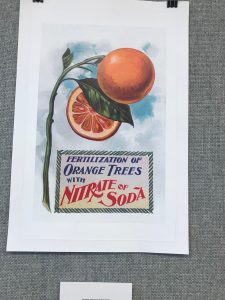
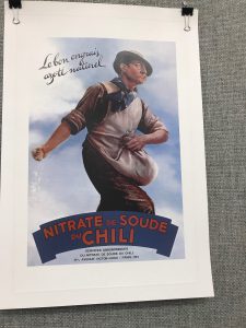
On the week of October 20th, there was an exhibit in the Grace Gallery here at City Tech. The theme seemed to be a latin orange drink portrayed in each individuals perspective. However, they were mostly latin or spanish, some were done in chinese and other languages as well. Although, many if not all posters were done very well and were executed beautifully, there were three posters that stood out to me and caught my attention more than the rest. One of the artworks was called “Fertilization of Orange trees with nitrate of Soda” This artwork stood out to me because it shows the inside and outside of the product used to make the beverage. It also says organic without having to use the word and it shows the sky which demonstrates subtly the process of how the orange is grows. The next poster that caught my eye was ” Nitrale de soude Duchili.”
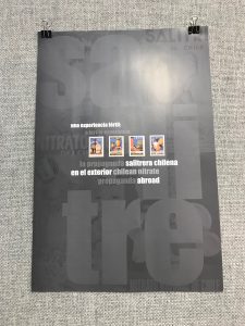
It caught my attention because it is an action shot. It also says organic without using the word. We know this because the farmer is naturally growing the oranges himself spreading the seeds in the field. This one shows the process and the naturalness of the product without showing the product at all. Lastly, “Una experiencia fertil”
caught my attention because it was completely different than the other images. It differs because it is not visual dominant, however, typography dominant. The images are small in forms of post stamps. The typography shows the experience and what the company and product is about explicitly using minimal color in an effective way.


