MoCCA Festival of the Arts – EXTRA CREDIT ASSIGNMENT


The MoCCA Arts Festival聽is a 2-day multimedia event, Manhattan’s largest independent comics, cartoon and animation festival, drawing over 7,000 attendees each year. With 400 exhibiting artists displaying their work, award-winning honorees speaking about their careers and artistic processes and other featured artists conducting workshops, lectures and film screenings, our Festival mission accelerates the advancement of the Society’s broader mission to serve as Manhattan’s singular cultural institution promoting all genres of illustration through exhibitions, programs and art education.


EXTRA CREDIT TRIP ASSIGNMENT :

Go to the show and look at as many different kinds of work as you can. 聽

Choose one creator whose work聽you admire. 聽Interview them about their work, inspiration and career. Find out how they approach their work, their process, and how they got started in the industry. 聽Take a picture with that creator and their work. 聽Write a blog post and share it on open lab. 聽Be sure to credit them and share their social media info with the class.

Tag your post as Discussion, Title: MoCCAfest interview: ____creator’s name____聽

DUE: Tuesday April 10th


Illustration Discussion

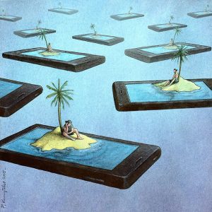
I don’t know the title of this illustration, but the illustrator’s name is Pawel Kuczynski. As much as mainstream social media issues illustrations annoy me, this one stood out to me. It spoke to me immediately, in other words, it did the job an聽editorial illustration is suppose to do, communicate of an issue without words. It shows how when people are on their phones, they’re sort of isolated form the rest of sociality, physically. So them being on the phone (excessive use) is like they’re on an island, in their own world.

Illustration: week 11 discussion

An artist that i chose was, Pawel Kuczynski. Kuczynski has done a set of illustrations on how facebook has altered our lives. One illustration that caught my eye was a police officer having a duel with a cowboy with a gun and the gun is the facebook logo. It seems that the illustration shows us about how theres always opposing views on facebook. We have our own opinions but many people may not agree with our opinions. A lot of different views can lead to a passionate and heated argument. I think in this illustration the artist conveys that the policeman and the cowboy are extremely against each others views through social media.

http://theinspirationgrid.com/thought-provoking-facebook-illustrations-by-pawel-kuczynski/

Week 11 Discussion

http://theinspirationgrid.com/new-editorial-illustrations-by-paul-blow/

This illustration by Paul Blow looks relevant based on my topic. In his works he tends to use a candy color palette and in this illustration the colors have a very strong contrast between the yellow and the magenta. In this piece he juxtaposes the smartphone and eyes as if he were saying the smartphones have become our eyes. The earphones also lead me to think the message of this editorial is that we live vicariously through our phones.

This illustration is paired with an article about choices not being made by the user but rather the browser and smartphone and I would assume it has something to do with how easily it is for companies to collect data from all over the internet.

Daniel Stolle Illustration- Sharif Tyler

Daniel Stolle is a German illustrator who is known for his black and white illustration style. This illustration obviously represents technological addiction. IT shows a black silhouette of a person looking down at a tablet. Almost as though this silhouette is praying to it. I chose this image in particular because I liked ho Daniel Stolle was able to easily convey his message without any words at all. I also like how he used black and white instead of color like most illustrators do.

Extra Credit: Mocca Arts festival

An artist who I saw at the mocca arts festival goes by the name of Kate lacour. Kate lacour is from New Orleans. She is a cartoonist, comic book artist, and therapist who works with autistic kids. Her work is mostly drawn figures of the human anatomy. Most of it is usually seen as horrifying or gruesome. Most of her drawings contain elements of human anatomcial horror. She says that her work is built around neurosis, which is a mental illness. She recently came out with two illustrative comics called Vivisectionary and The Disciple. Vivisectionary shows drawings of human diagrams mixed with horror and fantasy and the disciple is a series narrative drawings which also is mixed with horror and fantasy. Her references for those two books came from old biology textbooks from school. She used those books for anatomical references. Kate draws on archival ink first on watercolor paper. Then she paints with a combination of watercolor dyes and colored inks. She uses a scanner to scan her work and she uses photoshop to fix it up.

Concept in Illustration

Class

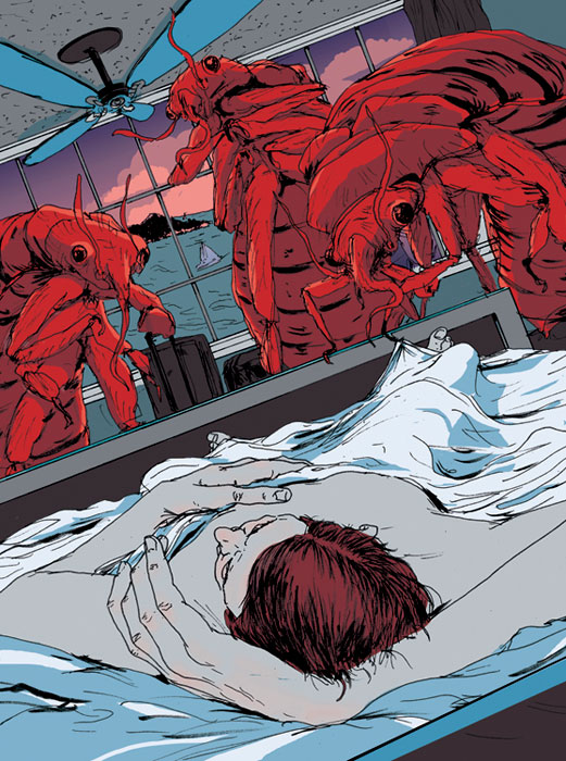
Find an editorial Illustration you admire. Such as this amazing illustration by Mike Byers on the topic of Bed Bugs.聽 馃檪聽 聽Read the subtext about the illustrations and where / how they were used. 聽Analyse what metaphors they chose to illustrate the subject matter. Observe the way the artist has conceptualized their subject.

Pay attention to what methods they have used:


Fusion

Juxtaposition

Replacement

Exaggeration

Symbolism

Displacement

Period Imagery

Style


Here’s a few places to start looking:

https://society+of+illustrators+competition+editorials

http://theinspirationgrid.com

https://www.creativebloq.com


But most of all, just聽look.


SARA

Week 5 Discussion

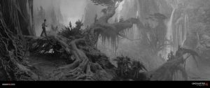
I choose this piece as an example of tonal organization. This is concept art by Aaron Limonick for the Uncharted game series. I think this is a good example because you can clearly see the blacks, grays and whites here. You get a good sense of visual hierarchy with things in white being apart of the background and things closer get darker in color.

Example of Value Variation

“Robsybot Spaceclash

In this piece by聽badillafloyd on deviantart, shows a great variation of highlights and midtone values all working together to create a sense of depth, creating a serious kind of mood for a funny yet confusing concept. The way the artist used tone organization with the help of highlights as well, was to make it as though each characters is coming out of the dark which helps them to appear to stand out more (however, the moon behind the robot stands out more than the robot itself, when the robot perhaps is suppose to be the main subject of this piece…?). With the source of light coming from the moon, it acts as the “highlight” on the characters for them to project more (since apparently they’re in space where it’s pitch black). The artist also uses value structure to indicate the importance of subjects in the piece.


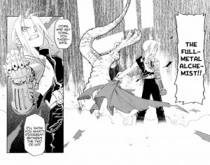
Reading On Value – FMAB

This manga illustration is from FullMetal Alchemist Brotherhood (Chpt. 1, Pg. 52) is a good example of value structure and tonal organization. Even though you see a lot of scattered grey in the background, it feels like it’s not too much because of how it flushes out. But it brings a sense of intensity to the character. The character has a good balance of white, grey and black that differentiates from his skin tone, clothing and metal arm.