Project 4 Story Idea

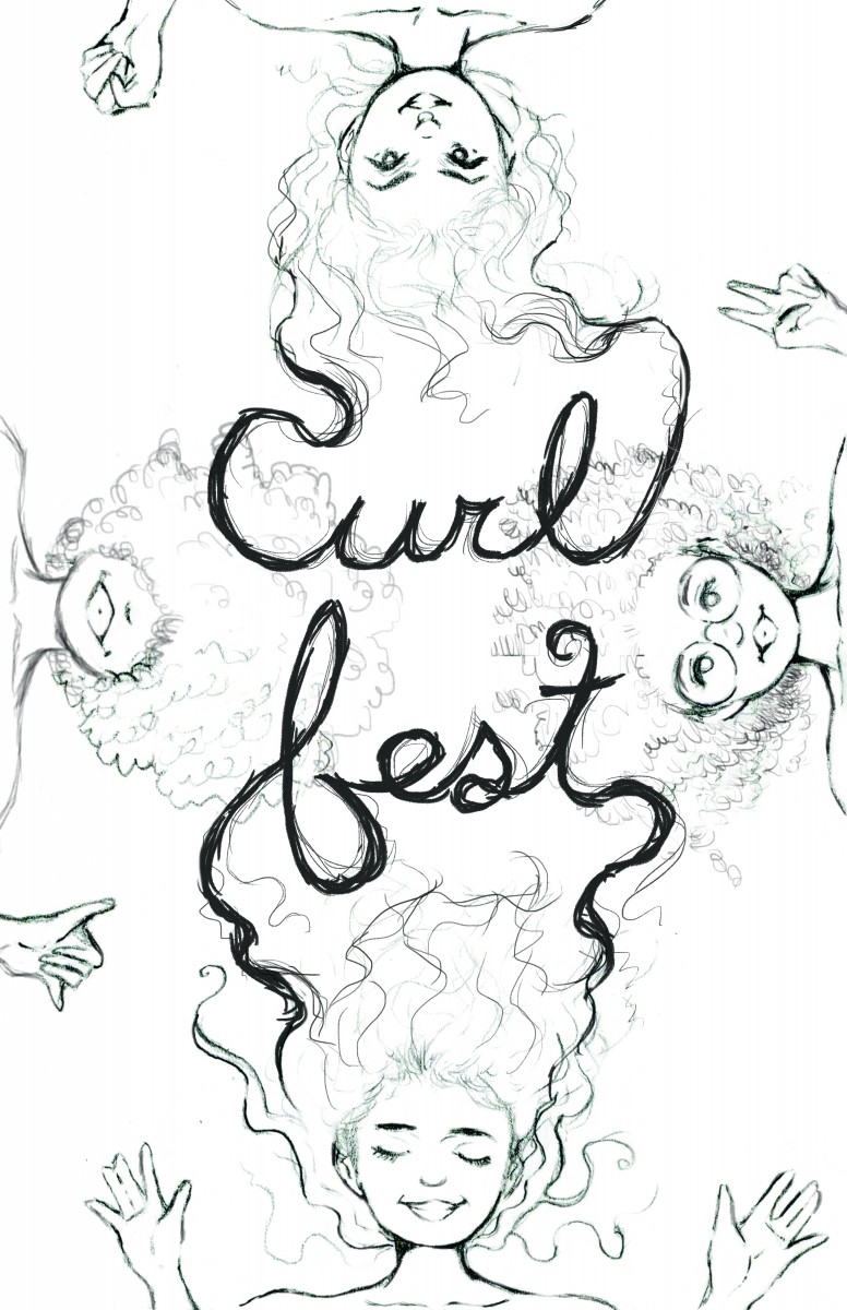
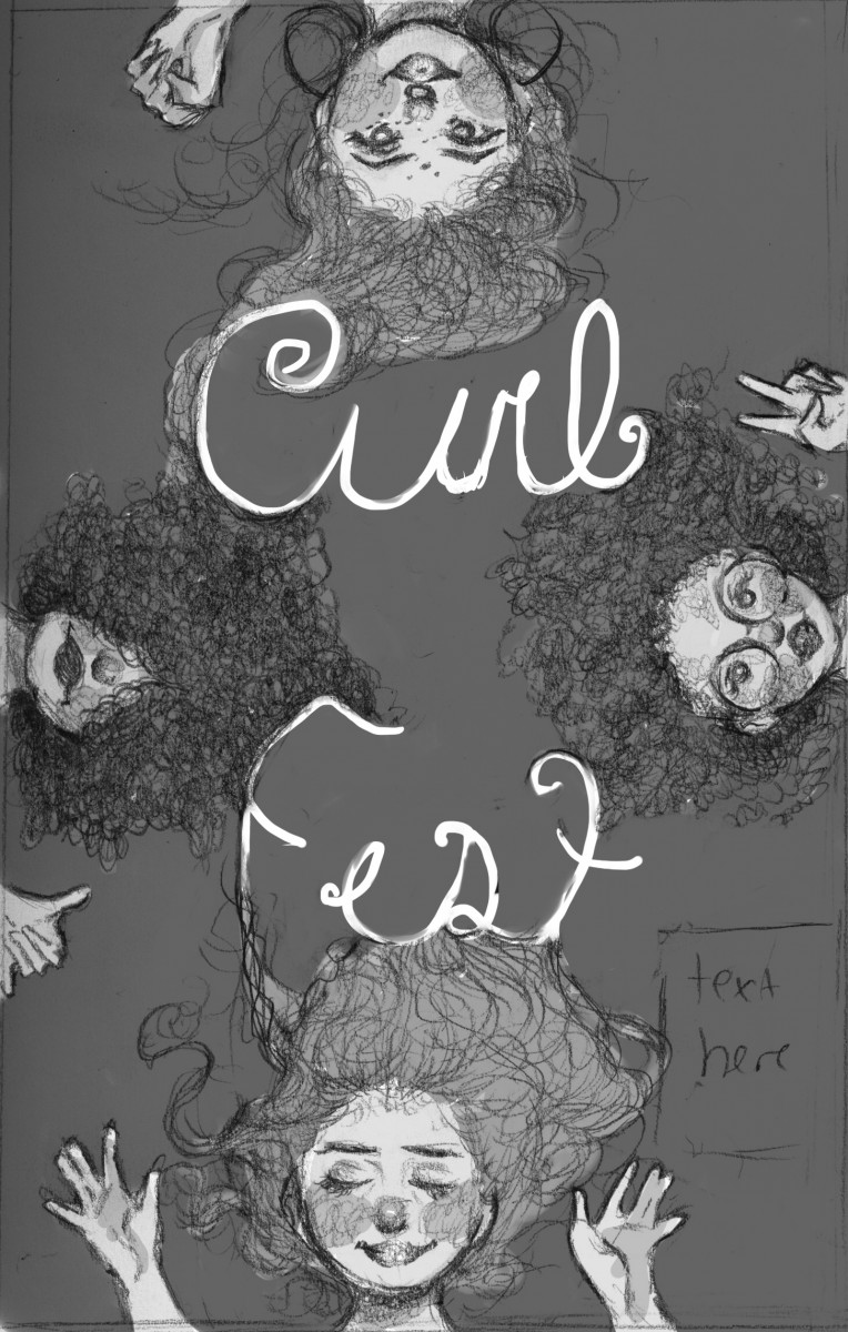
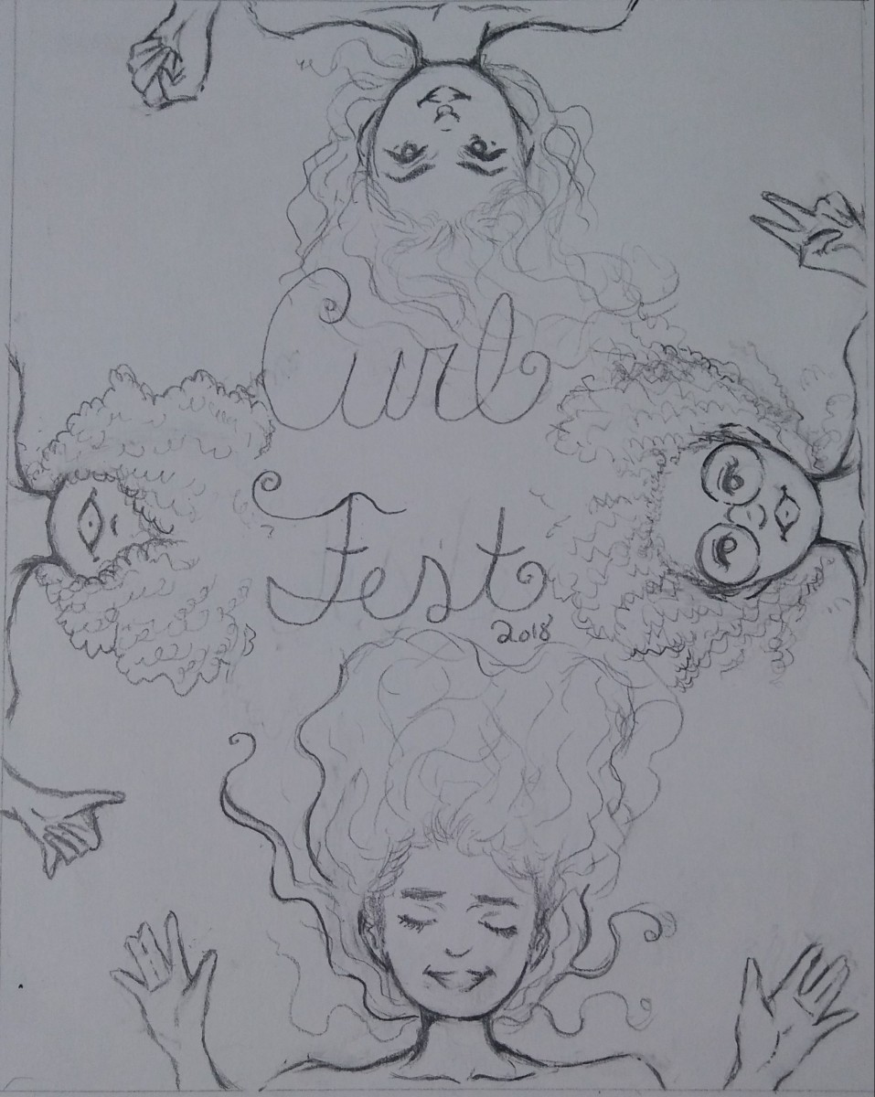
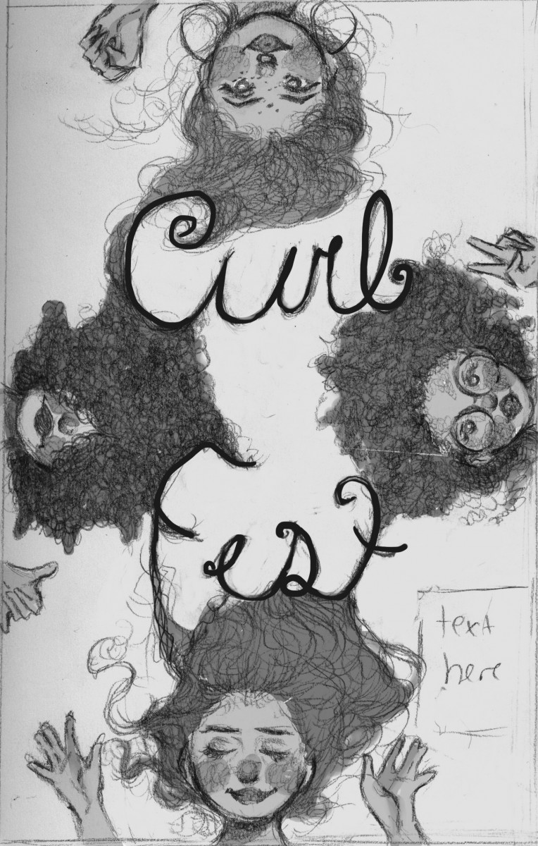
The original story where the concept derived from is from the story, Repunzel by The Brothers Grimm.

In the original story we have a princess, named Repunzel, as “a damsel in distress” locked in a stair-less tower by a witch and is eventually saved by a prince …. However, in my story, she is her own knight in shining armor. The story take place in a Nigeria (a country in W. Africa) in a village complex called, Umuahia, (so yes, she’s a darker skinned African). Ngozi, stubborn, yet strong willed, is the oldest of 7 children in a prestigious royal family. She is appointed to take the throne after her mother. her mother, Chibundo, who favors her more than the rest of her 6 siblings. One of her siblings, Azuka, who has strongly envied her for years, is in disdain, so one night she gives Ngozi a herb to knock her unconscious for a few days, she then locks her away in a sky-scrapping  tower where she eventually removes the stairs. The mother, who has no idea what Azuka has done, thinks Ngozi is died and gives Azuka her future crown. As Ngozi unknowably is locked away, she finds magical herbs growing within and around the tower, she starts feeding on them and gains strength and power in the most usual part of her body, her hair. For the 10 years she is imprisoned, her hair grew rapidly and out of control, she then locs it for easier management.

In the duration of 10 years, the mother dies from heartbreak and Ngozi is still locked up in the tower. Her younger sister, Azuka, is set to take the throne as queen. But, Nogozi, now older and stronger with her hair longer, is going to escape the imprisonment and take back her rightful place on the throne from her wicked, corrupted sister.

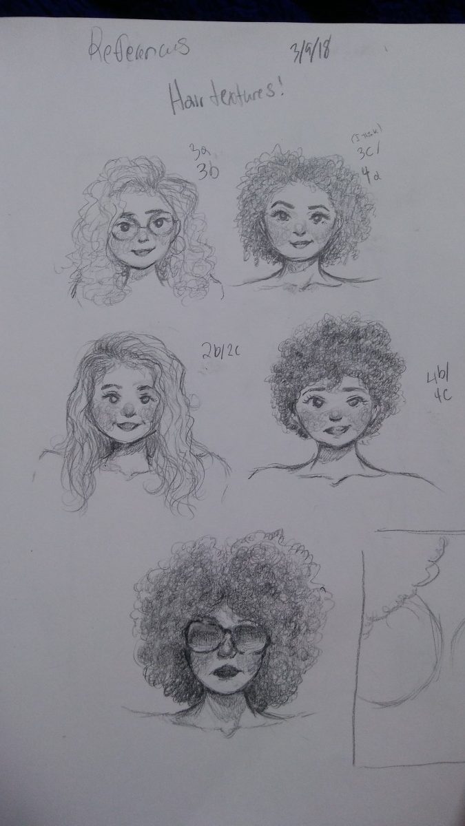
Details: Whenever Ngozi is in fury, her eyes glow along with her locs, as strength generates in her locs.

Target audience: Young adults to mature adults; has violence and gore (not too much though).


Illustration Discussion

I don’t know the title of this illustration, but the illustrator’s name is Pawel Kuczynski. As much as mainstream social media issues illustrations annoy me, this one stood out to me. It spoke to me immediately, in other words, it did the job an editorial illustration is suppose to do, communicate of an issue without words. It shows how when people are on their phones, they’re sort of isolated form the rest of sociality, physically. So them being on the phone (excessive use) is like they’re on an island, in their own world.

My topic for project 3

*I don’t know why but openlab isn’t letting me put the link… but the name of the article is “Black Hair, Still Tangled in Politics” from the New York Times.*

My topic is about how black hair can get “entangled” in society and in political issue. I choice this topic being that I am an African American woman with tight coily hair, I could relate to the black girls and women being discriminated and bashed for their hair (it hasn’t happened to me but I want to speak out on this issue, visually). Another thing is that, this issue isn’t so much recognized in the list of social issues, and it is even often disregarded. Everyone needs to be aware of this issue because rejecting and depriving someone because of what naturally grows out of their head leads to decline of self esteem, especially to the younger generation. So this isn’t an physical issue, but a mentality issue as well. People would often say, “well it’s just hair”, well, this hair is being rejected from jobs, suspended/expelled, from schools and bashed even by the U.S government. So yeah, it’s a pretty big deal. As for the article. it discusses hair discrimination not only in politics but in society as well, yet it isn’t seen as an serious issue. I like the title of this article, Black Hair, Still Tangled in Politics, you can almost sense the tiredness and the “ugh, not again” in the title, which helped me visually what I want for a concept. As for my idea, I want to visually represent what us black women and girls have to go through today because of hair discrimination through metaphor.

Example of Value Variation

“Robsybot Spaceclash

In this piece by badillafloyd on deviantart, shows a great variation of highlights and midtone values all working together to create a sense of depth, creating a serious kind of mood for a funny yet confusing concept. The way the artist used tone organization with the help of highlights as well, was to make it as though each characters is coming out of the dark which helps them to appear to stand out more (however, the moon behind the robot stands out more than the robot itself, when the robot perhaps is suppose to be the main subject of this piece…?). With the source of light coming from the moon, it acts as the “highlight” on the characters for them to project more (since apparently they’re in space where it’s pitch black). The artist also uses value structure to indicate the importance of subjects in the piece.