80s Design is Alive, Well, and Living in 2019” by Nadja Sayej, published in PRINT, March 6, 2019
Here are some questions to which you can respond in your reading response:
- How or where are the principles of “collage” and “mixed media” used today?
- In what ways do we see the 80’s aesthetic / ideologies in more the recent “cyberculture, vaporwave or glitch art” trends?
- How was self-publishing in the Postmodern-era (“the use of the photocopies/zines became an alternative voice for communities who were not well represented in mainstream media”) similar to the use of today’s technologies?
- Find 1 example of work from a postmodern graphic designer from the 1980s and 1 example of work from a contemporary graphic designer from the last five years. Deconstruct the works and explain which visual and/or ideological elements are associated with Postmodernism of the 1980s and why.
The principles of “collage” and “mixed media” are widely used in various artistic and creative fields today. They are utilized across various artistic and creative disciplines including visual arts, graphic design, fashion design, digital art, and advertising. These techniques offer artists and designers a versatile means of creating unique and visually stimulating works incorporating different materials, textures, and visual elements. In visual art, Artists often combine different materials, such as photographs, magazine cutouts, fabric, and found objects, to create layered and textured compositions. In graphic design, collage and mixed media elements are frequently incorporated to create dynamic and visually engaging designs to achieve a desired aesthetic or convey a specific message. Fashion designers use collage and mixed media to create innovative, avant-garde clothing and accessories. They may incorporate fabrics, prints, textures, and embellishments to create visually rich and unconventional designs. Combining different materials and elements can result in uniquely and expressively pieces. Digital collages and mixed media artworks can be created by blending photographs, illustrations, textures, and various digital effects, offering limitless possibilities for experimentation and creative expression. They are also employed in advertising and marketing campaigns to grab attention and communicate messages effectively. Advertisers create visually captivating and memorable advertisements that stand out from the competition. This technique helps to convey complex ideas or evoke specific emotions in a visually compelling manner.
The recent cyberculture, vaporwave, and glitch art trends demonstrate a strong influence from the 80s aesthetic and ideologies. They draw on nostalgia, incorporate retro-futuristic elements, embrace visual distortions, and adopt a DIY approach, much like the artistic movements of the 80s. With nostalgia, they incorporate visual cues imagery associated with old computers, VHS tapes, neon colors, pixelated graphics, and geometric patterns reminiscent of the 80s aesthetic to evoke a sense of nostalgia and fondness for that era. Cyberculture, vaporwave, and glitch art trends often incorporate this retro-futuristic aesthetic, blending technology, fantasy, and surrealism elements. Glitch art embraces imperfections, visual distortions, and digital artifacts that occur due to technological limitations or malfunctions. This aesthetic resonates with the 80s ideology of embracing imperfection.
While the specific tools and technologies have evolved over time, the spirit of self-publishing as a means of alternative expression for underrepresented communities has remained consistent. Both the Postmodern-era photocopies/zines and today’s technologies offer a platform for independent voices, facilitate community building, and challenge dominant narratives, promoting greater inclusivity and diversity in media and cultural discourse. The Postmodern-era self-publishing through photocopies and zines was rooted in a DIY (Do-It-Yourself), emphasizing self-expression and creative autonomy. Photocopies and zines served as a means for like-minded individuals or communities to connect, exchange ideas, and collaborate. Self-publishing in the Postmodern era had potential to challenge and disrupt the dominant narrative propagated by mainstream media. They allow for the amplification of marginalized voices and provide a counterpoint to similar perspectives often found in traditional media. By offering alternative viewpoints and narratives, these platforms contribute to a more diverse and inclusive media landscape.
Postmodern graphic designer from the 1980s:

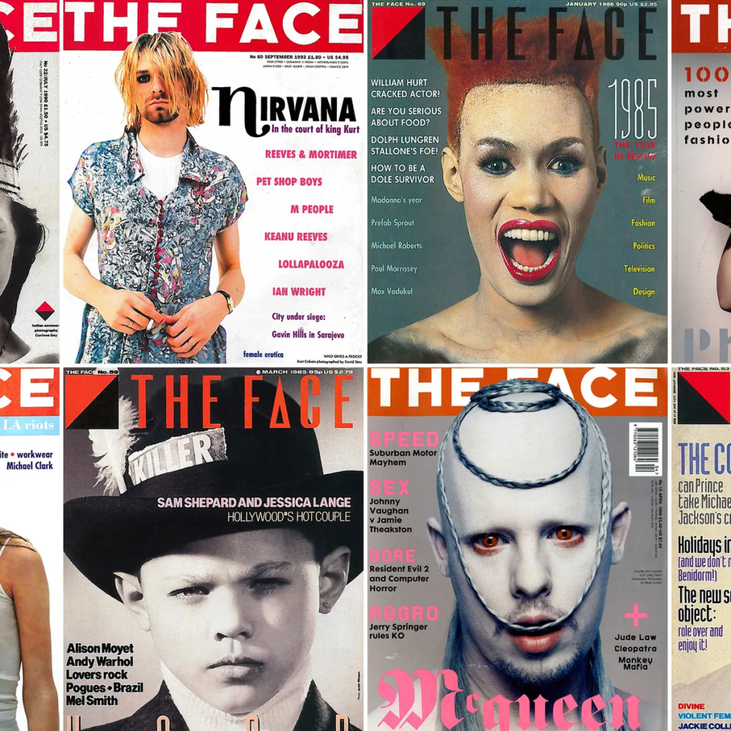
Neville Brody, a renowned British graphic designer, was a prominent figure in the postmodern movement. One of his notable works is the cover design for “The Face” magazine in 1984. By deconstructing and associating his work with postmodernism we can see he uses elements of typography, pop cultural references, and layering/collaging. With typography, he uses bold, geometric letterforms, fragmented text, and unconventional layouts. This use of non-traditional typography challenged the conventions of legibility and readability, embracing aesthetic experimentation over functionality. It was common for Brody’s work to have popular culture references, such as iconic celebrities and fashion. As for layering and collage, the composition of the magazine cover usually involves layering various visual elements, including photographs, and typography. This technique created a sense of blurring the boundaries between different elements and challenging the traditional notions of visual hierarchy.
Contemporary graphic designer from the last five years:

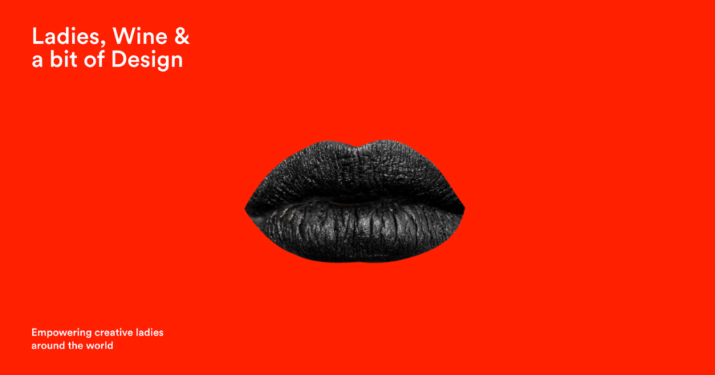
Jessica Walsh is a prominent contemporary graphic designer known for her innovative and socially conscious design work. One example of her recent work is the “Ladies, Wine & Design” campaign in 2018. Typography often plays a significant role in her work. In the “Ladies, Wine & Design” campaign, she employed bold, vibrant, and expressive typefaces that challenged traditional typographic norms. This departure from conventional typography reflects the postmodern tendency to experiment with type as a form of visual communication. She also used bold and contrasting colors in her work. In this campaign, vibrant colors were employed to catch attention and create a visually striking impression. The juxtaposition of different colors, sometimes in unexpected combinations, adds a playful and dynamic quality to the design. While Walsh’s work demonstrates a contemporary approach, it still carries echoes of the postmodern spirit through its emphasis on experimentation, bold visuals, and critical engagement with cultural and social issues.
Annotations:


Leave a Reply