80s Design is Alive, Well, and Living in 2019” by Nadja Sayej, published in PRINT, March 6, 2019
Prompts
- How or where are the principles of “collage” and “mixed media” used today?
- In what ways do we see the 80’s aesthetic / ideologies in more of the recent “cyberculture, vaporware, or glitch art” trends?
- How was self-publishing in the Postmodern-era (“the use of the photocopies/zines became an alternative voice for communities who were not well represented in mainstream media”) similar to the use of today’s technologies?
- Find 1 example of work from a postmodern graphic designer from the 1980s and 1 example of work from a contemporary graphic designer from the last five years. Deconstruct the works and explain which visual and/or ideological elements are associated with the Postmodernism of the 1980s and why.
Response
Collage and mixed media principles are widely used in contemporary art and design, across various mediums including traditional fine art, digital art, and graphic design. Collage involves layering different materials to create a textured composition, while mixed media combines various techniques and materials to create multi-layered works that are visually engaging and dynamic. These methods are admired for their versatility and ability to produce unique and captivating artworks that tell a story.
The 80s aesthetic and ideologies have significantly influenced recent cyberculture, vaporwave, and glitch art trends. These artistic mediums explore the cultural and political beliefs of the 1980s while also paying respect to design aspects and themes from the era, including neon colors, pixelated graphics, and retro technology.
Similar to today’s digital technologies, self-publishing through photocopied zines in the Postmodern era gave underrepresented communities a way to share their own work and get recognition. Both put equal emphasis on making information accessible and promoting different viewpoints.
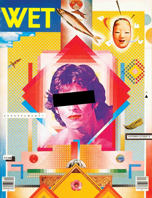
You can see many aspects of the Postmodernism of the 1980s in this magazine cover by April Greiman. First of all, the use of vivid, bold colors and the collage-like design style remind us of postmodernist interest in a variety of non-linear and diverse visual compositions. The combination of several typefaces and graphic components also illustrates the postmodernist ability to stray from modernist typographic and design principles. Also, she used computer-generated images as well as photocopying of type.
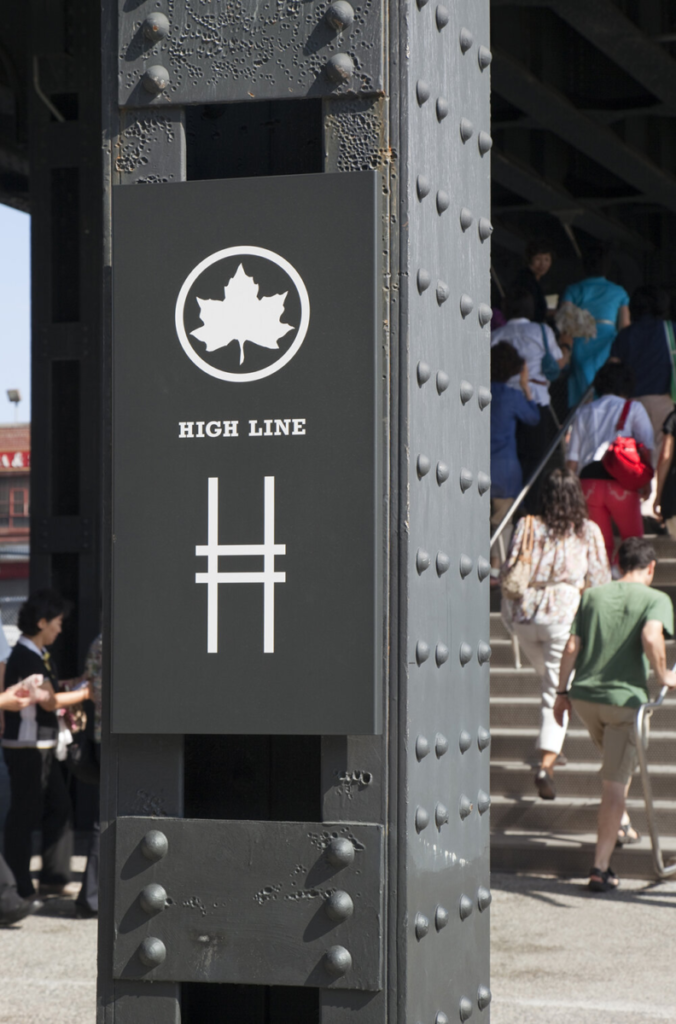
This Highline identity contains a few aspects of the Postmodernism of the 1980s, starting with the mixing of typefaces breaking the traditional rules of typography. The use of abstract shapes and patterns, such as the zigzagging line that appears throughout the identity, reflects the postmodernist interest in non-linear visual compositions.


Mahreen, you’ve responded successfully to several of these prompts but missed the last one, I think. 🙂 See if you can find a more obvious example in contemporary design that utilizes post-modern/80’s aesthetics. I’ve identified and expanded on this in Hypothesis. Please take a look and let me know your thoughts.