Swiss Typography and International Style
Karl Gerstner, Designing Programmes pg55-61, Joseph Muller-Brockman, “Grid and Design Philosophy” pg62-63 Graphic Design Theory: Readings From the Field by Helen Armstrong; and Margaret Rhodes, The Swiss Designers Breaking Tradition.
Response
Muller-Brockmann, Josef and Gerstner, Karl believed in moving away from popular and normalized norms of design. From their approaches, one could infer that the design environment was not as effective or efficient as they believed it could be. Thus, this resulted in them creating design work that was more professional and organized to a high standard. Karl’s work was, at times, inspired and motivated by science which could be strict and require rationality that art seemed to lack during the time that they were developing a plan to propel art to the next level.
Brechbuhl pushes the idea of rule breaking through their disregarding of what they learned in order to be more original and “Asymmetrical.” Characteristics of the “Swiss style” that they were trying to showcase through their maybe differing contributions about the traditional style. This artist makes the great point that the goal of modern designers is to not be bound by the past and to always try to raise the bar. This is different from the main ideals of the Swiss style since it allows for more creativity and expands what falls under the style. Below is an example of Contemporary typography that shows signs of some of the philosophies of Gerstner and Muller-Brockmann.
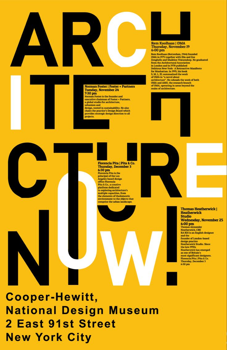
This poster design is very creative but manages to keep an effective and organized layout that complements the choice of typography. It expresses the modernization of typography and emphasizes the importance of displaying information in creative ways. The different uses of the lettering make the words more memorable due to how we may interpret them differently or similarly. The clearest thing is the address of where the events that fall under the name are going to be held, which emphasizes its importance. Future designs may be influenced by this due to how clear the messaging is even though it looks very spread out and geared more towards aesthetic.
Annotations
International Typographic Style, “Swiss Style”
“Work Differently than the past”
“New Typography” Helen Armstrong G
“Diverse designs, many aesthetics”
“Disruptive Aesthetic Agena” Helen Armstrong


Leave a Reply