80s Design is Alive, Well, and Living in 2019

This album cover by Prince is heavily photography-based. In his form of art, Prince chose to only use natural elements, as there is very little to no editing done here. One element that stands out is the use of light. Light in used very sparingly here to promote the dark surroundings. But when lighting is used, it highlights the other elements as well. The blue light in the bottom-right section of the cover is used to show Prince on a motorbike on top of the rainwater on the ground. While the red light dims surrounding areas of the cover, it brings out the smoke, which in itself is another natural element used in this photoshoot. The red and blue light sort of come together in the middle section of the cover. Red and blue combine to create purple, which is the name of the album and the color of the suit Prince is wearing. So overall, light is used as a tool.
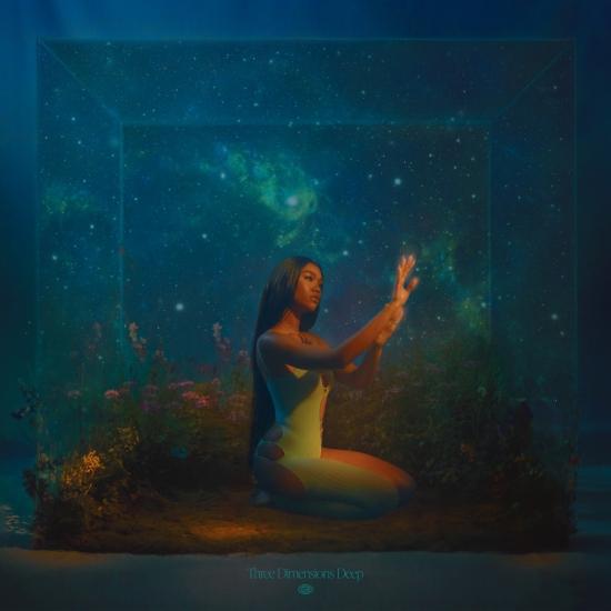
On the other hand, editing was a primary focus in this cover of Amber Mark’s album. Editing is used to portray to audiences that she is, in fact, in a three dimensional cube deep underwater. At the same time though, she is in another galaxy as symbolized by the glistening stars. That feat would be hard to reach naturally, so editing is used well here. However, it isn’t an inclusive design because of how far off this design is from the 80’s aesthetic. Based on this example of the two album covers, the 80’s used more natural elements to create elaborate design. Editing is used in the recent era to bring complicated and unrealistic visions to reality.


Leave a Reply