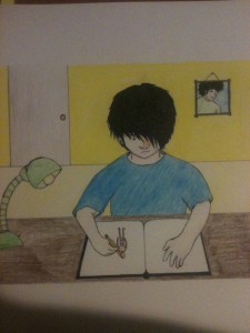
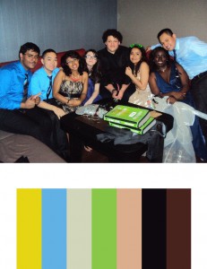
For this project, we had to make a color inventory and illustrate a harmonious moment in our life. For the color inventory, I chose a picture of my friends and I after prom. I felt that the bright colors and the joyous feeling in the picture depicts a truly harmonious moment where everything feels good. As for the harmonious moment in my life, I chose to draw myself drawing (mind blown!) I feel like when I draw, I really escape from any problems and just focus on making as good of a piece that I can. That’s when I truly feel harmonious with the world. The colors from the color inventory served well because bright colors generally give off a good vibe. They fit into the drawing where I’m really focused and happy.
Tag Archives: Saturation
Paired Color Identities with Simultaneous Contrast
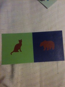
For this group project, I teamed up with Dez to show contrast in colors that were the same using different background colors and symbols. My symbol for Dez was a cat because they’re small and adorable but they can be quite ferocious. I also chose a green background for her as I felt it represented her down to earth side. We chose burgundy as a central color to represent how caring we are towards others, but have a side of us that we don’t like to show. Using burgundy to show the halo effect was quite difficult as burgundy is such a dark color, but we found that blue and green worked well; especially green as it’s a complementary color to red. For the cat, I see a sort of reddish halo, as that is the complementary of green. For the bear, I see an orange tint as that is the complementary color of blue.
Departures and Arrivals
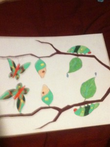
For this project, we visited a mosaic in a subway station that depicted the departure and arrival of old and new species of animals. The piece by Ben Snead shows symmetry among the different animals by using chromatic, muted, and prismatic colors, as well as having specific placements on the wall. Ben Snead’s work inspired me to create a piece where a caterpillar turns into a butterfly. Similar to Ben Snead’s idea of arrival and departure, the caterpillar arrives to the middle point of its life when it in the cocoon, and departs in its final stages of life as a butterfly. I tried to use chromatic, muted, and prismatic colors as a metaphor to show how the colors transition from desaturated to saturated, much like how the caterpillar transitions from a caterpillar to a butterfly.
Chromatic, Muted, and Prismatic Color Studies
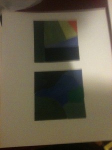
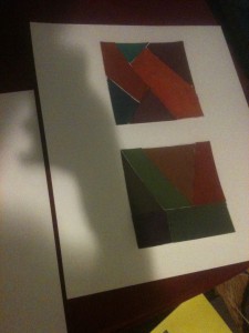
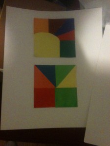
These pieces are my chromatic, muted, and prismatic studies. They were done to show how saturation affects a color. The first piece represents muted colors. Muted colors are generally colors that are not too saturated, but not too desaturated. This one was easier than chromatic grays as all I needed to do was add some white to certain colors to saturate them a little bit. The second piece shows chromatic grays, which was the hardest to depict in my opinion. Chromatic grays are heavily desaturated to the point where any color will have this dirty, brownish look. I had to blend several colors to achieve this. The last is prismatic colors, which was by far the easiest. Prismatic colors are colors without any added saturation or the subtraction of saturation. For example, a straight up blue or red would be considered prismatic. This was the easiest as most of the colors came straight from the tube.

