
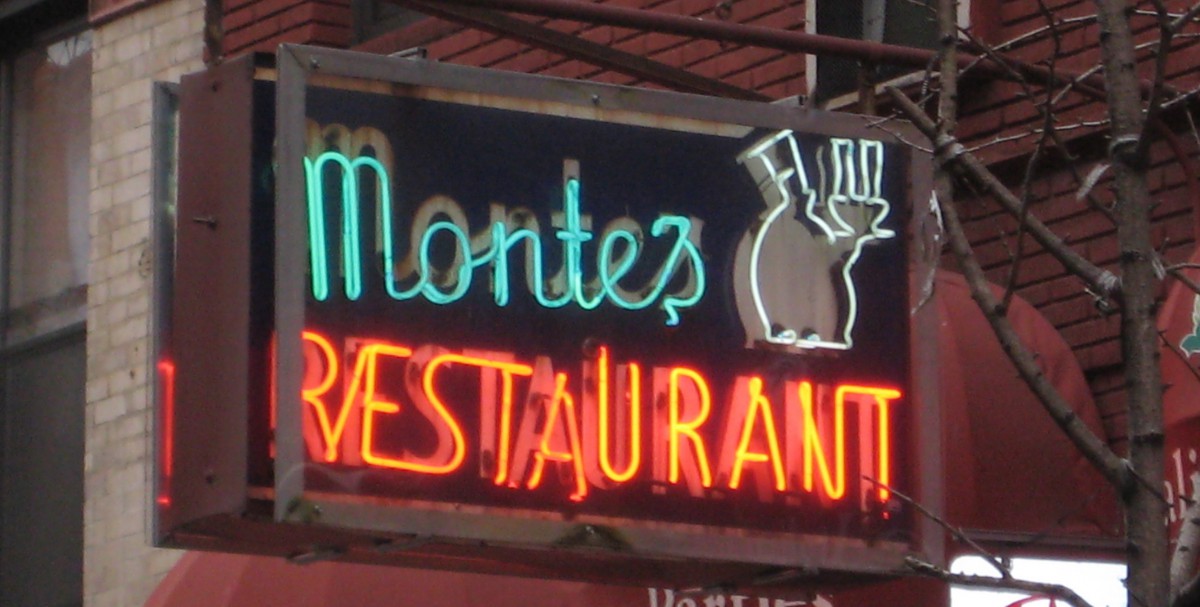
This first picture represents what I would consider bad kerning. I feel like the two different fonts make the word “Montes” feel too separated, and “restaurant” feel too clustered. The A and U in restaurant look way too close compared to the rest of the letters. The M in Montes looks to be slightly further than the rest of the letters.

I feel like the kerning in this sign is bad because it makes the letters feel too clustered, especially with the font they used. It’s not difficult to read, but if the letters were space out a bit more in “Shabu,” it wouldn’t be as much of an eye sore.
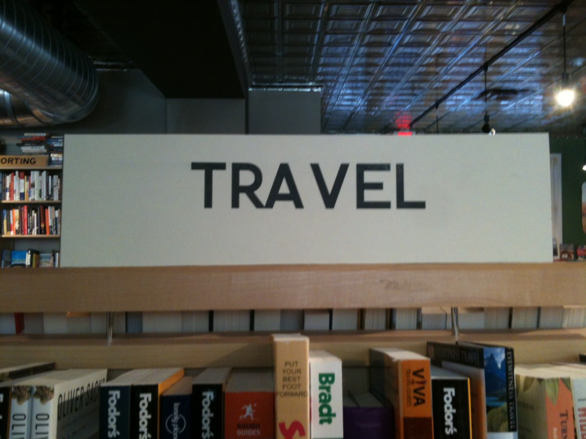
I think it’s pretty clear why this is terrible kerning. The word “travel” looks like two different words here. The A and the V are way too far apart. The R and the A are also uncomfortably too close.
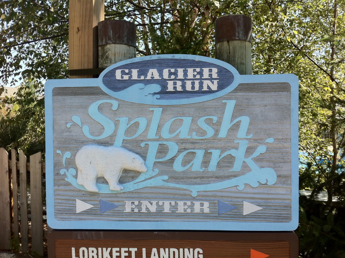
The image above is an example of tight leading. I feel like the placement of “Splash” and “park is too cluttered, making it feel like the word is almost emerging. For a water park, this might be considered clever, as it can almost represent water, but anywhere else, I don’t think this would work.
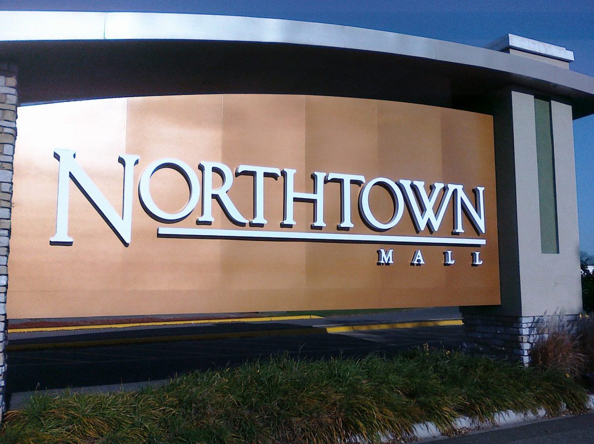
This feels like comfortable leading to me. I feel like I can read both Northtown and Mall clearly, and they don’t feel like they’re too separated. Perhaps the line between the words helps the leading?
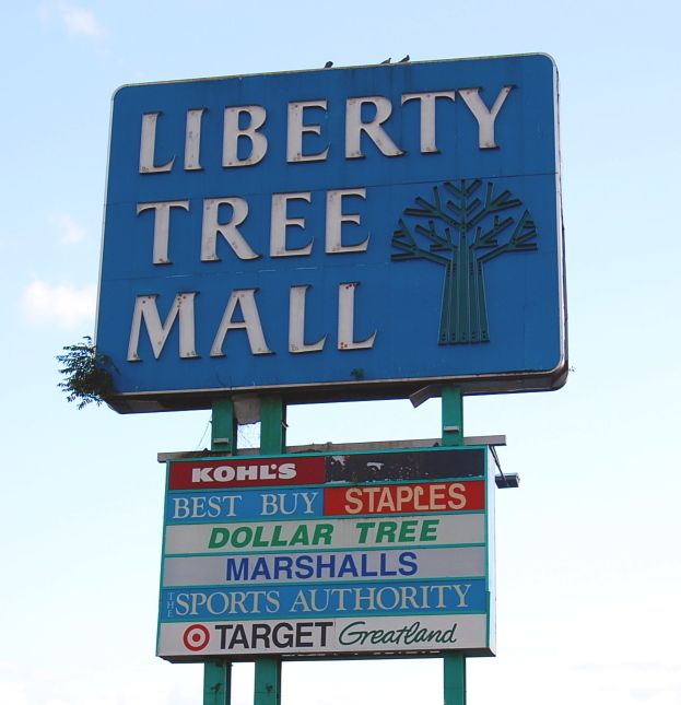
I think the words Liberty Tree Mall is an example of loose leading. The space in between each word is pretty large, and I feel like it makes the composition look really ugly. It also looks like Mall is a littler further down than the other two. It doesn’t help the composition at all like the other two.

