
Since the character I used for my typebook originates from Japan, I thought it would be interesting to research Japanese typography. One of the first things I learned is that Japanese is actually written in three scripts, with thousands of characters, which is far more than what we have here in America. The three scripts are Kanji, Hiragana, and Katakana with Kanji containing the thousands of characters and the other two containing 46 characters each. What I found interesting is that in modern Japanese writing, Kanji, Hiragana and sometimes Katakana are used in nearly every written sentence, making Japanese one of the most complex languages to write out, especially when words in Kanji can have different pronunciations.
Something unique in Japanese typography is the placing of text in Japanese writing; it can be set vertically or horizontally. Vertical text is something I noticed when looking through Japanese manga, and I always found it to be quite interesting. Horizontal text is used for more formal writing such as business documents. Vertical text is used for “traditional” Japanese writing such as in novels. Interestingly, in newspapers, both styles are used, with vertical text indicating the main text and horizontal representing headings and subtitles. Both orientations are combined often to give space in information-heavy pieces; this allows us people to easily follow what’s written down on things such as maps.
During my research I found a project involving Japanese typography that I actually found to be really cool and creative. A group of friends in Japan go around looking for store signs with fonts created by store owners. The characters are not fully fledged, only creating what is needed in the sign, so the the group of friends actually use the font to make a real one. In order to do so, they take a picture of the signs, trace over them, break each piece into parts, analyze each individual characteristic of a piece, and create other characters using those characteristics. In the end, they’re left with their very own created font that started based off of a few characters. The Noramoji project as it’s called it very unique and something that I think should be done out here in the United States where stores generally use made up fonts for signage.

Example of horizontal and vertical orientation.

The Tokyo Metro map which uses both horizontal and vertical orientation, making it easier to follow.
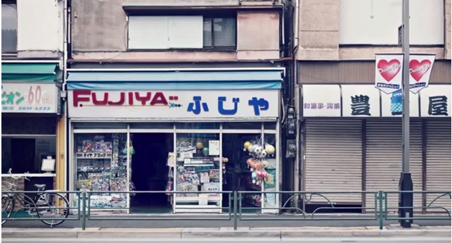
Before: The original three characters found on a store in Japan.
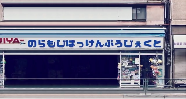
After: Characters created in the Noramoji project based off of the three original characters in the first picture.
Sources:
1. http://www.smashingmagazine.com/2012/03/05/japanese-a-beautifully-complex-writing-system/
2. http://www.huffingtonpost.com/2013/12/04/japanese-street-fonts_n_4378642.html
3. http://en.wikipedia.org/wiki/Japanese_writing_system

