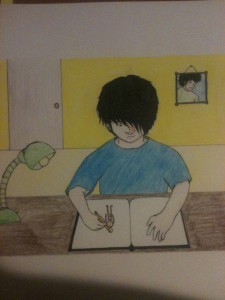
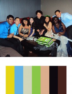
For this project, we had to make a color inventory and illustrate a harmonious moment in our life. For the color inventory, I chose a picture of my friends and I after prom. I felt that the bright colors and the joyous feeling in the picture depicts a truly harmonious moment where everything feels good. As for the harmonious moment in my life, I chose to draw myself drawing (mind blown!) I feel like when I draw, I really escape from any problems and just focus on making as good of a piece that I can. That’s when I truly feel harmonious with the world. The colors from the color inventory served well because bright colors generally give off a good vibe. They fit into the drawing where I’m really focused and happy.
Tag Archives: Added
Paired Color Identities with Simultaneous Contrast
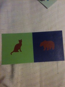
For this group project, I teamed up with Dez to show contrast in colors that were the same using different background colors and symbols. My symbol for Dez was a cat because they’re small and adorable but they can be quite ferocious. I also chose a green background for her as I felt it represented her down to earth side. We chose burgundy as a central color to represent how caring we are towards others, but have a side of us that we don’t like to show. Using burgundy to show the halo effect was quite difficult as burgundy is such a dark color, but we found that blue and green worked well; especially green as it’s a complementary color to red. For the cat, I see a sort of reddish halo, as that is the complementary of green. For the bear, I see an orange tint as that is the complementary color of blue.
Value Added Digital Collage (Broad Range)
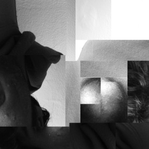
 This is the digital version of my broad range value collage. The transition to photoshop was surprisingly easy, as there was no actual cutting and pasting. I feel like I was accurately able to replicated the broad range collage. This whole project has really opened up my eyes to value, and how much of an impact it can have on a piece. For example, in this broad range piece, I decided to use different values to lead my audiences eyes to a certain point of the piece. In this case, it is the sphere on the right hand side. I feel like the light area at the top left brings the eye into the darker areas, and allows it to loop around into the sphere. Value was also very important in pinpointing a focal point in my narrow range piece. The dark corners looked like vignettes, which are generally used to bring focus to the middle of a piece. The corners lead my eyes towards the shape in the center, which was my primary goal.


