
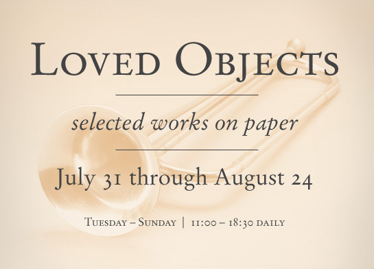
The first type of font style is Old Style: Garamond. This is present in the words “Loved Objects” above. Upon close observation, you can see the curved serifs look very rough. It’s clear that at the time this font was made, their technology was not refined. Letters such as the V, E, and D have some very thick strokes, and once again, the serifs are cruelly curved.
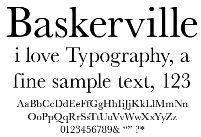
This type face is Traditional: Baskerville. Unlike Old Style: Garamond, this type face has more refined, sharper serifs. This is seen in the serif in the B, V, and L. Also, as seen in the B and K, it has thick strokes, and thin strokes.
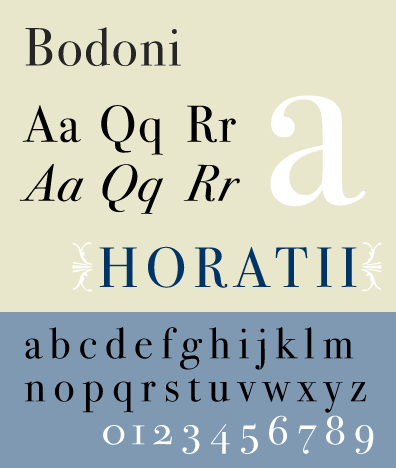
This type style is known as Modern: Bodoni. As located in the A and the lower case q, the serifs are defined by straight lines instead of curves. The capital A also has a very thick stroke, and very thin hairline.
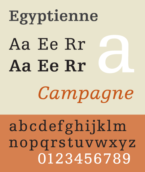
This type style is known as Slab Serif ( or Egyptian Serif). Compared to the other styles, this one is very blocky when it comes to strokes and serifs. The serifs are extremely thick. There’s also less distinction between the thin and thick strokes.
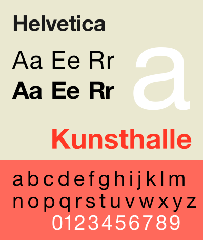
The final type style is Sans Serif: Helvetica. It is extremely different from the other type families. The first thing I noticed is there are no serifs (which is what “sans” indicates). The strokes are also very equal in terms of thickness/thinness. It is very blocky compared to the others.

