
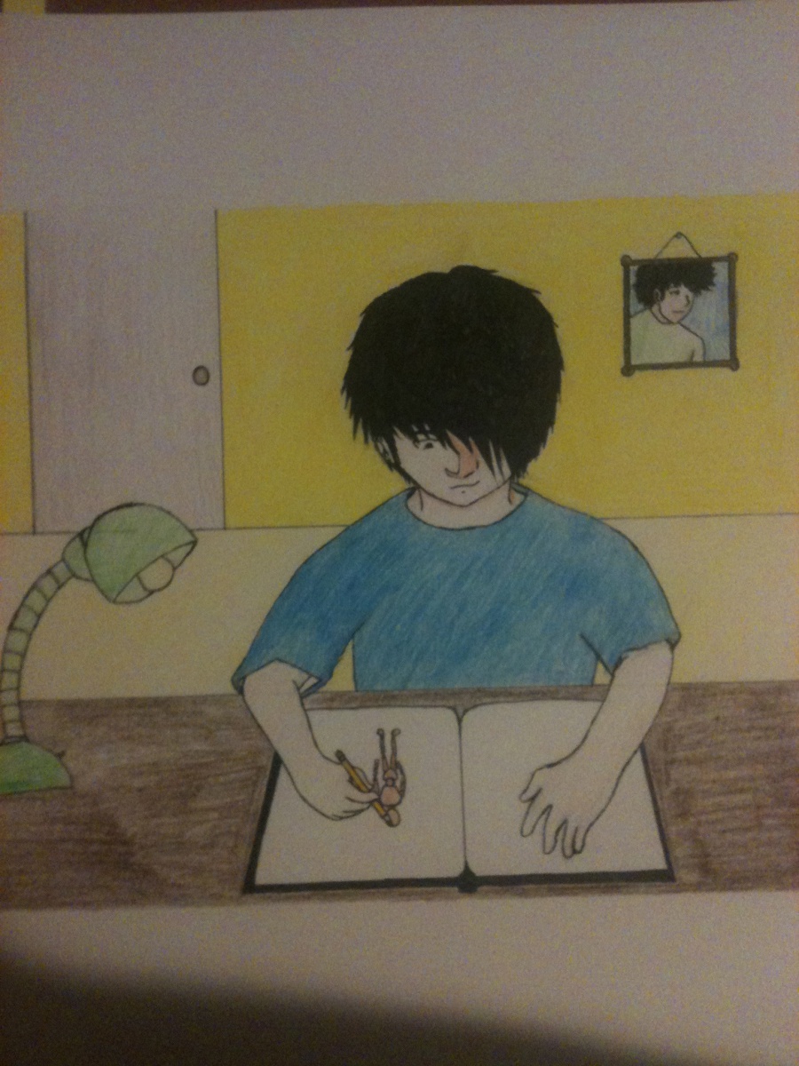
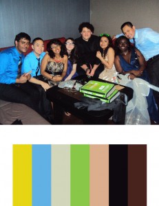
For this project, we had to make a color inventory and illustrate a harmonious moment in our life. For the color inventory, I chose a picture of my friends and I after prom. I felt that the bright colors and the joyous feeling in the picture depicts a truly harmonious moment where everything feels good. As for the harmonious moment in my life, I chose to draw myself drawing (mind blown!) I feel like when I draw, I really escape from any problems and just focus on making as good of a piece that I can. That’s when I truly feel harmonious with the world. The colors from the color inventory served well because bright colors generally give off a good vibe. They fit into the drawing where I’m really focused and happy.
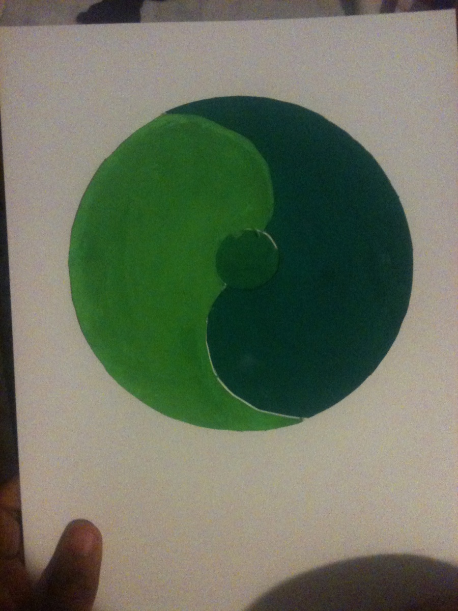

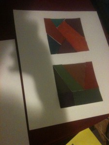
This project was done to show our understanding of color harmony and hierarchy. The first piece is an analogous palette. Since we needed some balance, I figured I’d signify that by drawing something similar to a yin yang circle. The first color is a light green, while the second and third are darker greens. I put a muted green in the middle as it was a color in between the other two, and I think it shows a balance between the two colors. The second piece is a gas mask because I have this strange fascination with gas masks (don’t judge me!) This piece was meant to show shades, tints, and progression. Shades are colors that go from prismatic to black. In this piece, the violet transitions to black. Tints go from prismatic to white as shown by the yellow. Progression has one color transition to its complementary color, as shown by the goggles where the violet turns into yellow.

For this group project, I teamed up with Dez to show contrast in colors that were the same using different background colors and symbols. My symbol for Dez was a cat because they’re small and adorable but they can be quite ferocious. I also chose a green background for her as I felt it represented her down to earth side. We chose burgundy as a central color to represent how caring we are towards others, but have a side of us that we don’t like to show. Using burgundy to show the halo effect was quite difficult as burgundy is such a dark color, but we found that blue and green worked well; especially green as it’s a complementary color to red. For the cat, I see a sort of reddish halo, as that is the complementary of green. For the bear, I see an orange tint as that is the complementary color of blue.
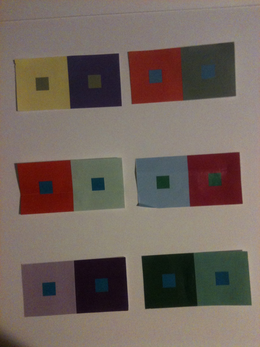
For this piece, I had to make a color appear as 2 different colors by changing the color behind it. This was definitely one of the most interesting projects we’ve done. I had no idea that I could make one blue look like 2 different shades of blue by changing what was around it. For some of the squares, I had to change the value of the surrounding color. I had to alter the hue instead of values for some. For others, I changed both hue and value. I found that this made the center squares appear either lighter are darker (lighter if the background was dark and darker if the background was light) even though they were the same colors. I also saw a “halo” of whatever the complementary color of the background, which was something new.
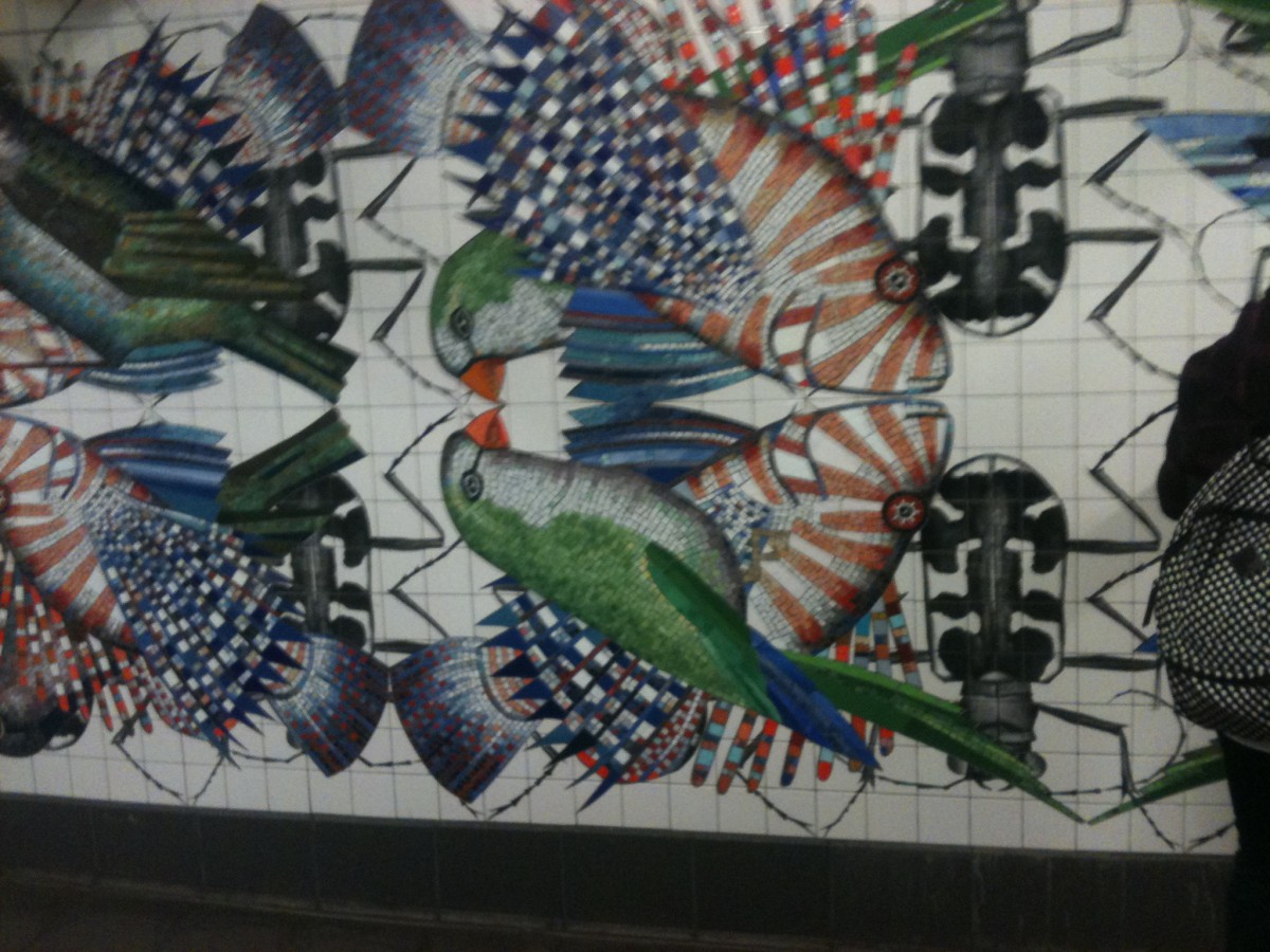
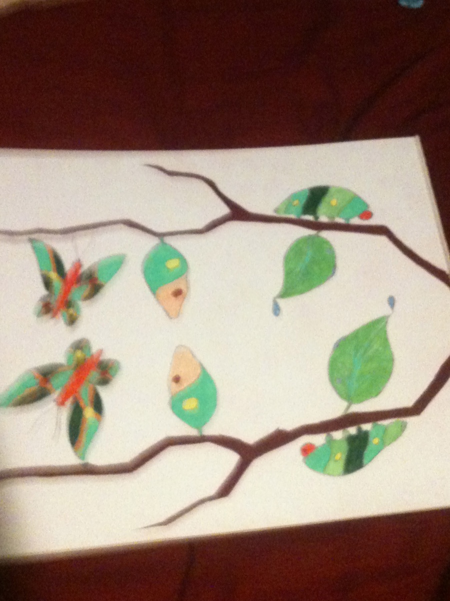
For this project, we visited a mosaic in a subway station that depicted the departure and arrival of old and new species of animals. The piece by Ben Snead shows symmetry among the different animals by using chromatic, muted, and prismatic colors, as well as having specific placements on the wall. Ben Snead’s work inspired me to create a piece where a caterpillar turns into a butterfly. Similar to Ben Snead’s idea of arrival and departure, the caterpillar arrives to the middle point of its life when it in the cocoon, and departs in its final stages of life as a butterfly. I tried to use chromatic, muted, and prismatic colors as a metaphor to show how the colors transition from desaturated to saturated, much like how the caterpillar transitions from a caterpillar to a butterfly.
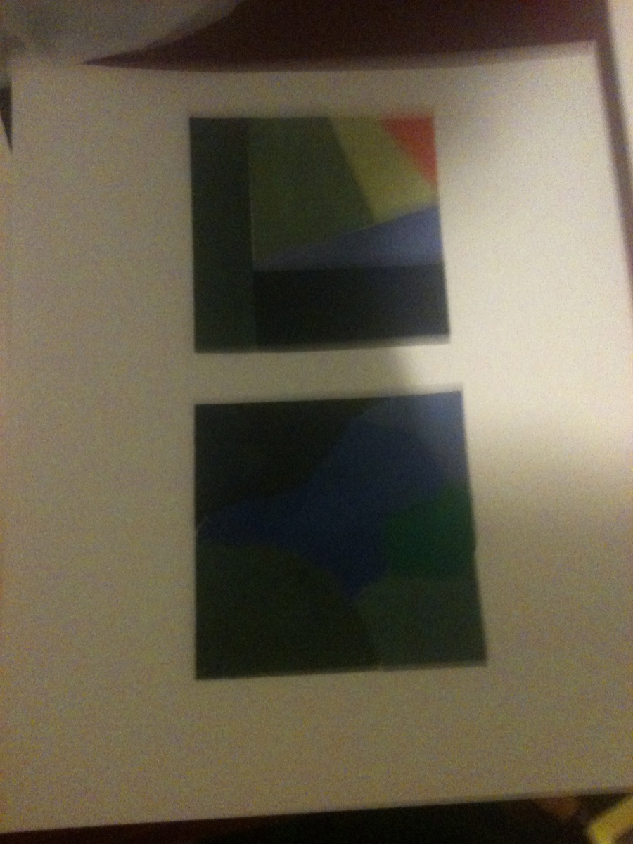
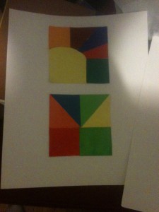
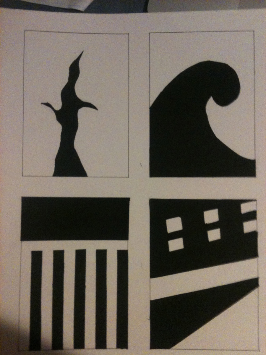
These pieces are my chromatic, muted, and prismatic studies. They were done to show how saturation affects a color. The first piece represents muted colors. Muted colors are generally colors that are not too saturated, but not too desaturated. This one was easier than chromatic grays as all I needed to do was add some white to certain colors to saturate them a little bit. The second piece shows chromatic grays, which was the hardest to depict in my opinion. Chromatic grays are heavily desaturated to the point where any color will have this dirty, brownish look. I had to blend several colors to achieve this. The last is prismatic colors, which was by far the easiest. Prismatic colors are colors without any added saturation or the subtraction of saturation. For example, a straight up blue or red would be considered prismatic. This was the easiest as most of the colors came straight from the tube.
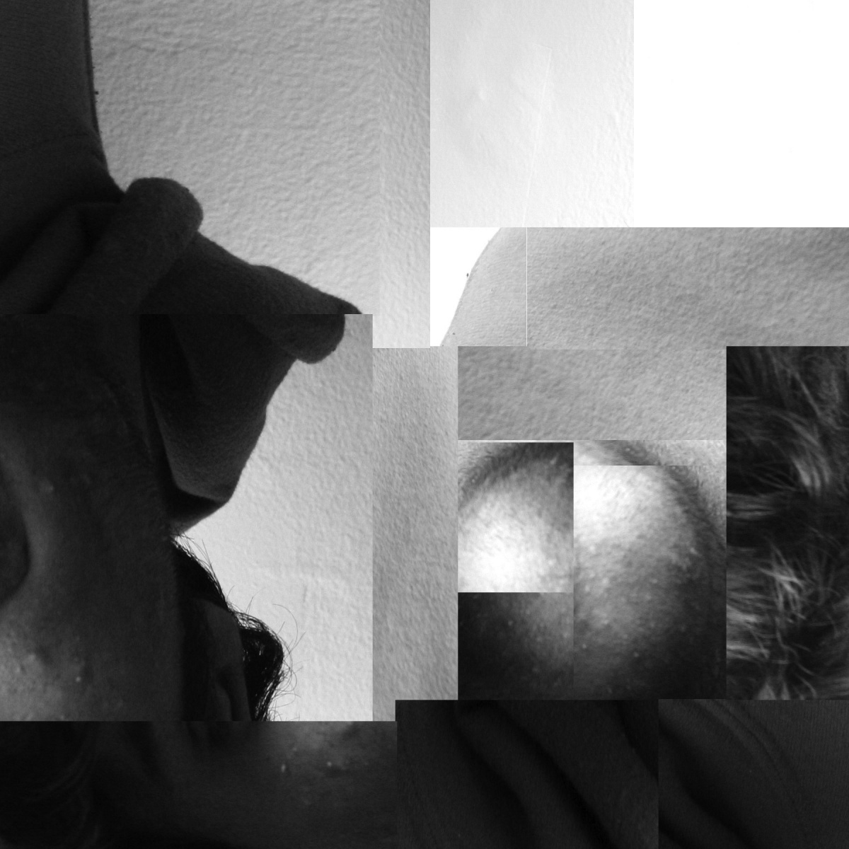 This is the digital version of my broad range value collage. The transition to photoshop was surprisingly easy, as there was no actual cutting and pasting. I feel like I was accurately able to replicated the broad range collage. This whole project has really opened up my eyes to value, and how much of an impact it can have on a piece. For example, in this broad range piece, I decided to use different values to lead my audiences eyes to a certain point of the piece. In this case, it is the sphere on the right hand side. I feel like the light area at the top left brings the eye into the darker areas, and allows it to loop around into the sphere. Value was also very important in pinpointing a focal point in my narrow range piece. The dark corners looked like vignettes, which are generally used to bring focus to the middle of a piece. The corners lead my eyes towards the shape in the center, which was my primary goal.
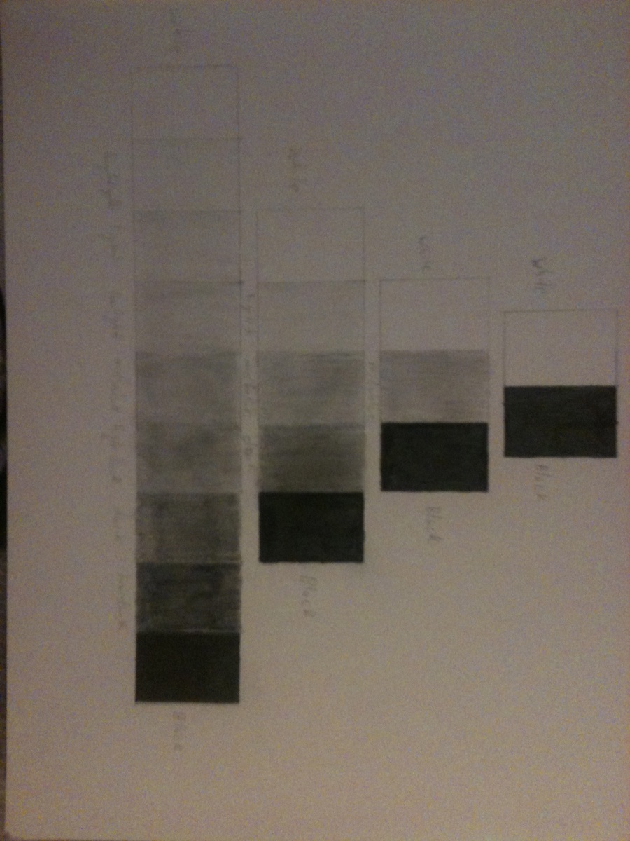 Unfortunately, I was unable to obtain the brushes and paint to use for this research, so I chose to use several pencils instead. Creating the black and white boxes were the easiest. In order to find the midvalue, and all of the values surrounding it, I started from the black in the last row. I made each subsequent box lighter as I went down the chart, until I got to the midvalue. I was happy with the midvalue I was able to achieve, and used that as a basis for the rest of the boxes in that row. For the row with five boxes, I used every “other” value (dark, midvalue, and light) to balance it. Finally, for the row with three boxes, I just added the midvalue.
Debdy’s map felt very unique compared to others. It had this very sporty feel, which was indicated by the various sports team logos, the Nike logo, and the race track. This map showed that sports take a huge role in Debdy’s everyday life. He also had some train tracks that represented actual train lines. I believe this shows the environment he lives in or comes from is his comfort zone, as he’s familiar with these trains and he felt they strongly represent him.
The OpenLab is an open-source, digital platform designed to support teaching and learning at City Tech (New York City College of Technology), and to promote student and faculty engagement in the intellectual and social life of the college community.

