
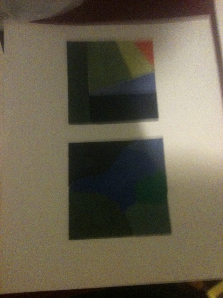
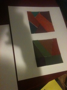
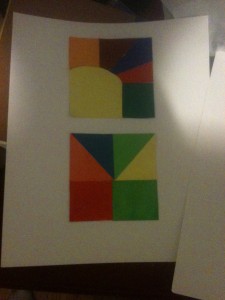
These pieces are my chromatic, muted, and prismatic studies. They were done to show how saturation affects a color. The first piece represents muted colors. Muted colors are generally colors that are not too saturated, but not too desaturated. This one was easier than chromatic grays as all I needed to do was add some white to certain colors to saturate them a little bit. The second piece shows chromatic grays, which was the hardest to depict in my opinion. Chromatic grays are heavily desaturated to the point where any color will have this dirty, brownish look. I had to blend several colors to achieve this. The last is prismatic colors, which was by far the easiest. Prismatic colors are colors without any added saturation or the subtraction of saturation. For example, a straight up blue or red would be considered prismatic. This was the easiest as most of the colors came straight from the tube.

