(image by mkhmarketing via Creative Commons Liscence)
WordPress is constantly updating. Most of the time the changes are small enough to not warrant mention, or are “back end” updates that our users won’t notice. But the most recent updates, 3.5 and 3.6, bring some changes and new features we thought we’d point out. Hope you enjoy them!
______________________
NEW THEME: Twenty Thirteen
We’ve added a new theme! Twenty Thirteen. Apart from its minimalist “flat” look (much like the newest iPhone system) and retro colors, it also has a few features that weren’t available on Twenty Twelve.
- The Home Page template has changed: the theme is designed to be a simple blog, with no sidebar. But if you’re attached to sidebars (and why shouldn’t you be), you should note that the “primary widget area” on this theme appears at the bottom of the page, and the “secondary widget area” is your side bar. Drag widgets there to have them appear on the right side of your pages and posts.
- The page is now “mobile responsive” for optimal use on mobile phones.
- Post now can take various forms: Standard, Aside, Image, Link, Quote, or Status. You can find these just below the “publish” box on the right side of your dashboard. And you can find more about each of these forms here.
And you can find a more detailed write-up about Twenty Thirteen here.
_______________________
CUSTOM MENUS
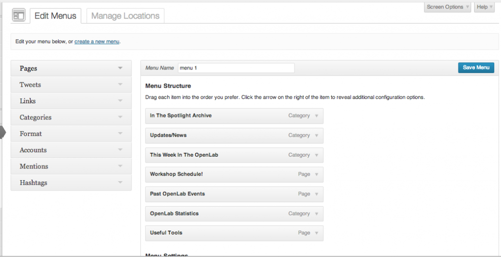
The format for custom menus has changed as well. The biggest change is an accordion style left hand menu and a vertical layout, with two tabs: one for editing the menus and one for assigning them locations. The whole thing functions as it did before, it’s just streamlined for easier use.
______________________
MEDIA UPLOADER
The Media Uploader is drastically different since 3.5. But it’s also drastically better, and vastly more intuitive. Users probably will have no problem making the switch (who doesn’t love clicking once where you used to have to click three times?) but a few words on the new features.
- The “Add Media” button now says “Add Media” instead of making a distinction between types of media (and, to be truthful, those distinctions didn’t matter anyway!)
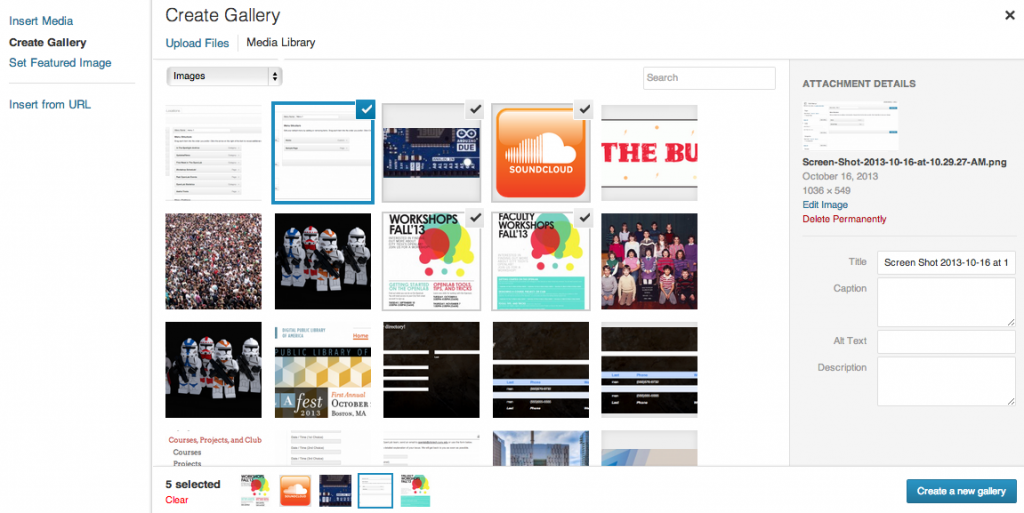
- It’s far easier to deal with media now. The media gallery is accessible by a tab next to “insert media,” and clicking on an image will give you options on the right for captions, editing the image, and (very important) changing the image size. Click “insert” into your post or page, and you’re done.
- Galleries are easier as well (and look nicer). Click “Create Gallery,” click as many images as you like, change the order (drag them around where they appear at the bottom of the gallery or on the next page), and insert them into your post. The new galleries look much sleeker, eliminating (in most cases) the need for gallery plug-ins.
___________
OEMBEDS
WordPress has added an oEmbed functionality for SoundCloud, SlideShare and Instagram. What this means is that you can add items from those services directly to your post by copying and pasting the URL of the file, and YOU DON’T have to use the “share” dialogue box to copy either the iFrame code (which will never work on the OpenLab without a plugin) or the WordPress code. Using oEmbed makes things very easy, but it is a change if you’re used to doing things the old way.
You can check out this list for the complete and up to date sites that WordPress has added to its oEmbed list.
__________________
NO MORE LINKS??
Oh no! The Links Manager has disappeared from the left hand dashboard menu! Wordpress believes that users simply don’t use it enough to make it a default part of the navigation. True or not, we know that quite a few of you depend on that feature for managing your sites and courses. We will have a plug-in that replaces that function soon.
We hope you like the new updates. As always, contact us with any questions, any time!
(Thanks to searchenginejournal.com and ostraining.com for help with this post.)


