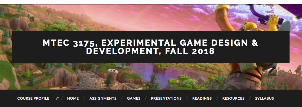
 This week we’re spotlighting Professor Boisvert’s fall entertainment technology course, MTEC 3175, Experimental Game Design & Development. This course is a “hands-on studio” where students explore various complexities of gameplay development and design through creating prototypes. In short, the course touches on technical game construction, to aesthetics and design (character development, level design), to user experience and more. This course provides a useful case study for thinking about how to use the OpenLab to support your course and student learning, as well as demonstrating the interesting coursework available at our College of Technology.
Integrating Environments
In the context of this course, the OpenLab is one among a suite of “environments” where students in the course will be creating, sharing and engaging course material, broadly speaking; in addition they’ll use GitHub, Slack, Steam and a personal Game Journal. Each of these environments offers a different set of possibilities – for example, GitHub is good for storing, sharing and co-editing files while Slack is good for centralizing communication; Steam is a platform that offers easy access to the latest video games and a community, while a personal journal allows space for personal reflection and the development of ideas. Integrating these separate environments is specific to each course, but could be a useful way of organizing course work and may also be useful in introducing students to platforms they may come to depend on later in their careers.
Blogging
In this context, the OpenLab is a centralizing and public environment where visitors can learn more about the course by accessing course materials provided by Professor Boisvert and by reading through students’ critical reflections via the blog on the homepage. As in other courses, Professor Boisvert uses the blog for low-stakes, reflective and critical thinking writing by students. This third blog post assignment, asks students to re-analyze a game they enjoyed as a child. Explained in another way, this assignment asks students to revisit and think (more) critically about something they know a lot about already. This is specific and useful pedagogical decision that aims get students writing and couch the anxiety that can accompany that practice by asking them to write about something that they explicitly already know a lot about. This is a useful trick many faculty use that not only gets students more comfortable with writing, but also, through sharing experiences, helps students get to know one another and build up a classroom and college community.
Menu Structure / Organizing Site Content
This course site is a good example of a clean, straightforward site design that allows visitors to the site, including students, to easily find the information they’re looking for. Building a site that is more-or-less intuitive and easy for visitors to navigate is one of the challenges of building a site on the OpenLab. Professor Boisvert’s site achieves this through one top-level, navigation menu. By ‘top-level’, I mean that Professor Boisvert doesn’t use any drop down menus. Instead, each menu item opens up to a page where students can find all of the readings or assignments for the course, can read through the syllabus, or find all resources provided by Professor Boisvert. Alternatively, drop-down menus may make a new page for each weekly batch of readings or each separate assignment. Drop-down menus seem appealing at first, but from a user standpoint, they can make the site more difficult to navigate. For one, this means students are going to a different place to find course materials each week, which could get confusing, and it can be easier to end up on the wrong page (reading next week’s readings, for example). Second, drop-down menus bury, hide, and/or conceal information in second- and third-level menu items – a visitor must notice there is a drop-down menu and navigate through it to find the information they are looking for, rather than clicking through to one page for everything. Third, though our sites are responsive (meaning they work on mobile devices) long drop-down menus, or ones with 3 or even 4 levels can run off the screen, rendering them invisible to the visitor trying to access course information and materials.
Follow along with the course this semester to see how student’s ideas develop, and what games they end up developing through this studio!


