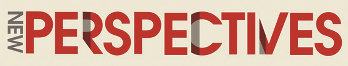
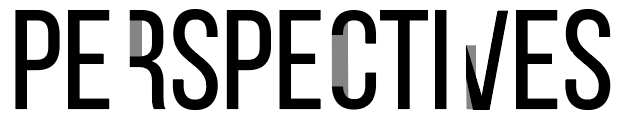
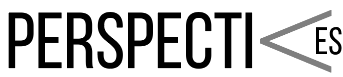
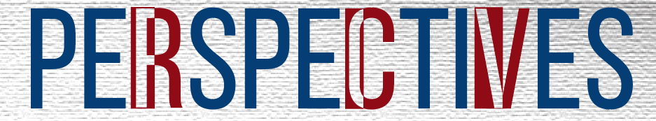
I was given the task to create a logo for a show that dealt with election topics. The show was going to be called Perspectives. My inspiration came from an image search, and the definition of perspectives. The definition of perspective is the way you look at something, an interpretation, view point, or at an angle etc. The font used was Bebas Neue, the font stands tall and it was perfect fit for the subject matter. I created three variations. The first one was close in appearance to the picture I used for inspiration. The second variation, still using Bebas Neue, I turned the “V” on an angle so it looks over the “ES.” For the third variation I turned the “V” to normal and instead I want to create a form of a mask with three letters. In used the Exclude tool in Illustrator to create a compound shape and exclude overlapping shape areas. Since the show was about the election I used the red and blue. To finish it off I place the logo in front of a gray scale texture background.
Inspiration from Google Search
First Attempt
Second Attempt
Chosen Logo

