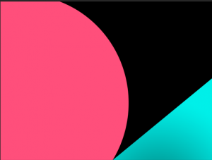
Another project that I was involved in was creating a banner for a show called Black America. The inspiration that I was given for this project was from another show and the banner was very simple layout filled with rectangle shapes. I chose to keep the simplicity with geometric design. I chose to use triangles and circles, as well as using some of the colors used in the show. The image below shows the layout out before adding anymore details.
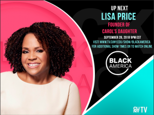
The next step was adding elements that made the banner more interesting: text and image. I added the image from the person who was going to be interviewed as well as important text: the guest name, when it was going to take place, the show’s logo and the tv’s logo. For the background, a mask was created using the logo of the show, to give a stamp look in the background. The final banner is below. For all the future guest, all they have to do is replace the photo of the guest as well as the information.


