Monthly Archives: September 2012

Jonathan, Gabby, Justin Design Doc

Interaction Design: Group Project

Team: TFGD (Touch Fuzzy Get Dizzy)
Group Members: Jonathan Alicea, Justin Seda, Gabrielle A. Bartomeo


Title and Description

The title of the project is QPQ. QPQ stands for Quid Pro Quo. Quid pro quo is Latin for “Something for something.” Another word for swapping something for something else is bartering.


QPQ is a phone app that allows users to barter with each other.

QPQ Goes Social

In economies of old, long, long ago, there was no such thing as dollars, coins, or credit. If you required an item, you would barter for it by offering items you have to another person to get the item you want. You didn’t trade what you could have, but what you had.


Enter the economic crisis of 2008 and the recession that appears to refuse to leave. The credit and housing crisis sent and continues to send many into poverty and homelessness. Those who are jobless and unemployed have shot up to unprecedented levels in number, and those who normally would be hiring have not been. Still, needs exist for all people. It is always better to trade that which is tangible rather than that which is intangible.


QPQ will allow people with smart phones to find and offer barters so that they can receive what they need, whether it’s food, clothing, games, art, or more. The best part about QPQ is that the barters you participate in do not involve money or credit – it involves only what you and others have.


This app’s target audience is ages sixteen and up, as anyone younger seeking to participate in a barter should contact a parent or guardian to learn about bartering and have their parent help them, providing a potential bonding experience.

 

HW#4: Stardate 09.24.2012

Captain’s Log:

In Edward R. Tufte’s “Graphical Excellence”, he writes about how graphical presentations such as maps or charts can convey more information and statistics than a simple report. He presents several examples with most of them being examples of maps.

The one example that really caught my interest would be the map of the U.S. that showed data for people in different parts of the country affected with certain types of cancer. The map clearly shows sections of the U.S. that are most affected and the least affected or unaffected. However, the map shows each county in the U.S., a little unnecessary since the map seems really cluttered to be honest. If they sticked to just showing the states affected, I think the same data would’ve been conveyed. A missing piece of information I noticed also would be that the chart only shows white people that are affected which seems to imply that the U.S. consists only of white people(kinda racist…..jkjk). That aside, it’s a good map and representation of cancer victims afflicted in the U.S.

As for designs that make me pay more attention to the aesthetics rather than the information, I’m sure there has been some that I’ve seen however I can’t remember any; maybe the MTA bus schedule.

Remy’s 10/3 homework | step count : 5023

I chose the Trachea, bronchus, and long cancer: white males; age-adjusted rate by county 1950-1969 map. The image does what it says, tells me where there are different rates of cancer from 1950-1969 in white males. I don’t know what the population is of each county. Maybe it could draw lines or some sort of pattern to illustrate degrees of the population?

I can’t think of designs where I think of the look more than the information any off the top of my head. It has happened, I just can’t remember what they were for. Usually when it does happen it’s because I don’t understand what the information is supposed to day.

Noitatidem group (Ian, Remy, Rosa) post 1: Design document

Team name: Noitatidem (“noy-ta-ti-dem”)

Title of project: Proxyhealth

  • 1 Sentence Description:

Proxyhealth keeps parents up to date with immunization and the board of education’s department of health.

  • Describe the social aspect of the project- what is the reason for doing it? Is there a story behind it? How will it help people? Who is it for? Where will they experience it?:

It’s going to help kids stay healthy, parents stay in touch with their kids needs, and helps the healthcare system make money.

  • Describe the interaction model- how does it work? What is the interface like? How will people interact with it?:

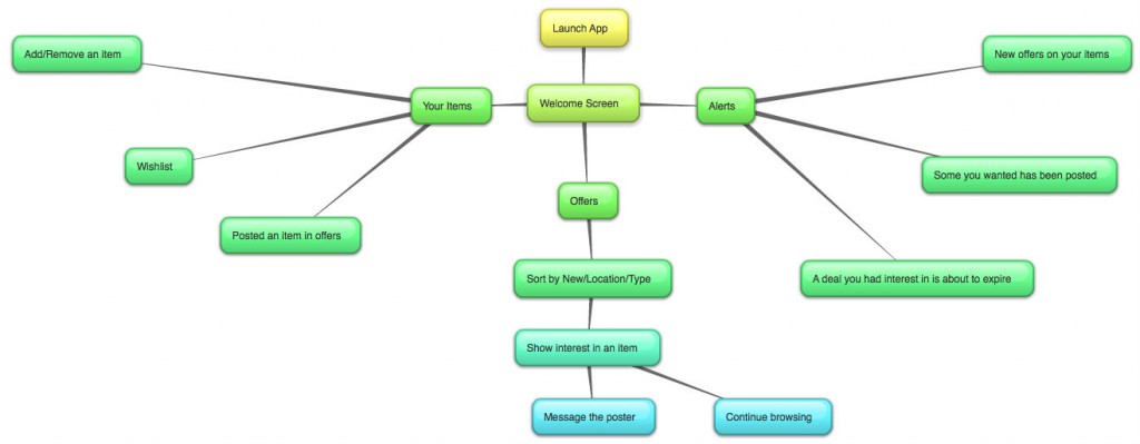
If we were to make a final product, it would be an app on a smartphone. However, in the span of the semester and for the sake of simplicity, we’re just going to create a UI that looks like it could be on a smartphone, but it’ll run on a computer. Or maybe we’ll make a site that is formatted for a smart phone. But anyway, the home screen will have buttons for appointments, alerts, and history. And those tell you what your appointments, alerts, and history are.

  • Diagram- flowchart:

  • Diagram- Wireframe:

Next time!

  • Schedule- what is your plan to build the different parts of the project?:

TBD

  • Test cases- how will you plan to get feedback about your prototype? What will you need feedback on?

We know that our service would be useful if it were to be implemented in the real world. However, what we need to know is how easy it is to use. We’ll have people try it out and give us feedback on it. Responsiveness, if it’s an eyesore, what we should add, etc. We’ll give our subjects whatever platform we’ve developed for, give them a scenario, and ask them to complete a task or two.

  • Materials/budget- Do you need to use any special materials? Do you need to buy anything- hardware, software? Are there specific graphics, sound, other assets that you will need?:

Nope! Nope! Nope! We’ll probably need graphics and sound of some sort. Maybe not even sound though.

Group Project

Team Members:

David Alvarado

Alexis  Shuffler


For our project, we decided  to make a photometer using arduino.  Here’s the design document:


  1. Device that measures how much light a plant needs and alerts user when perfect amount of light is reached.


This device is perfect for anyone trying to grow and maintain plants. This is good for people who are forgetful of taking care of their plants and for aid in taking care of the plants. This is a device that will be place next to or on the plants for the most specific readings and can be placed on any plant making it completely portable.


2. The idea behind how it would work would be that it would measure how       much light is needed for the plant and have a signal or some sort of alert for the user to know that plant is a perfect light levels or overstepping suitable light conditions. An interface would most likely be a light bulb that blinks in certain patterns to shows how much light is being received and how close it is to overstepping that limit. A sort of panel would be used for absorbing said light to retrieve data


And here’s our flowchart:

John Maeda, “Emotion”

What do you think of Maeda’s observations on simplicity and emotion?

Maeda’s observations are very interesting. I agree with when he says that emotional intelligence is now considered an important aspect for leaders and that expression of emotion is no longer considered a weakness. The way I see it, if you don’t show any emotion, that is considered a weakness. It shows that you don’t care what happens and people would walk over you like nothing. To be honest, I really didn’t get much out of this reading besides that we should express emotions through certain ways such as text and mouth to mouth.

How can designing for emotion foster engagement?

Lets say for example you have a pencil and a feather and ink. People in this generation would most likely pick up a pencil to write with because it is more familiar to use. Designing for emotion is a good way for people to become familiar with certain things.

Is there an object or design that you are attached to?

It seems that I may be attached to my phone. No matter where I am, if my phone rings or beeps or vibrates, I immediately go check it, no matter where I am. This seems to be a big problem and could probably make myself look unprofessional.


HW 3 – John Maeda, “Emotion”

What do you think of Maeda’s observations on simplicity and emotion?

Maeda’s observations on simplicity and emotion is that simplicity and emotions are not directly proportionate nor do they scale together. An object that is very simple and Modernist may bring some people happiness or another desired emotional response, but everyone has their own perception and this can greatly affect the emotional result of this object. This goes past objects and can be applied to incorporeal entities, such as thoughts, conversations, or even sites and games on the internet.


How can designing for emotion foster engagement?

Designing for emotion is the process of crafting to get a rise out of a consumers. This can be done by using color, text, key words, and a plethora of other attributes that can cause one to be drawn to and respond to a given creation. When one is emotionally involved with something, in a sense they come to own it. It becomes part of something they know, they become protective of it on a level, and they will choose it again and again over an unfamiliar item, even if performing a vaguely similar function. When one feels a closeness to something, or that they own it in some way, the natural response is to interact with it and when unable to interact, wanting to interact with it.


Is there an object or design that you are attached to?

There are a few art styles that I am particularly attached to that I find, when applied to objects or design, increase the likeliness of me wanting to interact with an object. Styles that attempt to modernize or stylize pre-Christian styles – such as the art style of the Hawaiians, Egyptians, Greeks, Norse, Aztecs, and Mayans. An example of this is a piece of art by the deviantart artist shoomlah called Pele, Fire Goddess of Kilauea. Designs and objects based off of or clearly inspired by pre-Christian art styles are more likely to end up in my personal inventory and in my thoughts.

HW3

1. John Maeda’s book The Laws of Simplicity explores effect emotions have on subject matter, in correlation of emotions being brought out by designs. This can be proved by advertising during the holidays or even by company’s like Hallmark. Your meant to feel insensitive unless you buy this item for whom ever. Another example would be the fast food industry. Every time i see a McDonald’s I’m hungry.
2. It fosters interaction for example RPG games where the outcome is dependent on interaction like farm ville. which also incorporates social media.
3. I’m Definitely attached to my PlayStation . I know this because i cant wait to go home and play it. This is true for a lot of men who’s relationships are in jeopardy due to lack of attention paid to there partners.

Remy’s 9/19 homework | step count : 4738

I find Maeda’s observations to be very on point. The things and people that grab my attention and fondness most are the things that at least try to express emotion. Even if they are simple emotions, like smilies.

Designing for emotion fosters engagement in a huge way. Perfect example, in Half Life, VALVe spent a lot of time developing their NPC (non player characters)s to convey fear, appreciation, dependance and weakness. I felt very attached to the characters when I first played. They looked and sounded terrible but they caught my attention and I grew fond of them. Then a remake was released a week ago, and they haven’t grown on me as much. The emotion isn’t there. They look and sound spectacular, but insincere.

I can’t think of any particular design off the top of my head, but I do know that designs with a lot of emotion catch my attention more than anything. It’s the reason why realistic games don’t appeal to me as much as imaginative ones. Like Darwinia and Battlefield. In Darwinia, you’re responsible for protecting and reviving little green digital men. They cry when they’re under attack, and they frolic when they’re safe. They even explore! Meanwhile in Battlefield, everything is hard and cold, very detailed but not very expressive at all. It has a hard time grabbing my attention.

HW#3 John Maeda – “Emotion”

What do you think of Maeda’s observations on simplicity and emotion?

John Maeda says that from a rational perspective, ‘simplicity’ makes good economic sense – because it is easier & cheaper to produce. However, it also looks cheap. People expect emotions from product’s design. The author mentioned that in professional field, people tend to think it looks unprofessional when they show their emotions to others. I think that is why, ironically, people feel more lonely and look for more warm emotions in their everyday life.

Is there an object or design that you are attached to?

I agreed with his saying : ‘the best art makes your head spin with questions. Perhaps this is the fundamental distinction between pure art and pure design. While great art makes you wonder, great design makes things clear.’ I believe that good design is simple enough to figure out how it works, but added human emotion that has care, attention, and meaningful feeling.