What makes a great photograph?
A great photograph is basically a crystal clear image. When I say crystal clear I mean a image that’s easy to read.A image that is very detailed and where theres no blurriness is an example of a great image. Most importantly a great image also tells a story. Sometimes great photos show a lot of expressions and emotions. Another thing that makes a great photograph is how everything is positioned in the photo. For instance there can be a repetition in the photo and even patterns. It also captures moments in life. A great photograph can then be related to your own personal life.
HW#1 AFTER 35 YEARS, GLADYS IS RETIRING
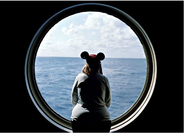
The photograph that caught my attention the most was a photo taken by Thomas Holton which is called “AFTER 35 YEARS, GLADYS IS RETIRING”. In this photo it indicates a women looking outside of a window at the view of the ocean. From the looks of it, it seems that this person is really inspired and at peace just looking at nature. As if she doesn’t want to leave from where she’s at and all she wants is to be left alone just so she can enjoy what’s ahead of her. When I look at this picture, I look at it as even though this woman maybe stuck in a place where she doesn’t want to be, she knows that there’s still hope left right in front of her for a better life. The best is yet to come as she continues to look ahead and move forward. Now the intentions of the photographer were to create a story behind this photo. Based on the photographer, the story behind this photo is basically about a woman who plans to retire and begin a whole new life. The purpose of this image is to demonstrate the comfort and relaxation that this person is in when she’s looking out the window thinking about life.
In addition, the three of the formal elements from the Steve McCurry video that are important in the photo that I selected are framing, figure to ground and symmetry. The photographer used framing by having the window shaped as a circle. Framing are basically used in natural frames like windows and doors. Now when it came to figure to ground, the photographer used this element when it came to the subject which is the women and the background which is the ocean. Now we have symmetry. Symmetry is shown in horizon of the ocean which separates the water with the women and the sky.
https://i2.wp.com/vervephoto.wordpress.com/files/2009/05/holton_usa.jpg
Composition and Camera Angle: Symmetry
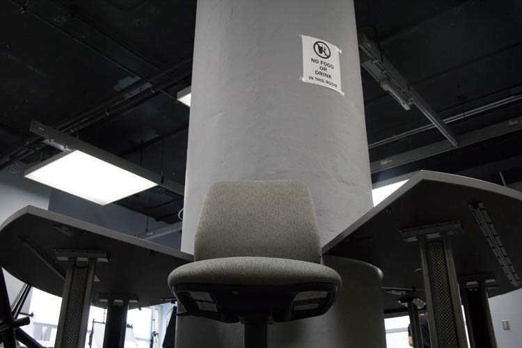
This photograph was taken by me and my partner and its basically a low angle symmetrical photo of a chair. I really enjoyed this picture out of the five pictures my partner and I have chosen because its clear on whats the focus. To me, the position that the chair is on makes it stand out even more. What also caught my attention was the lightening of the chair. To me I see a pattern in the lighting of the chair. As you can see the top of the chair has light and as you go down it gets dark then it goes back to light then back to dark again. I found that interesting because a lot of photos you would see don’t have different lighting. One last reason why this photo fascinated me was because its the most dominate item amongs its surrounding. That’s another reason why this photo stands out more.
Brooklyn Bridge Park
When taking pictures at the Brooklyn Bridge Park, my favorite photo that I took was the picture of the fly. The visual qualities of this photo was the focus was very clear. Meaning all eyes was meant to be on the fly. This photo as you can see is an example of off balanced and symmetrical photography. What caught my attention the most about this photo the focus of the element. The background is blurry but the center of the photo is not. Another thing I enjoyed about this photo was the shape of what the fly was standing on. The oval shape makes the photo interesting.
Aperture Foundation
In the class trip to the exhibit called the Aperture Foundation, it was a great experience that I will never forget. First of all the surroundings in this exhibit was very peaceful. So peaceful that you can actually relax on the couches that they have and enjoy observing the photographs and art that’s on the walls. It was that type of environment where you will see in the library people who at rest working on their laptops, drinking coffee or tea and reading. But in this case instead of books this place was like a library that had different and interesting photos. Many of these photos that were taken around the 1900’s had a message that spoke to our lives. For instance, there’s photos that have messages about love, suffering and from what I remember a playful message. In one of the photos that had a message about love, the picture indicated a couple kissing and in the shadows you would see someone holding a child. In the photo about suffering it showed a group of people surround a man who was either hurt or dead on the ground and it seemed as if someone was holding back the persons mom from getting close to the body. The facial expression from these peoples faces were sorrow, devastated and worried.Now when it came to some images that were a playful theme, one of the images showed these kids doing their own thing, either communicating with each other, laughing, playing or just relaxing.
Since this exhibit was about Mexico, the kind of things, places and people in the photographs were first of all the places looked old and wrecked. It seemed as if the people were suffering from poverty and didn’t have a stable home because of how terrible the condition was. The environment seemed crowded in certain places and some weren’t. For the people that were outside from the looks of their faces shows pain as if they’re striving for a better life for themselves and family. To compare life of the people in Mexico to here is that in Mexico it’s more of a rural area and in NY it’s more urban. However, the way Webb’s approach to photographing Mexico is as stated in one of his quotes crowded, vibrant ever changing place, where “no one” becomes a metaphor for the precarious, the chaotic, and the multitudinous.” In other words Mexico had a few violence taking place that effected the environment and the growth of crime and threats which was very tragic.
One photograph that I loved so much was a photo taken by Tijuana Baja California which was a picture of Jesus and certain pictures around him. The reason why I choose this photograph is because the image of Jesus itself is powerful besides the message it’s trying to give. You may ask what so powerful about this picture of Jesus suffering. The message behind his suffering makes this so powerful because this suffering He went through was for all of us but yet society today don’t think what He did was relevant because we’re so busy focusing on what’s going on in our life which is allowing us to become blind. We’re focusing on what society is offering us instead of what Jesus offered us. Which was His blood. As you can see above Jesus, you see images of Santa clause which represents fairytales or make believe stories, a picture of a girls legs which could represent lust and there’s other photos surrounding Jesus but the point that I’m trying to make is we putting all these things before and above Jesus knowing that He paid a price for us so that we can get a second chance in living life the right way and so that we can be saved from sin. This photo makes me feel disappointed because of the foolish decisions we make in life and it makes me feel disappointed because look how society repays Jesus after everything He has done. Society is just ungrateful from my understanding.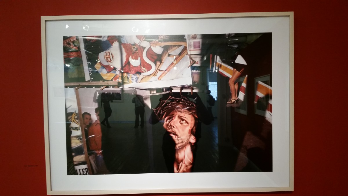
Lighting Portrait
In this photo which I thought it was my favorite, I realized that on one side of the face there’s a lot of light and the other side there’s a shadow. There’s shadows in the eyes and also shadow in the left side of the sweater. The mood in this photo I say is a serious kind of mood. The pose that he’s making kind of shows he’s thinking. What made me come up with that idea is the way he has his hands holding his chin as if he was staring at something or coming up with a thought.
Class Portrait 2
What I enjoy about this picture is first of all the lighting. This is an example of split light because the subject is looking forward and the light is directly at the face. I also find this picture interesting because of the mood. The mood or theme seems like a playful and happy theme.
LL7- SHUTTER SPEED + CAPTURING MOTION
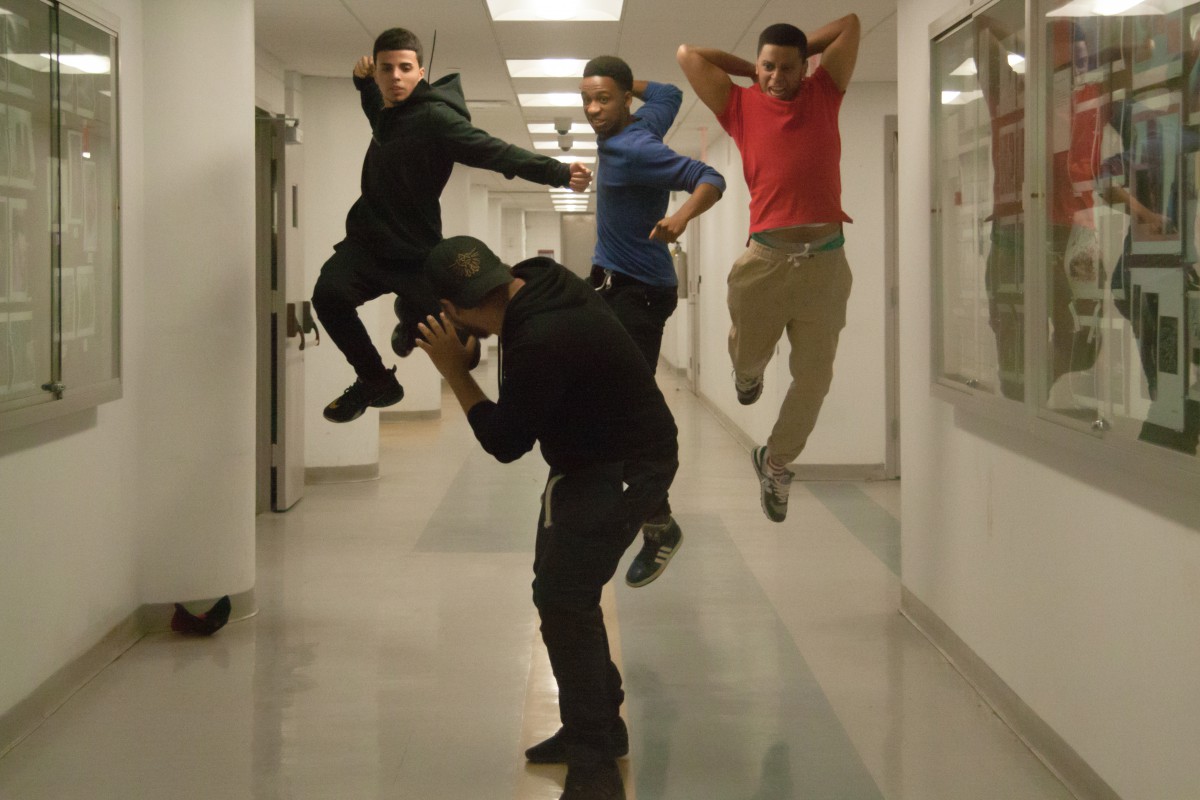
In this photo I really like the motion of those who are in the air. This photo shows depth of field. Overall what brings my attention is the expression on the subjects faces and motions.
In this photo which shows blurriness in the surroundings is an example of a eye view photo. I feel like this photo is so strong because there can be a message behind it. From looking at this picture we can see that the shutter speed is very low. I figured this out by just looking at the surroundings of the photo. The surroundings are blurry but the focus isn’t.
Painting with lights
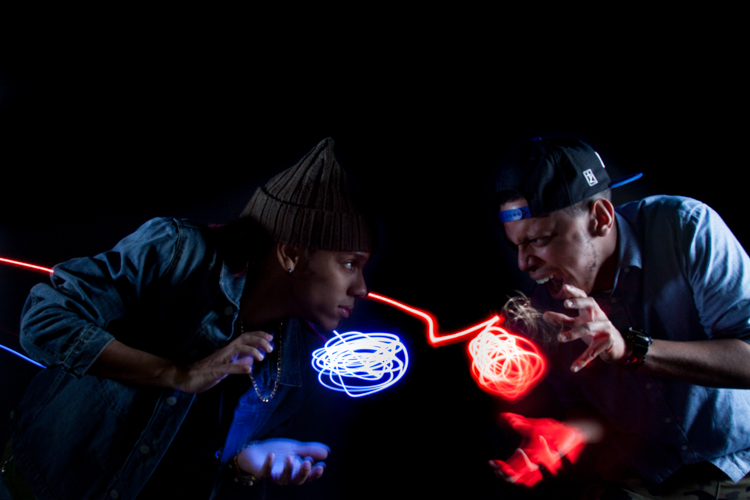
I felt like this one was my best photo because the lights just go with the motion. The expressions on their faces makes the photo even more dynamic and strong. What was basically going on here was that we had two people do a pose as if they were getting ready to attack each other and the way we set up the lights up was that we had someone in the background move the lights around close to our hands. The shutter speed was set to 8 seconds and the aperture was 8. We also left the ISO to 100.

