Author Archives: seth balloqui

Steph Balloqui / My Favorite Color

My favorite color is red. While I do love any color of red, my favorite shade of red is fire engine for it’s bright intensity. The color red is associated with energy, blood, danger, strength, power, determination, passion, desire, lust, and love. It’s many different meanings and the fact that it’s the most emotionally charged color is another reason why I love red.

To determine the colors for my list, I used my color wheel as well as consulting this site!

Steph Balloqui / SELFIEMOTION / Deliver

So the emotion I chose was fear- and the motion I chose was a spiral. Fear can lead you to spiral down into paranoia and madness, and I wanted to capture a melancholy, uncomfortable kind of fear with my piece- the kind of fear most people are living with nowadays. My focal point is my eyes- when afraid, people tend to cover their eyes, so I kind of wanted to do the opposite- opening your eyes up to the fear and embracing it in a sense. I sought out to capture the emotion of fear while turning myself into an object or creature to be feared.

I will the first to admit it- it’s a little messy. my original idea with the eyes failed because my printer ran out of ink. I used ink pens and acrylic paint to highlight the spirals and splatter “blood” around the piece, and my greyscale is even in the shape of a spiral!

Steph Balloqui / Greyscale and Collage “Sketches”

4/3/20: EXTRA SKETCHES! Note that these are photographs, not scanned in, and not on a white background so the intention is not as clear. ALSO- there are some finishing touches that I want to do that I feel would ruin the cutouts I currently have so I’ll try out those finishing touches when I cut out more eyes/faces!

3/26/20: Hey! This is the filled in greyscale!

These are my collage “sketches” for potential deliveries for my emotion, FEAR- I decided in the end to portray it as something that makes you spiral out of control, and makes you spiral out of sanity if your fears control you long enough. Fear can eat you alive and make you spiral. I feel the last one definitely portrays this!

Steph Balloqui / TEXTURE AND PATTERN / Deliver

Hey everyone! The world is ending and we’re all going to die of The Corona but at least I uploaded my project! Hooray! I am running on a blood transfusion and 3 Red Bulls but I knew I would forget to upload this in the morning so it’s going up at 1am! Am I a vampire? No but blood does have a nice taste!

Overall- this project was a fun challenge but it’s not a challenge I want to do anytime again soon. When it came to linework I think I did pretty okay, but I really struggled with the type aspect of the project. No matter how much feedback I would get on my type, it would never seem to want to come out the way I envisioned it and that was really frustrating. The entire project had a lovely idea behind it but a horrid and ugly output on my part.
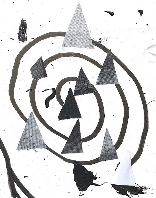
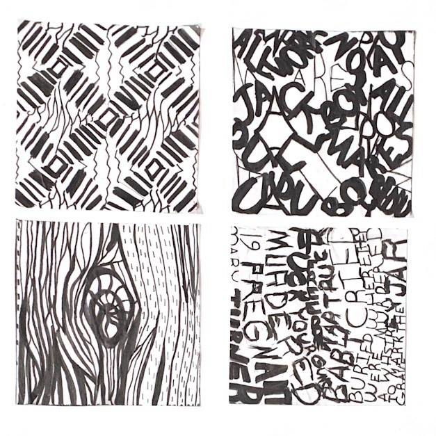
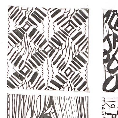
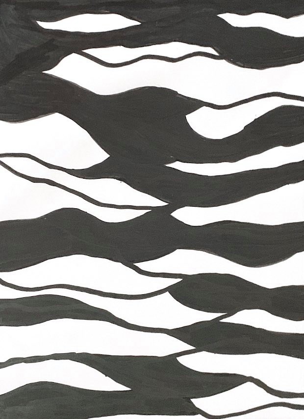
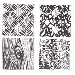
LINE / PATTERN

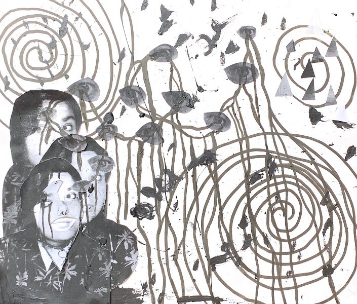
The mood that I got from this pattern was very groovy- very 60s, illusionist, something you would find on a rundown hotel’s carpet. I wanted to go for linework that captured a groovy, loose image while changing up the appearance of the image completely, and I actually really like how it came out.
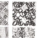
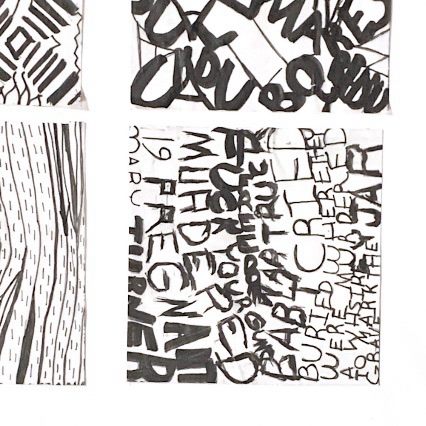
TYPE / PATTERN

I discovered pretty quickly that working with random letters didn’t motivate me and didn’t give me enough of a challenge. I wanted to lean into the “rundown hotel in the 60s” mood I got from the pattern, so I decided to lean into that when working with the type for pattern, so I decided on the quote “All work and no play makes Jack a dull boy” while also sneaking a “REDRUM” in the end for good measure. Again, I got rundown hotel vibes from this pattern so why not use some quotes from The Shining?
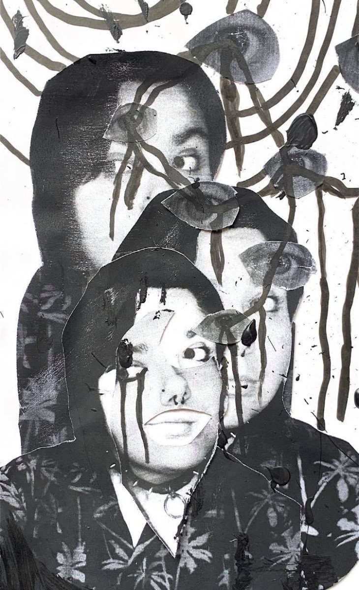
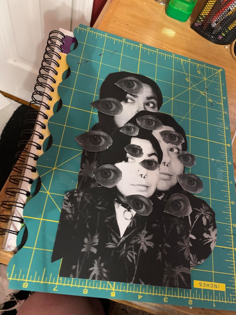
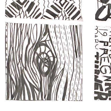
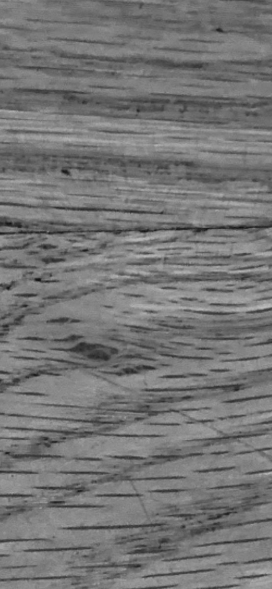
LINE / TEXTURE

Out of all the ones I did, this one is my favorite. The mood I was going for was uncomfortable and uneasy, almost a little threatening, and I feel like I perfectly captured that. I loved being able to have a little more creative control over lines and how to use lines to convey color in texture compared to pattern.
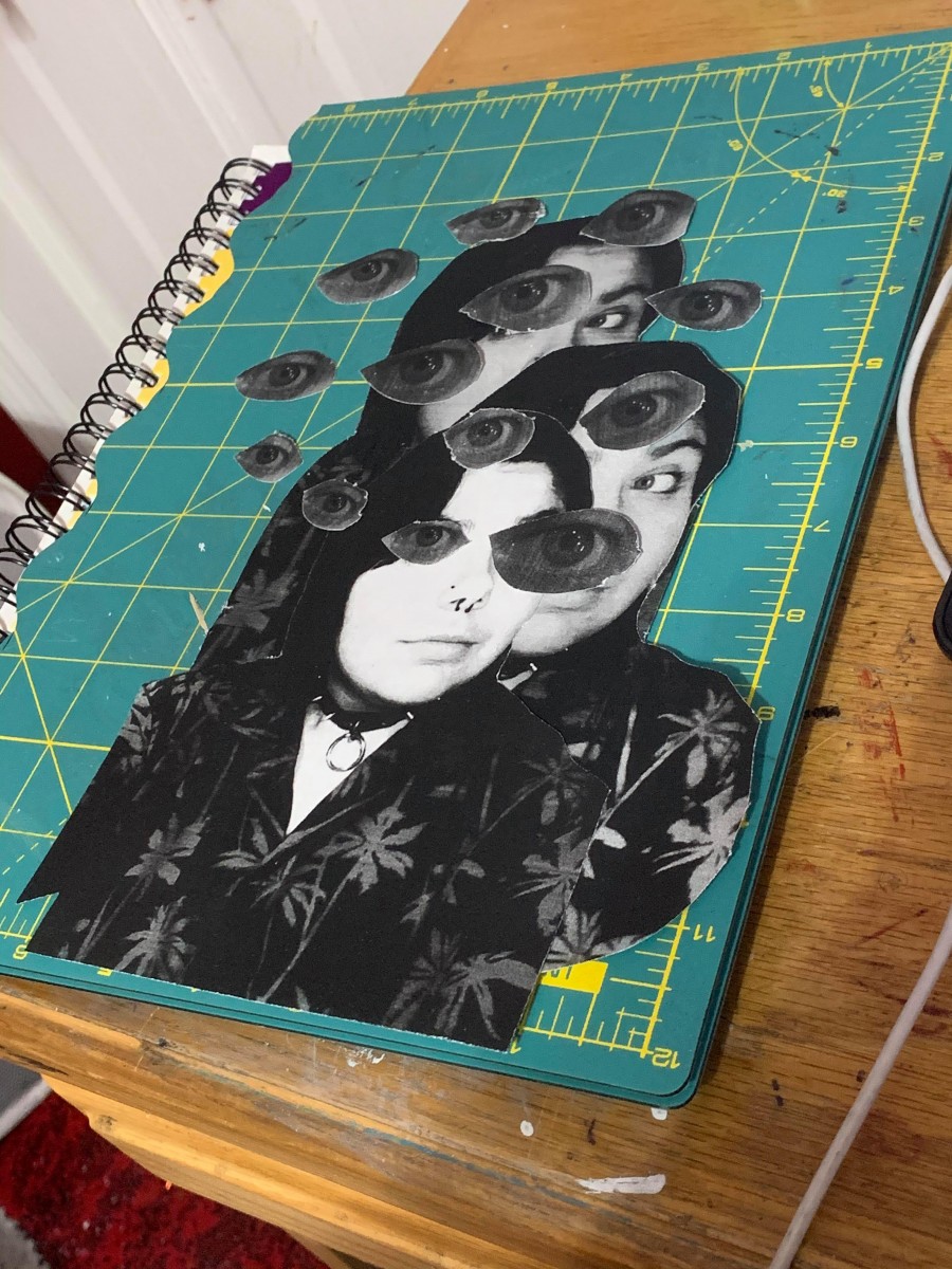
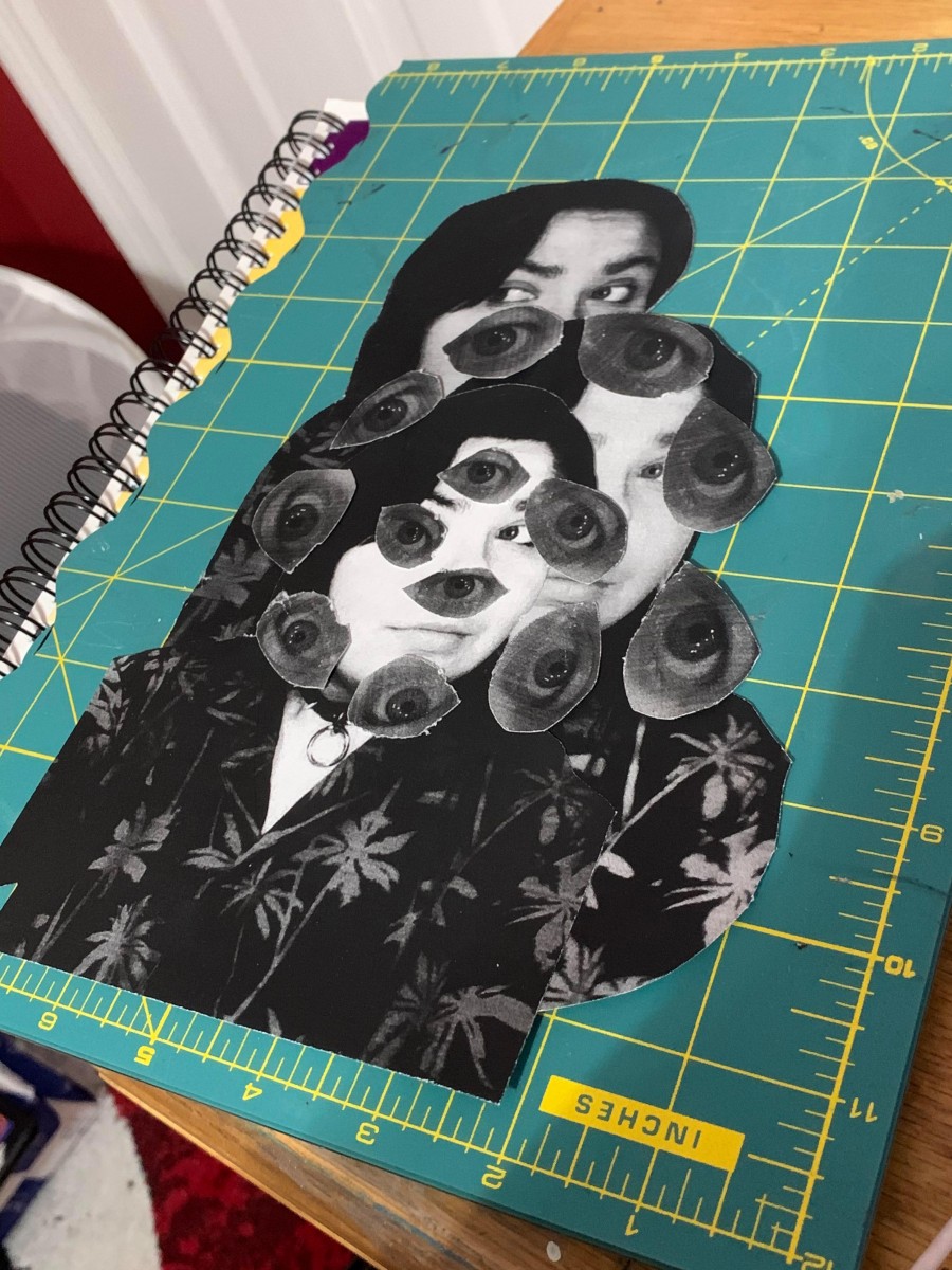
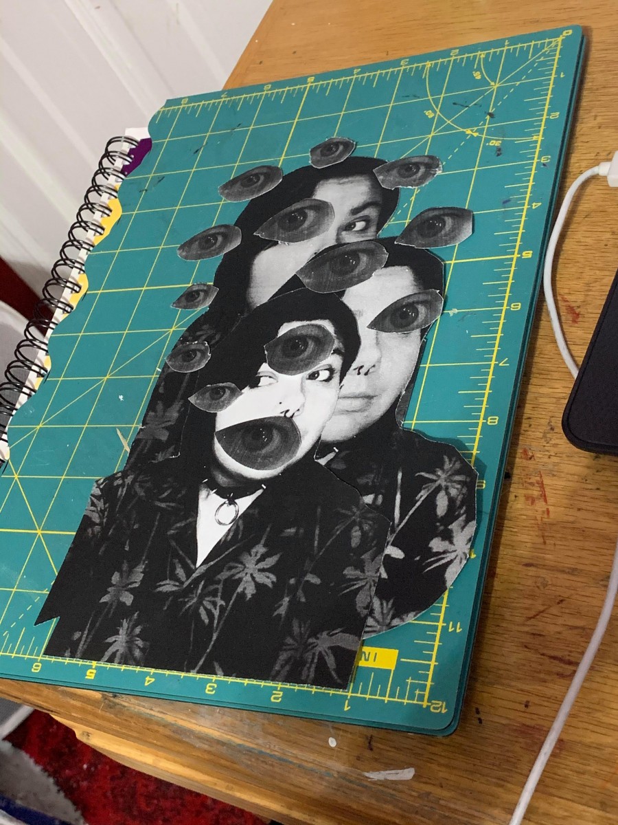
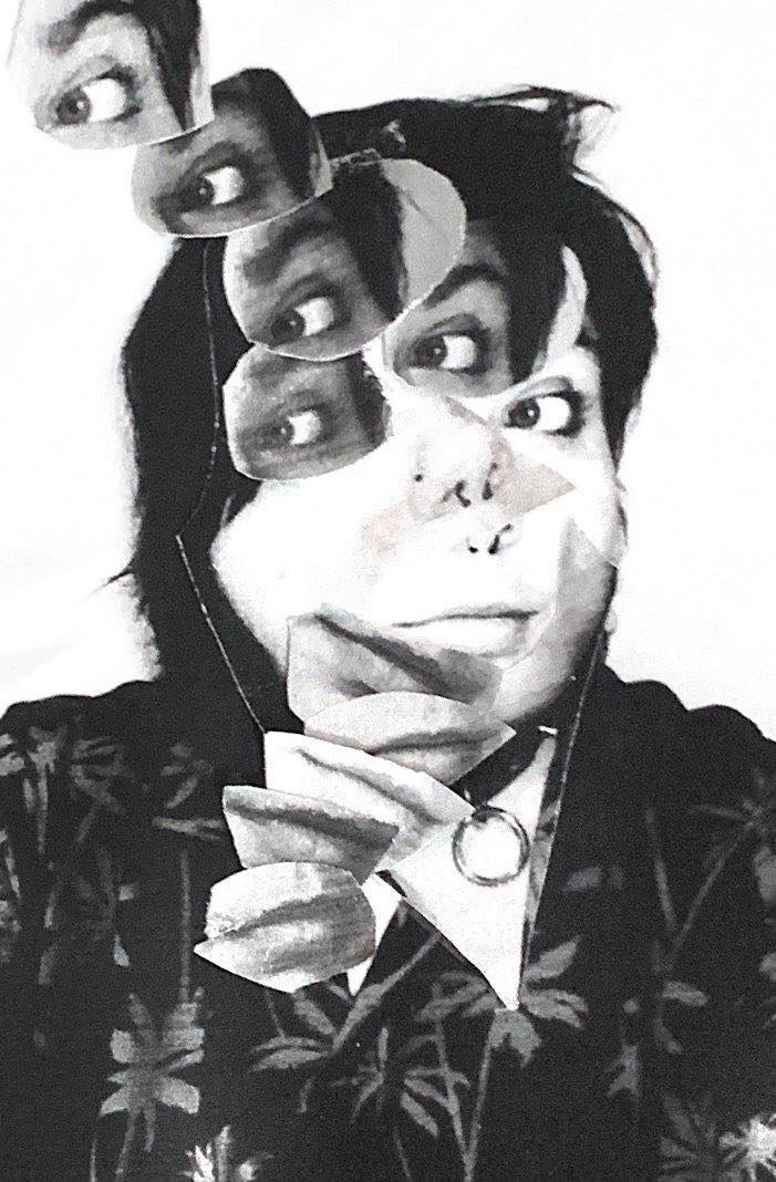
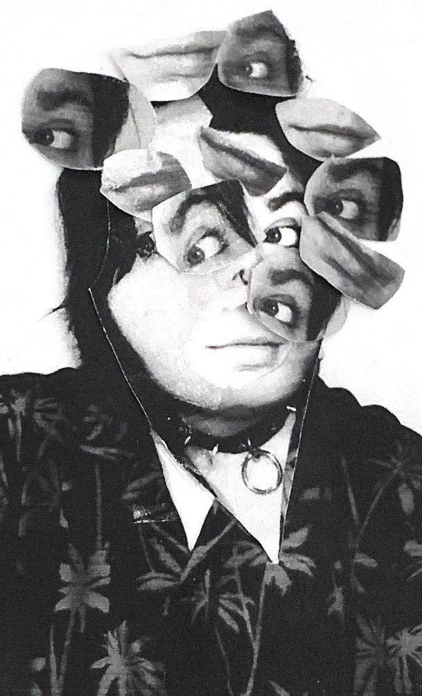
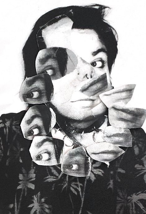
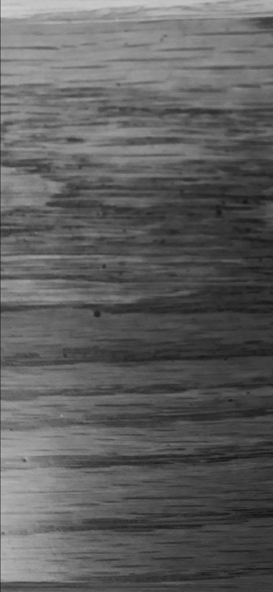
TYPE / TEXTURE

This is the one out of all four that II had the most trouble with, most likely due to attempting to fit text into small lines- eventually I decided to make the text bigger and follow the flow of the line instead of the size, and I think it looks pretty okay. To keep up with my uncomfortable, threatening mood that I got from the texture, my text consists of modified lyrics from the song “Mary Turner Mary Turner” by Xiu Xiu; a song that tells the true story of a heavily pregnant women who was lynched after protesting the lynching of her husband, and while they burned her alive they cut open her stomach and proceeded to crush the skull of her baby, and left their bodies in a gravesite marked by a whiskey jar. I’m not sure why I decided to do such a political piece, but I think it has to do with me learning that lynching only officially became a federal crime in 2018, combined with going to the south for the first time and being extremely disgusted and uncomfortable with the casual racism that surrounded me in the south- even as a white person, I felt unsafe in situations where racism was heavily present, and America has a history of treating minorities, namely black people, horribly, and America will never be a country with freedom and justice for all until we understand the “for all” part.

Steph Balloqui – final images (step four: deliver)

Hello guys, gals, and gender rebel pals! Here’s the final images, inked and scanned!


Obvious

One problem I quickly encountered while inking my images was that being left handed, as well as never working with ink before, made it a really difficult process- but I managed! To get the exact shape of the image, I cut out my original sketch and used it as a stencil.


Ambiguous

This one was my favorite to do, as I found myself having more space and room to be creative and freestyle the work while also getting the original wood pattern to come out. This piece also reminds me a little bit of the album cover to Joy Division’s Unknown Pleasures with the usage of only black and white with heavy line/shape work.

Steph Balloqui – images

Obvious #1- Found on a construction site near my house. I was trespassing on some private property because “be gay do crimes” and I stumbled upon a TON of broken up concrete. I like to think that they accidentally dropped a car in this spot, or that they lost control of the equipment and it all fell apart.

Obvious #2- I switched this image out from the last one because i liked how much clearer this image is. This was taken outside of the train station, and I like to think that one too my phones dropping onto the concrete left a hole.

Obvious #3- There’s a piece of sidewalk outside of a bar I used to work at, and when it was first poured it was written out to spell “Gordie”, but maybe Gordie missed one too many child support payments and his angry ex wife destroyed the “r” almost completely, and now it reads “Go Die”.

Ambiguous #1- A picture of the sidewalk taken with flash at around 3am. I was looking for animal bones in the woodsy area by my house (I collect bones I’m not hexing anyone I promise) and thought that maybe this would be an interesting idea.

Ambiguous #2- A boat dock at 7am. I decided to come back and take this picture after I took the first one with flash earlier in the morning, and picked a different spot so the patterns would look different. I managed to get onto the property of the country club by my house and loved how “clean” the dock looked.

Ambiguous #3- The same dock at around 4am. Taken with flash, and you can even see the shadow of my phone. This was from the same night I was looking for animal bones, and I realize that it looks like I might be a serial killer due to me always going out at night but I promise I haven’t killed anyone; it’s just easier to look for bones at night.