Monthly Archives: May 2020
Protected: Jorge Buenabad – Deliver
Steph Balloqui / Project 5 / more defined sketches
Andre Jones – Project 5 (Deliver)
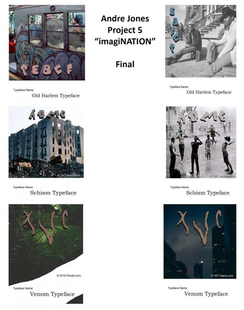
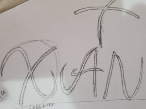
Old Harlem Typeface:
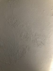
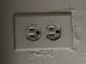
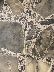
Process: This was originally taken from sided of my refrigerator (quite old). Zoomed in and contrasted heavily, I began to see letters similar to those in alphabet soup or old graffitti (if you look, you will see plenty of letters). The roughness of the shape reminded me of late 70s, early 80s graffitti. I called it the “Old Harlem” typeface because it seems like it would not be out of place for those times.

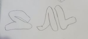
Schism Typeface:
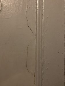
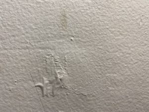
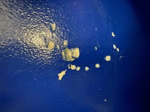
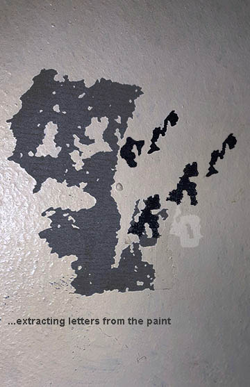
Process: This was taken from peeled paint on my front door. The letters remind me of schizophrenic madness.
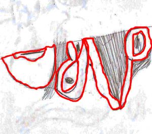
Venom Typeface:
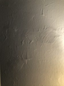
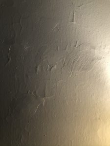
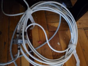
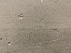
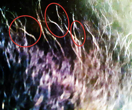
Process: Honestly, I looked all over and cannot remember what this was a picture of!! All I know is that after using the processing technique from our previous project, some letters started to form. These letter forms immediately reminded me of a comic book character called Venom (anyone familiar with Spider-Man knows who this is). Though the fonts actually used for his name are different, I believe that my typeface more accurately captures the essence of who/what Venom is. The letters even resemble his features.
This project has really helped me to, not so much think outside the box, but to think WITHOUT a box.
Israel Martinez – pictures Project 5
Museum Visit
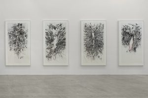
Julie Mehretu – Myriads, Only By Dark, 2003
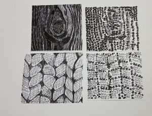
I am comparing to this Myraids, Only By Dark, because the feel that it gives off and the way the lines are obstructed to make the art pop and come out. With my work with the tree the lines very close giving that dark feeling and the same in the art above. Its almost like a uneasy feeling looking at both of the pieces.


