kairise’s Gallery Report

Pace gallery: When i saw the magazines and fashion i thought about how modernized society is today. I saw the difference between how much vogue magazines had made so many changes to the font from bringing things into color. I thought about nature vs. nurture because of the beauty of nature combined with human elements like lips with a bee laying on top. This attracted my eyes because bees can be dangerous to a human so it caught my attention of being fearless.

Nick Brandt: I was overwhelmed when i saw how large were his images, which i thought was pretty cool to look everywhere. He used strong lighting in his pictures. He uses his focal point on each image in the face. Also uses high depth of field in all pictures and photographs on level medium shots.

Marryboone: The images have alot of color and have unique antique style. Uses different wallpaper. The designs reminds me of the framing of a daguerrrotype. The different sceneries shows his technique of taking picture. They all look as if someone is fixing or moving into a house. I like how he uses perspective from showing one room going into another room.

Dangizer: The fact that all of the images were made in a water tank impressed me. Each water tank consisted of the sillhoute of leaves. It gave me a cool feeling because each imaged looked calm and relaxing. The images looked 3D instead of it being flat inside a tank. Each image had a different color which gave it a different type of mood.

Yancy Ruchardson: She used a solid for snow as a replacement for dirty snow. You can see the cracks of the mountain in high definition. These landscape images made me feel as if im inside the picture. It reminds me of the map of the earth. She uses alot of negative space purposely.

David Zinger: Most images seem like night scenes most seem lonely in hotels and things you find around a hotel. He uses the lighting to highlight the face and blocks out the body with shadow. Each image told a story as if someone is watching them. He uses alot of city lights. I personally thought this was the best gallery because they were strong images about male prostitution.

Posted in Uncategorized | Leave a comment

LL9-Final Evaluation

Please list and describe three concepts that you learned in this class. Include how you think knowing these things will help you in the future.

Posted in LL8-Final Evaluation | Leave a comment

Painting With Light — Darren Parvatan

IMG_3533

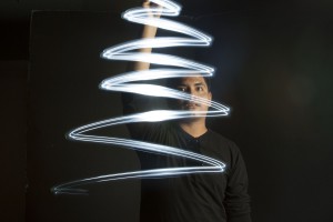
This was my favorite picture due to the simplicity and the Christmas feel you get from it since the holiday season is here. This picture was taken with a shutter speed of 4″ and an aperture of 11. From first glance you get that it is a Christmas Tree. Miguel used the flashlight himself to create the effect of the tree. Within the 4 seconds he quickly started from the bottom to create the shape and stopped at the peak.


Posted in LL7-Painting with Light | Leave a comment

Painting with light – Best Photo

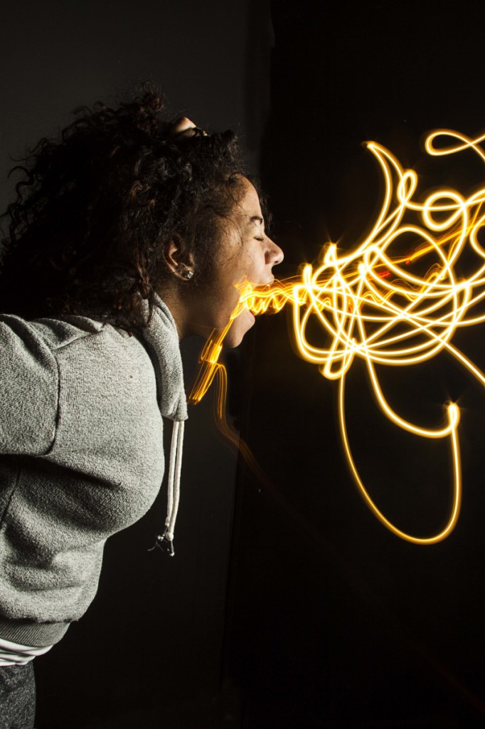
IMG_9476


This photograph was taken with a strobe light, two flash lights and a shutter speed of 8″, ISO of 100 and a F-stop of 16. This photograph is my favorite one from the ones we took because of how the light instantly translates to fire, and you immediately get that the model is breathing fire. In order to create this effect Hery and I had to wait on side until the timer ended and the strobe light went off. Then, while concealing the flashlights behind our hands to prevent a line to her mouth, we painted flames with the light until the 8 seconds were up.

Posted in LL7-Painting with Light, Uncategorized | Leave a comment

strobe light

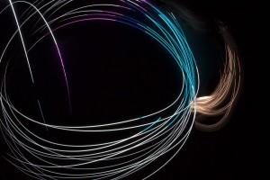
_MG_1933


shutter speed 8.0 aperture 16.0

I personally like this image the best because of how the strobe light creates such a beautiful composition, the mixing of the different colors makes it more appealing to the eye, and catches my attention more than any other photo we took. Starting from the gold light and continuing to the white, purple, blue and green creating a continuos circle that doesn’t seem to end.

Posted in LL7-Painting with Light | Leave a comment

2 Best

The photo above uses the optical illusion where objects closer to the camera lens appear larger and disproportionate to those objects further away from the camera lens, along with that his posture helps the photos mood, the style of photo is to be quirky and fun, and the model is having fun and smiling.


The Photo above has only one light source and a dark backdrop, the mood that the setup creates is very depressing and sad, and the model embodies this perfectly, with just a litle more then half of his face in visible light, and his hand in the form of a gun next to his head, the feeling of sadness and despair is present.


Posted in LL6-Portrait Lighting for Mood | Leave a comment

Painting With Light Best

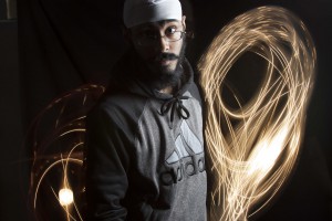
_MG_1981

This is my personal Best painting with light capture, because i feel like the lights  adds dimensions and a background to a flatter image. the colors match the subjects skin tones, and his interesting posture is as unique as the lights behind him. The Subjects face is also plays a role, he is making eye contact and only half of his face is in the light. One small detail that is noticeable is this outerwear is black and grey which in most cases would blend into the background but it does not. the shutter speed was 20 seconds for the shot, and in my guess the most interesting 20 seconds of his life, kinda..

Posted in LL7-Painting with Light, Uncategorized | Leave a comment

kairise’s best picture

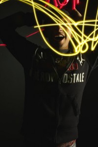
IMG_9470.CR2


I chose this picture as best because it is interesting to look at. The way the lighting is covering the models eye makes it look mysterious. The facial expression makes the mood of the image look crazy. I like this picture because the lighting is being placed in a spontaneous way.

Posted in Uncategorized | Leave a comment

Personal Best

_MG_1942

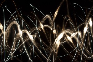
I chose this picture as my personal best because the strobe lights fill the whole frame and creates a beautiful masterpiece. I especially like how the thinner lights mingles with the thicker lights giving it a sort of vector design look. What I found very interesting was using the camera phone flashlight to create a brighter light than the flashlight itself. Mixing those two lights together was a great idea, and using a shutter speed of 8 i was able to capture it perfectly.


Posted in LL7-Painting with Light, Uncategorized | Leave a comment

Painting with light

chosen


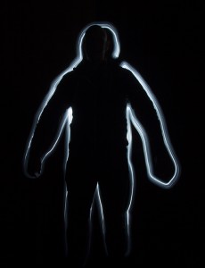
I chose this one as my favorite because I it reminds me of a sad  thing when my best friend passed away a couple years ago in an accident, and  this pic looks exactly like the silhouette that the police drew in the spot where he died. But anyway this looks also like someone who’s coming from nowhere and it’s kind of a teasing Ad. I remember we did a teasing campaign in order to aware the people to drive safely and stop death on the streets. We ran that for 1 month, and then we put on the real Ad with the same silhouette on the floor but in the real life on the street. Also the fact that it’s not silhouetting the whole body everything but the feet, makes it somehow mysterious.
The shutter speed used was 20 seconds, it was enough to silhouette the whole body, I think that was successful.

Posted in Homework, LL7-Painting with Light | Leave a comment