-
Recent Posts
Recent Comments
Categories
LL2-Exposure
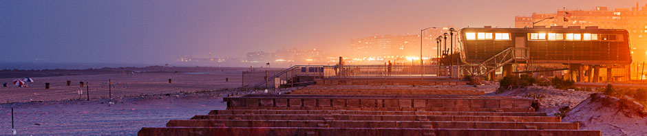
Post your most successful photograph from the Brooklyn Botanic Garden that uses the contrast of light and dark. Describe why the photograph is so successful. How did you meter it and did you use exposure compensation? why or why not?
Posted in LL2-exposure
Leave a comment
LL 1-Composition Bria K.

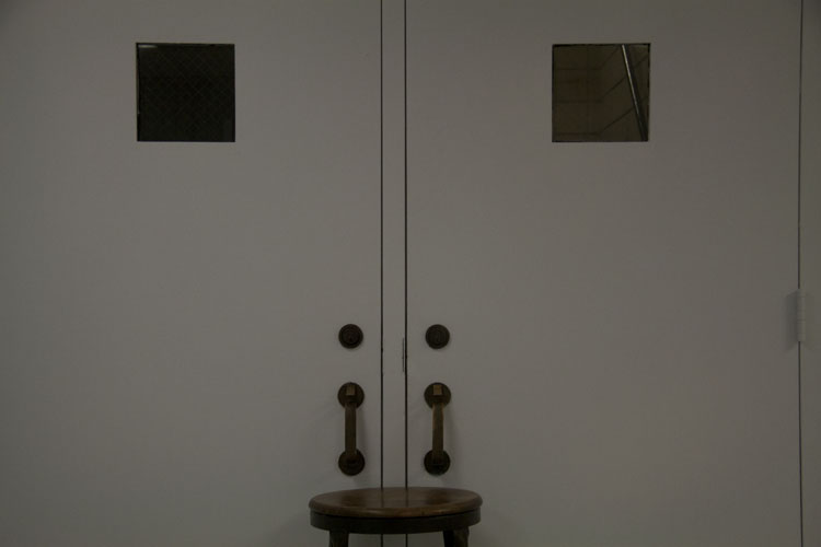
I chose this photograph because of the black background against the chair. This is an example of the rule of thirds. The chair has this unique curve at the top of it. I think it makes you think about more than the object just being a chair. It allows you to wonder why the chair has a curve or is it a dent? The chair in this photograph definitely sets the mood of being alone. It tells a story, i think it has a lot of emotion. The black background creates a level of depth in the photograph as well. It makes me wonder if it could be the beginning of a tunnel or an empty room.
Posted in LL 1-Composition
Leave a comment
Composition- Gregory Mitchell
I chose this photograph because I like the symmetry in it and I like the shapes. I like how the windows and door handles look like plain geometric shapes. Instead of looking like a chair in front of two doors the shapes make it look like an abstract photograph.
Posted in Uncategorized
Leave a comment
Composition – Darren Parvatan
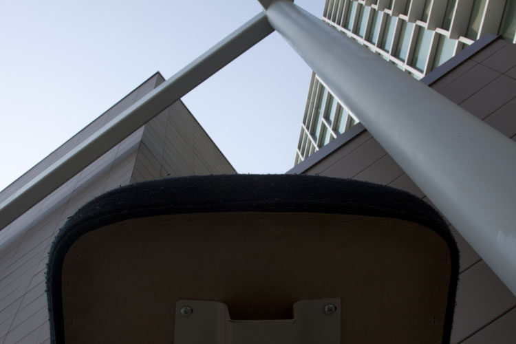
I chose this photo because of the interesting view you get from it. This worms-eye view lets you see the chair from a great angle that not only makes the chair look huge but its surroundings too. It also has many elements to it with the different lines formed and the negative space through the poles intersections along with an obvious balance and symmetry.
Posted in LL 1-Composition
Leave a comment
John Bhatia hw1 Re
John Bhatia
Gra 2330 Photo1
Homework 1
http://www.michaelkenna.net/gallery_images/bd5a5e41.jpg
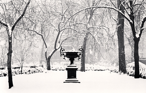
Michael Kenna – Winter Morning
Michael Kenna captured Gramercy Park during the winter of 2003, he conveniently titled his photograph ‘Winter Morning’. The photos subject, a lone sculpture in Gramercy Park during the winter. From what it appears the snow has just passed, because there is still enough snow on the branches to have them bend, and there seems to be no foot print in the snow. The mood feels to be solitude one object in the middle and many other subjects distant from the center and from the sculpture. It also has a calming feel, as there is little to no motion. It’s also calming because it is quiet, if you were to in vision yourself there at the moment of the click, you would be very relaxed.
More specifically he uses perspective lines to guide you past the foreground to the mid ground. His use of lines also goes vertical, along with many organic free flowing lines caused by the branches. But that also cuts the scene in half, the bottom half is very structured and the top half is very free- curving. There are only two types of figures in this picture, the man made sculpture, which can be broken down into natural forms, and the organic trees. There also is square like shape on the ground acting as the perimeter counter to the circular bowl. The image in a way gets cut into two, the top follows a very cross hatch pattern and the lower portion has no pattern at all. The photo is very cohesive you can cut it up from many different angles and the weight doesn’t flow any heavier to any one side, it’s very structured and symmetrical. Despite being captured in 2003 the image is black and white. The contrast marks the ground negative space perfectly it’s just out of the way enough to get noticed as a foundation. The image has a nice contrast, the details that need to be noticed first have a sharp edge to the lesser important followed by the details that enhance the mood with subtleness. All these elements sum up the overall mood, I feel this image would not look as good as it does if it had color, because there is less to get distracted by, if the image was taken in color then the vibrant colors of the materials would be disorientating from the subject.
Posted in HW1-photo description
1 Comment
HW#1 Adha CHAABANE
Michael Kenna caught my attention and impressed me by his set of black and white photos of New York. I picked this unique photo “Wall painting, New York, New York, USA, 2013” under this link=http://www.michaelkenna.net/gallery.php?id=14 (picture #3). My first interpretation of this photo was wrong because I thought that represents shadows of people in a concert or a party especially with that diagonal lighting form across the photo; but actually when I read the title I discovered that the picture is a wall painting of New York. The wall, the window and the door are painted in a continuous way as they form one piece where the shadows, the watermark give the photo readers a “trompe l’oeil”. I checked the rest of Kenna’s artwork, but I really felt in touch with this photo because it gives me a sense of how black and white pictures sometimes could give you a false vision of what they really are like it happened to me. I like this picture because it remembers me of previous participations in painting school walls and I enjoyed it. I think Michael Kenna likes shooting monuments of New York in black and white style which gives his works a unique style among other photographs. I believe Michael Kenna’s photographs dominate the architectural mood and he likes taking picture of monuments.
There is a very high contrast between the background and the foreground in this photo; the foreground consists of black shadows in the half bottom of the picture and the background consists of mostly grey lightening color with a diagonal white form that divides it in two slices which drives our eyes along and gives you a sense of movement. Placing the shadows in the bottom gives the photo a strong base and certainty feeling. The interference of the different shapes _diagonal, rectangles (window and door), triangle…etc._ in this photo helps create and develop the architectural mood of Kenna’s photos. Everything in this image has some sort of shape and pattern. The balance is pretty much obvious between light and dark where the line is strongly present as well.
Posted in Homework, HW1-photo description
1 Comment
homework #1 Jorge Agredo
http://michaelkenna.net/gallery.php?id=14
The photograph that caught my attention and mesmerized me in a certain way was “twin towers, study one, New York City, Usa, 1978” by photographer Michael Kenna. In the picture we can see the twin towers standing above Kenna like two giants. Taken from a worm’s eye view angle which made the building look taller than what they already were. It creates sort of a majestic feel to it, making the towers bigger than us and not by size, but by importance, magnitude and impact that they would indirectly eventually have in our lives, creating an emotional connection, a direct relationship between the photograph and the viewers. In my opinion, developing that relationship is just as important as capturing the desired image. I believe the mood can be interpreted in many ways because of what unfortunately happened to the world trade center on september 11th 2001. Therefore I believe the mood is a bit melancholic and sad. In the picture, the day appears to be cloudy and with little light to indicate otherwise, and although the photograph was taken in 1978, as years passed by, and events occurred, the importance of the picture has increased dramatically.
The diagonal alignment of the towers guide our eyes towards the little light that the photo has, which is located right on top of the buildings, making it look kind of like a halo and giving it a godlike feel to it in a sense. The asymmetry of the photograph which can be found specially on the left tower help create and develop the mood. The contrast between the dark of the buildings and the light of the sky contributes to develop that sense of magic that the picture portrays. The dark of the towers allow the top to pop up due to having more light, creating a more appealing looking picture.
Posted in HW1-photo description
1 Comment
photograph project
the reason why i picked this photo is because of how the color of the chair interacts with the color of nature, I think it creates a relationship between nature and an object made by man., the green of the plants surrounding the chair gives it a more interesting look overall.
Posted in LL 1-Composition
Leave a comment

