Category Archives: HW1

HW1

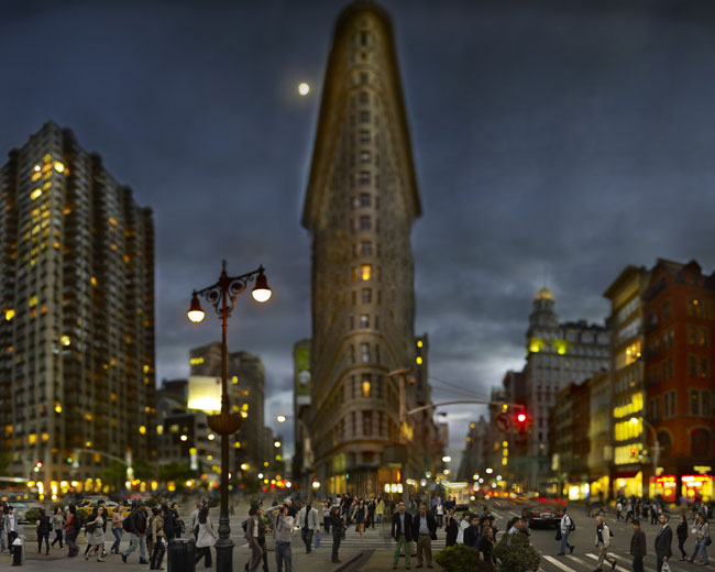
Michael Kenna – Morning Traffic, Midtown, New York City, USA, 2000

1,This is an image that is used to give off a message. With the use of black and white I felt that this image was very powerful, Yet peaceful being that there wasn’t too much going on in the image. I also feel the use of emphasized texture, and lines are elements that make this photo really strong.

2, what I think the photographers intentions were with this picture, were to be able to show us early morning traffic in NYC. What I got from this picture is, being that New York is such a busy city, which normally has large amounts of traffic, This picture was titled morning traffic which appeared to have very little traffic, which isn’t very normal for such a busy city. To me I think that this means that this picture was taken very early in the morning maybe around 5-6am. Being that the streets are empty and there are street and headlights on

3, In this image the photographer created a huge emphasis on the concrete floor in front of him, while having the distance blurred out. While in the distance you can view different light which represent all of the cars down the road. Also the concrete has emphasized texture in which the light from down the street is reflecting off of the wet concrete.

4, I feel that the technical matters help this image. I think that this image was meant to show us a different form of midtown traffic.

5, the graphic elements used in this photograph was a diagonal line. The first thing I happend to look at was the diagonal line in the concrete that I then followed upwards in the photo. And from there it leads to all the different lights from cars and streetlights that were blurred out.

6, What I found that this photograph reviled is that this image may have been taken really early in the morning being that there isn’t much traffic going on, as well as pedestrians on the street. Also I realized that this picture wasn’t taken long after it rained being that the concrete is still wet, in which there are still puddles and since the concrete is able to reflect light off of it.

7, This image has a really peaceful feel to it in my opinion. Being that this photo represents midtown traffic without it being much traffic, it kind of shows how there isn’t too much going on in the photo. Also I feel that the use black and white for this image was chosen so that you can focus on this image without the distraction. Since certain colors might instantly catch your eye and force you to look at it. The use of black and white leaves your attention undivided

8, the main thing that relates this photograph with the other photos by this artist is the use of black and white. Every image in this collection was taken in black and white and I feel that the photographer’s purpose was so that the viewer’s eyes can start off on an even plane when looking at the photo. By this not just one thing stands out as soon as you view the image. This can make different things in an image seem a lot more powerful serious and dramatic without the use of color. Also black and white photos can often give off this sort of classic and vintage feel to it. Another thing is the use of blur. With the certain things being blurred out, your attention is normally focused on everything that isn’t blurred out in the picture.


1 Comment

Filed under HW1

Ruvin Yusupov Homework #1

Jeff Chien-Hsing Liao
Flat Iron Building, 2011

What type of photograph is it?


This photograph is an artistic photograph, because it clearly shows the people around NYC’s Iron Fold Building.


What can you tell (or guess) about the photographer’s intention?


I guess that the photo shows that the people of New York make the city so great not the buildings that can be found there.


What emphasis has the photographer created and how has that been done?


The photographer creates emphasis on the people by using selective focus on them.


Do technical matters help or hinder the image?


Technical matters help the photo because the photo is of everything not anything specific amongst the crowd that is there.


Are graphic elements important, such as tone, line, or perspective?


Yes they are important; the first thing I saw was the perspective that is made from the Iron Fold building.


What else does the photographer reveal besides what is immediately evident?


He reveals the cultural diversity of New York City.


What emotional or physical impact does the photograph have?


This photo makes your eyes widen with the deep perspective and then it brings you back with selective focus on the people.


How does this photograph relate to others made by the same photographer, in the same period, or of the same subject matter?


This photographer takes photos of New York’s greatest views from all over and this is another that captures the Flat Iron Building.

1 Comment

Filed under HW1, Uncategorized

Homework 1

Jeff Liao-Habitat 7

http://www.saulgallery.com/liao/habitat.html

1. What type of photography is it?
The Photograph looks like an advertisement of times square.

2. What can you tell (or guess) about the photographer’s intention?
My guess is that the photographer’s intention is to show the Times Square during rush hour.

3. What emphasis has the photographer created and how has that been done?
The photograph emphasis is to capture the motion focus of people in the city. It shows how busy everyone is like they are all rushing somewhere because the time is running out.

4. Do technical matters help or hinder the image?
The technical matters such as the focus on this one in particular helps the image because it sets the mood.

5. Are graphic elements important, such as tone, line or perspective?
The graphic elements are important because perspective for example, if the photographer was closer to the people you wouldn’t be able to see all the motion with the city in the background but just the people and the photograph would lose its power.

6. What else does the photograph reveal besides what is immediately evident?
It looks to me like the females on the advertisement boards are looking down at everybody laughing because they get to just hang there and relax while everyone else is in a rush like they are crazy.

7. What emotional or physical impact does the photograph have?
The photograph is unpeaceful. It makes me feel like I do not want to stay in the city for the rest of my life because of all the craziness especially since I am used to living in a small town.

8. How does this photograph relate to others in the same series by the same photographer?
A lot of them use the same technique of using the motion focus to show the movement of the city life.

1 Comment

Filed under Homework, HW1

Rafael C: HW 1 (Eugene Richards)

1. What type of photograph is it?

The photograph captures the action, as everyone is moving. I wouldn’t say it makes a great ad or news photograph but it does capture the moment really well and the fact that is not actually perfect as nobody is completely focus gives it a more realistic look.

2. What can you tell (or guess) about the photographer’s intention?

I’d say that the photographer’s original intention was to capture the image of the missing women. I say this because pretty much everyone except the women that happened to suddenly look back is looking away from the camera.

3. What emphasis has the photographer created and how has that been done?

The photographer emphasizes the panic during 9/11. You can see the shock in the women’s eye even though only one is actually showing. Her face expression combined with the missing women poster gives the photo an intense feeling of horror.

4. Do technical matters help or hinder the image?

The photo looks like it was ‘simply taken at the moment’, the fact nobody is actually focused gives it the feeling it already evokes.

5. Are graphic elements important, such as tone, line, or perspective?

The black and white tones are important and give the photograph a feeling of panic. Maybe if it were in full color it would not have the same impact when you first see it. Also because it is a little blurred it adds to the impression that it wasn’t a beautiful day and that perhaps that’s how the people there saw the scene at that moment.

6. What else does the photograph reveal besides what is immediately evident?

I didnt notice much new besides the height and weight of the person written on the taped posters, it’s striking because you can only imagine how desperately that persons family wanted to find her.

 7. What emotional or physical impact does the photograph leave?

The photograph leaves a feeling of suspense and shock, it makes you imaging the fear and worry those people were going through.

8. How does this photograph relate to others made by the same photographer, in the same period, or of the same subject matter?

Eugene Richards took a lot of photos during 9/11. Some of them were very similar to this one because they captured signs of missing people. They are all black and white so he kept going for a consistent style. However, in my opinion this one photo stands out a lot more compare to the others because it captures the moment with all the necessary elements and in a more pure form.


1 Comment

Filed under Homework, HW1

Homework 1

Digital Photography 1


Homework 1

Thomas Holton The Lams of Ludlow Street


  1. The image is a casual portrait of the Lam family, some of which are eating.
  2. The intention of the photo is unclear, though it is very serious it could mean a number of things.  It shows the family in a very casual setting and seems to just focus on the subject in focus.
  3. The emphasis is on the young man sitting on a chair; he appears to be eating and staring intensely at the camera.  The subject appears to be front-lit with very little shadow in the picture.
  4. The selective focus helps the image because it focuses on the expression of the subject in focus.  It also helps that the viewer is eye level with the subject in the focus.
  5. There is a High Contrast in the image that focuses on the brightest area of the image, which is the main subject.  The image shows a deep space but still focuses on the far end of the space.
  6. The image reveals the two children in the front of the deep space out of focus, both are at different distances and the one closest to the front is the most out of focus.
  7. The image makes the viewer serious and focused.  Also it shows calm in an area where there are many other things going on.  No one else in the image is focused on the camera except for the main subject.
  8. The picture relates to the other images in the series because it uses the same selective focus as in some of the other images and shows the family and the space they live in as the main subject.

1 Comment

Filed under Homework, HW1

Jeff Liao-Habitat Big Pictures for a Big City Gallery

http://www.saulgallery.com/liao/links.html


http://lens.blogs.nytimes.com/2012/02/24/big-pictures-for-a-big-city/


What type of photograph is it?

It’s a scenery shot taken from the sky to show the vastness of the Grand Concourse in the Bronx.


What can you tell/guess about the photographer’s intention?

I believe that the photographer’s intention was to show as the title of the gallery states, how big and vast the Concourse is. The Bronx really isn’t known for being “the city” but it is a major part of the city and it is such a “Grand” place.


What emphasis has the photographer created and how has it been done?

I believe the emphasis was not what the camera was pointing at, but what was in the distance. To really show how big an area is, you have you create a sense of depth and the best way to do that is to do at an overhead level which is what the photographer did.


Do technical matters help/hinder the image?

Since the image is done overhead, I believe that it helped the image because it got what the photographers intentions were and that was size.

Are graphic elements important (tone,line, perspective)?

The key in this picture was the perspective. Had the image not been taken where it was, the effect might not of been as effective.


What else does the image reveal other than what is immediately evident?

Since the Gran Concourse is such a busy area in the Bronx, this picture actually reveals a not so busy side of the Grand Concourse that not many people from the Bronx are used to.


What emotional impact does the photograph have?

I honestly can’t say because I don’t feel like there is an emotion portrayed.


How does this photograph relate to others in the same series by the same photographer?

The gallery is named “Big Pictures for a Big City” so naturally the picture needs to be of the city, and big and like all the other pictures in the gallery, it is of the city and it is “big”


1 Comment

Filed under HW1

HW1- Hillary Nguyen

Jeff Chien-Hsing Liao Habitat 7 series
http://www.saulgallery.com/liao/images/habitat/liao_habitat_04.jpg
42nd Street, Times Square, Manhattan 2005

1. What type of photograph is it?
The photograph of Time Square was a piece that belong in Jeff Liao’s Habitat 7 series which was published in New York Times Magazine. It was under the category of “Capture the Times”

2. What can you tell about the photographer’s intention?
I believe that the photographer’s intention was to capture NYC at its best. With the title “Capture the Times”. New Yorkers does everything in a fast pace. As you can see, the people within the picture are in a motion blur.

3.What emphasis had the photographer created and how has that been done?
In this photo the photographer uses selective focus on the buildings to make it looks more sharps while the people are more of a blur.

5. Are graphic elements important?

I believe that graphic elements are important. The first thing that caught my eyes were the people in the photo.

7. What emotional or physical impact does the photograph have?

The photograph gives off  a very energetic feelings.  A little bit of chaos because of all the people rushing and moving fast.

8. How does this photograph relate to others in the same series by the same photographer?
Throughout the Habitat 7 series, all the photographs seems to be taken from a far distance. Most of them seems to be from an high angle shots while others are eye level shots.

1 Comment

Filed under Homework, HW1

HW1

  1. What type of photography is it? This is picture taken from a flyer poster after 9/11 when many people were trying to find their loved ones that used to live, or work around the WTC area.
  2. What can you tell (or guess) about the photographer’s intention? It was to show the contrast of the happiness both women had in the picture with the despair and anguish there is due to 9/11 terrorist attack.
  3. What emphasis has the photographer created and how has that been done? I think the emphasis in this photograph has been very quite straight forward. The flyer is dead centered in the picture at an eye level, and there is a high contrast since the paper is white and the image is on grayscale. The fact that the photographer has used a grayscale filter for this series creates a mode of seriousness and sadness.
  4. Do technical matters help or hinder the image? They help the image because they make it look more real. For example the tape that is placed on top of the picture and blocks a part of the picture gives the photograph that realistic look. It makes it looks as if any person could have posted it in the desperation of finding their loved ones and that it was not supposed to be aethestic but informative.
  5. Are graphic elements important, such as tone, line or perspective? Tone really helps in this photograph since it makes the dark tones to be more noticiable, which helps the viewer to read the description of the woman, and also to see her face clearly.
  6. What else does the photograph reveal besides what is immediately evident? It reveals how death and tragedy can really affect anyone. Through the description we can see that both women were young and pretty, and maybe even got good money (because of the gucci watch reference) though, as I mention before, tragedy can affect anyone and therefore we are all vulnerable to it.
  7. What emotional or physical impact does the photograph have? It has a big emotional impact because as we all know, 9/11 was one of the most tragic events that have occured in New York, and even in America in the last few years and this picture shows one
  8. How does this photograph relate to others in the same series by the same photographer? All the photographs from this series were taken after 9/11 in New York, and also all of these photographs are in grayscale which emphasizes more the feeling of grieve and sadness.

1 Comment

Filed under HW1

HW1 – Dree Morin

Eugene Richards – Stepping Through the Ashes

Photograph 15 – Boy at a funeral.

1.       This photograph is from a documentary series on September 11, 2001, it seems they were all taken both on September 11th and in the days and months following.  This particular photo depicts one of many funerals for the first responders.

2.       I believe that the photographer’s intention was to document this horrible tragedy in our city’s and our nation’s history.

3.       This photo has deep space as the viewer sees people and objects both far away and closer to the camera.   It also uses selective focus, as the main scene is sharp and the boy at the forefront is blurry.  It makes me wonder if the boy got in the way of the camera or if he was an intentional part of the photograph.

4.       The selective focus with blurriness of the boy adds intrigue to the photo, whether he was an intentional part of the photo or not, it makes it more interesting.  It also shows how even the young among us bare witness to such tragedies.  There is a relatively shallow depth of field as it appears the photographer is across the street, and the viewpoint is overhead of the funeral, but almost eye level with the boy.

5.       The framing of this photo is unique as the boy’s head encompasses much of the photo and his head meets the top of the frame.  Also there appears to be iron work on the right side of the photo giving it a soft edge on the right.  This is in contrast to the crisp edges on the left and top left where the people and the building are cut off.

6.       This photo reveals how many people are affected by tragedies, from the person’s immediate and extended family to his or her brothers in arms to the anonymous boy in the picture who may not have known the victim personally, but was there to pay his respects, presumably with his parents.

7.       The immediate emotional impact is sadness as this is a photograph of a funeral.  There is increased sadness that the boy is there, since he is looking away from the funeral proceedings, you are made to wonder if he doesn’t understand what is going on, or if there is something outside the frame that is related to the funeral that has caught the boy’s attention.

8.       This photo is part of a documentary series on the aftermath of September 11, 2001.  All of the photos are done in black and white and they all show the devastation that the terrorist attacks had on both the physical buildings that were brought down and on all the people affected.  Two other photos I thought were poignant in the series are the graffiti laden storefront, until you realize that people were writing in the ashes from the trade center and they were all positive messages, the other is the hand reaching for the snow globe of the World Trade Center, someone looking for a remembrance of the buildings as they were, before the souvenirs were changed to include the dates that the buildings stood.

1 Comment

Filed under HW1

Photo description

1 Comment

Filed under HW1