Digital Photography has always thought was interesting and cool but it was something ive known little to nothing about had no experience with at all. I’ve just always been a fan of pictures that look cool and entertaining to me. With this course i was able to learn about the art of photography, And how powerful pictures can be. I learned to be able to view things from a newer and different perspective which is something i’ll continue to do from now on. What i learned to love about photography is how there’s always more then meets the eye when taking a picture or viewing an image. Because of this i can definitely understand the saying “A picture is worth 1000 words”. This is a course that ive enjoyed the most and was the most interested in now, and i look forward to learning alot more about digital photography in the future.
Author Archives: Joseph Coppedge
Learning Log 7: Painting With Light
Out of all the pictures taken i feel that this photo is the strongest and most effective image. This image was able to capture a great use of painting light with a very abstract light painting that looks a bit three dimensional and as if it is wapping around itself. Also i think that the lighting for the photo works with the abstract painting as well. The way half of her body was lit up while the other half fades to black,can make it look like the painting is the source of light in this photo 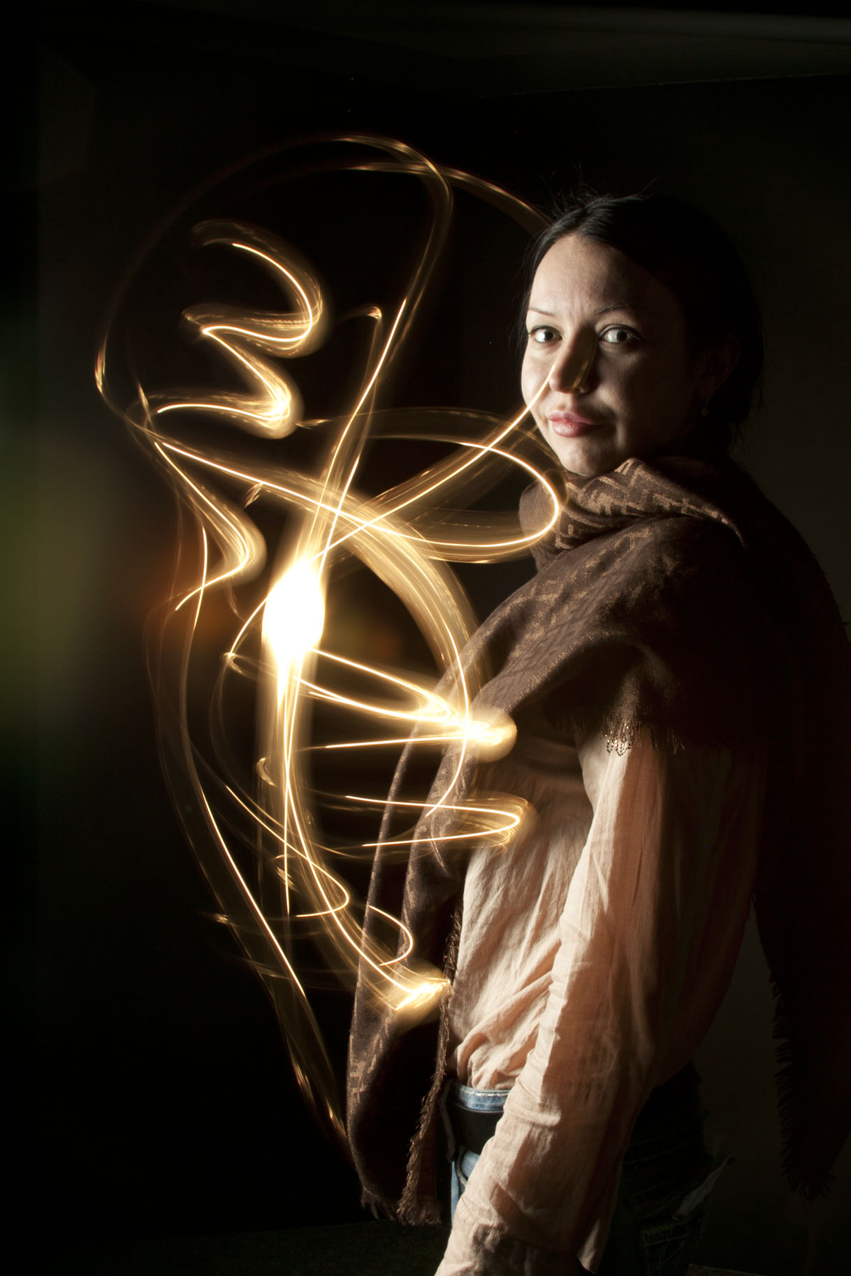
Filed under Uncategorized
1, What are important factors to consider when shooting a portrait?
The important factors of shooting a portrait is to focus on the face, and have a good use of lighting, creating a triangle on one side of the face.
2, What is the difference between broad and short lighting?
broad light is the light used on the side on the the persons face while the short light is use in the center of the persons face
3, in a classic basic portrait set up, what is the function of the main light?
This is good for adding good lighting in front of the subject
4, In a classic basic portrait setup, what is the function of the fill light?
The function of the fill light is to reflect and balance the lighting from the light on the subject
5,In a classic basic portrait set up, what is the function of the background light?
This is to be able to add depth and seperate the subject from the background
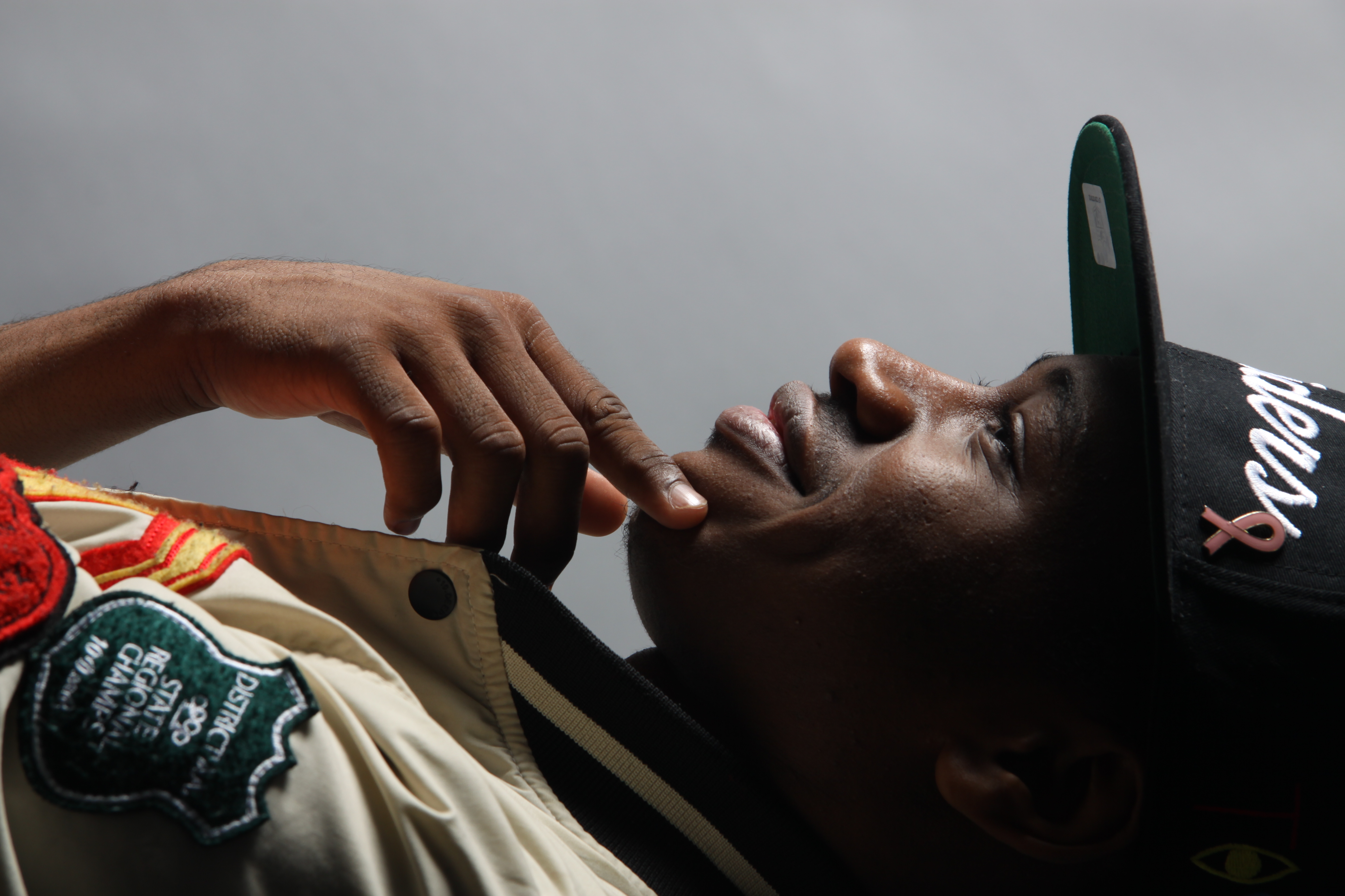 This is my favorite picture because i felt that there was a good use of lighting on my face.The way i was positioned and the way the lighting was worked well.I like how the lighting makes one half of the picture brighter while having the right side of the picture become darker and more like a shadow. Also i think my gesture in this picture give this picture a lot more feeling to it
Filed under Uncategorized
Botanic Garden Favorite Shot

This picture is my favorite of all the pictures that i have taken because of the focus on the flower in this shot. The amount of focus allows you to view the flower in detail with good lighting. In addition i feel that the blurred background of mostly green and darker colored flowers and plants really help the bright pink flower stand out from everything else.
Filed under Learning Log 3 - Botanic Garden
Learning Log 2: Sunflower
 I feel that this is the strongest picture that i have taken due to the different qualities that this picture has. The way the light reflects off of the flower pedals. and the way you can see the textures on the sunflower. Also with the flower being centered the negative space around the flower makes the flower alot more powerful
HW1
Michael Kenna – Morning Traffic, Midtown, New York City, USA, 2000
1,This is an image that is used to give off a message. With the use of black and white I felt that this image was very powerful, Yet peaceful being that there wasn’t too much going on in the image. I also feel the use of emphasized texture, and lines are elements that make this photo really strong.
2, what I think the photographers intentions were with this picture, were to be able to show us early morning traffic in NYC. What I got from this picture is, being that New York is such a busy city, which normally has large amounts of traffic, This picture was titled morning traffic which appeared to have very little traffic, which isn’t very normal for such a busy city. To me I think that this means that this picture was taken very early in the morning maybe around 5-6am. Being that the streets are empty and there are street and headlights on
3, In this image the photographer created a huge emphasis on the concrete floor in front of him, while having the distance blurred out. While in the distance you can view different light which represent all of the cars down the road. Also the concrete has emphasized texture in which the light from down the street is reflecting off of the wet concrete.
4, I feel that the technical matters help this image. I think that this image was meant to show us a different form of midtown traffic.
5, the graphic elements used in this photograph was a diagonal line. The first thing I happend to look at was the diagonal line in the concrete that I then followed upwards in the photo. And from there it leads to all the different lights from cars and streetlights that were blurred out.
6, What I found that this photograph reviled is that this image may have been taken really early in the morning being that there isn’t much traffic going on, as well as pedestrians on the street. Also I realized that this picture wasn’t taken long after it rained being that the concrete is still wet, in which there are still puddles and since the concrete is able to reflect light off of it.
7, This image has a really peaceful feel to it in my opinion. Being that this photo represents midtown traffic without it being much traffic, it kind of shows how there isn’t too much going on in the photo. Also I feel that the use black and white for this image was chosen so that you can focus on this image without the distraction. Since certain colors might instantly catch your eye and force you to look at it. The use of black and white leaves your attention undivided
8, the main thing that relates this photograph with the other photos by this artist is the use of black and white. Every image in this collection was taken in black and white and I feel that the photographer’s purpose was so that the viewer’s eyes can start off on an even plane when looking at the photo. By this not just one thing stands out as soon as you view the image. This can make different things in an image seem a lot more powerful serious and dramatic without the use of color. Also black and white photos can often give off this sort of classic and vintage feel to it. Another thing is the use of blur. With the certain things being blurred out, your attention is normally focused on everything that isn’t blurred out in the picture.
Learning log 1: Chair
The picture that i like the most out of the pictures that ive taken is the frame cropped image of the chair. I feel that this photo has a good use of negative and positive space. as well as the emphasized texture on the chair. also with it being cut off at an angle it makes you wonder whats going on with the rest of the chair.
Filed under learning log 1-Composition

