Author Archives: Dree Morin

Final Evaluation – Dree Morin

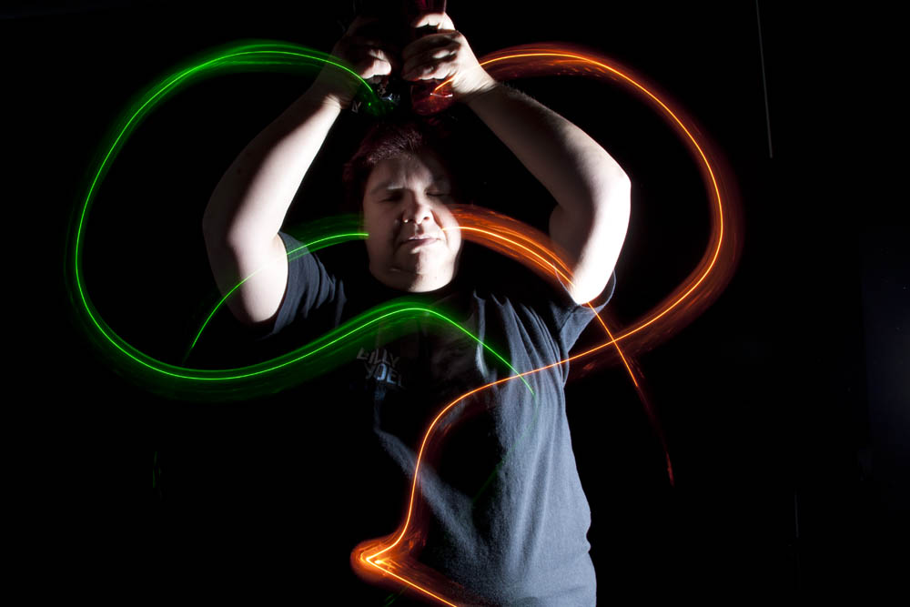
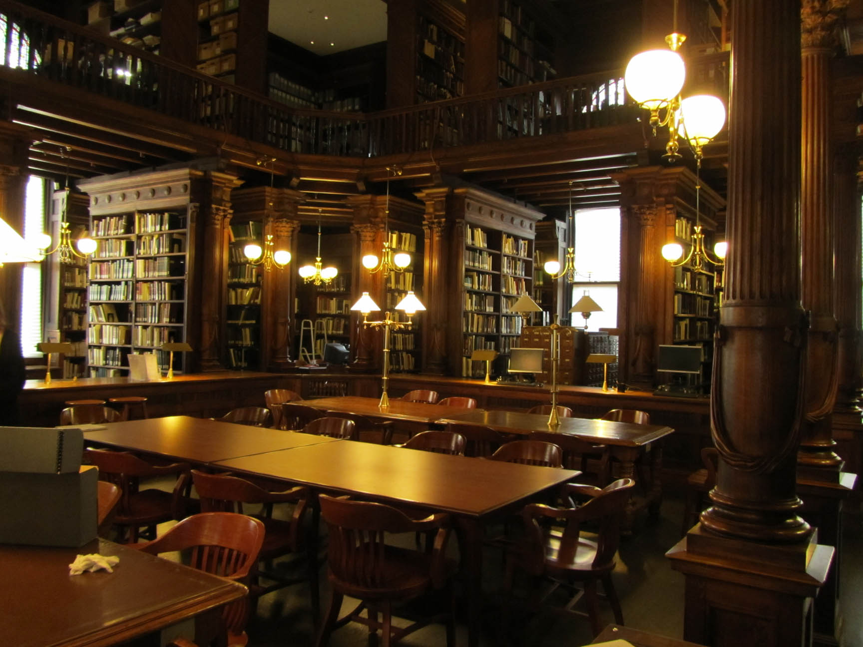
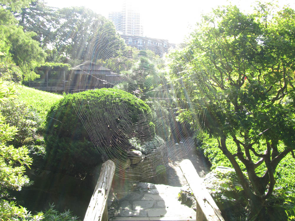
This was a fabulous class!!  I’ve always been a fan of photography, but before this semester, I had looked at backlighting, especially by the sun or a cloudy day’s diffused lighting as a hindrance to taking pictures, rather than a useful and creative tool.  I learned about proper portrait lighting and terminology.  The painting with light class was one of my favorites because it was so creative and I’d had no idea how that was done prior to this semester.  I also noticed that I have been taking photos for years utilizing certain terminology/techniques, without knowing it.

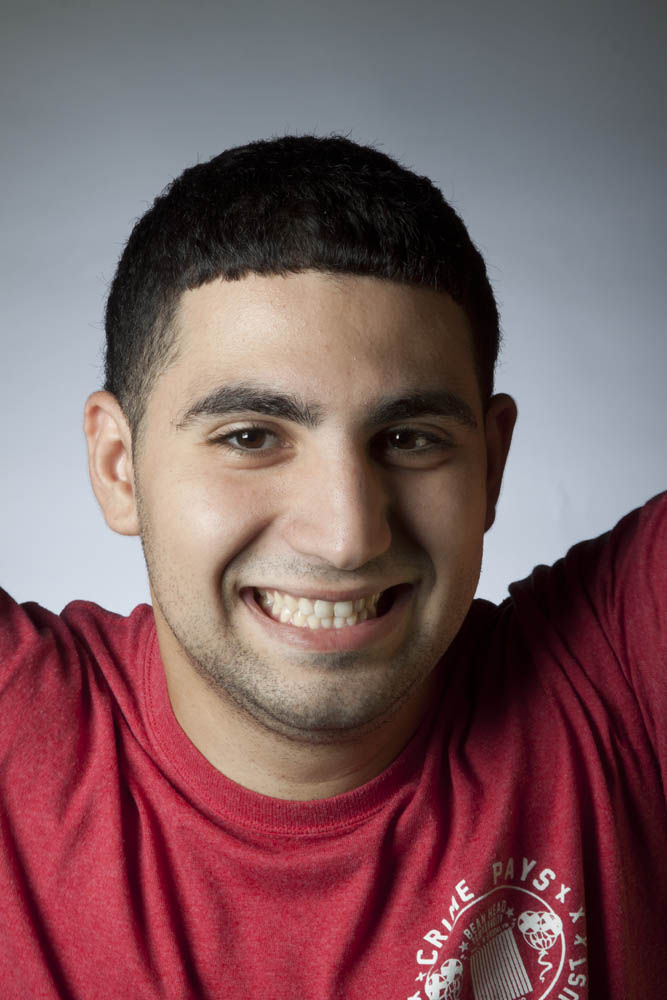
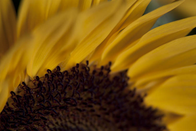
I’d seen many photographs that used shallow depth of field (thought I didn’t know the terminology) and knew that professional photographers were doing this on purpose, but I did not know how create this effect and when this would accidentally happen in some of my photos, I would see it as a failure of my skills and the photograph.  Now I know how to do this intentionally and make use of this technique.  I truly understand the function of the shutter speed and how to use it.  I’m still struggling with function and use of the aperture; I think this is partially due to the limitations of my current compact digital camera, and the fact that there wasn’t enough time to work with it in class.  I’ve been considering getting a DSLR on and off for years, but felt that I didn’t know enough about how to use one.  Now I am confident enough to purchase a DSLR and know that I will have plenty of time to practice with it next semester in Photography 2.  This was one of my two favorite classes this semester and I expect Photography 2 will be a favorite next semester as well.  I look forward to learning more!!

 Another thing I really enjoyed about this class was the personal interaction when we worked in groups in class.  I liked the fact that the groups were always changing.  Although I didn’t get to work with everyone in the class, I worked with many.   In so many classes you can go through the whole semester and never talk to or even know your classmates names.  

This class has given me more confidence in my skills as a photographer.

Leave a Comment

Filed under Final Evaluation

Painting with Light

(I just noticed that I never hit the send button on this one either, sorry again!) 

I thought the painting with light exercise was really cool.  I’d seen pictures like this in the past but never knew how they were done.  One of the key things I learned was that the lighting must be right in order to capture the person and not the background.  Also when the light fired, the motion had to be quick enough for the colored light to be captured without the light source.

This was my favorite photo today because it looks like the light is going through my face and changing colors as it does so.  I also really like the shadows on my arms from the positioning of the strobe light.

Leave a Comment

Filed under Learning Log 7-Painting with Light

Suggestions

(I just noticed that I never hit the send button on this post, sorry about that!)

Ming Yin’s primary suggestion for me was that some of my photos were too dark.  Some of the photos that he commented on were taken at very fast shutter speeds to intentionally make the photos dark, he felt that some were too dark.  I think that part of that is the monitor that they were viewed on since they didn’t look as dark on my computer at home.

I will be more conscious of the lighting and shutter speeds that I use and in the choosing of the photos that I post.

Leave a Comment

Filed under Learning Log-Final Project

BHS & GWC

At the Brooklyn Historical Society, my group learned about the Brooklyn Theater Fire that happened on December 6, 1876 where 278 people burned to death and 722 survived.  Of the 278 people who perished, 103 were buried together on this site with funds donated by wealthy people and the city of Brooklyn for those fire victims whose families could not afford to bury them.  Some of those families also received other monetary help, especially when the victim was the sole provider for the household.  This serves as a permanent “living” monument to those fire victims, I call it a “living” monument because of the beautiful flowers that surround it.  The monument itself was erected by the City of Brooklyn, before it became a borough of New York City.

Leave a Comment

Filed under Learning Log 6-Greenwood

Portrait Shoot

1. Important factors to consider when shooting a portrait, are the subject and their comfort level, the lighting and the background.

2. In broad lighting the light is on the ear side of the face in a three-quarter view, in short lighting the light is on the person’s facial features.

3. The function of the main light is to illuminate the person usually at a 45 degree angle, and you will usually end up with a triangle of shadowed light on the opposite side of the nose.

4. The function of the fill light is to remove the shadows on the opposite side of the face, and thereby soften the portrait by illuminating the entire face.

5. The function of the background light is to illuminate the background which helps give space between the subject of the portrait and the background and also brightens the entire picture.

I like this photo that I took because it is one of the fun ones that were taken, although we were using the fill light you only see part of its effect because Ruben was raising his arms in a cheer.  Because of this you see some of the effects of the fill light, but not all of it, and some shadow is showing on his forehead, also he had taken off his sweatshirt and the red of his t-shirt complimented his skin tones better than the white of his sweatshirt.


Leave a Comment

Filed under Learning Log 5-Portrait Basics

Daguerreotype vs. Digital

DaguerreotypeThe daguerreotype I examined at the Brooklyn Historical Society was a portrait of two young boys.  Since I have not yet taken a portrait this semester, it is difficult to compare the content of the daguerreotype and one of my own from this semester unless I were to compare with one of the statues that I photographed, and still that would not be the same.  Therefore I feel the best way to compare a daguerreotype to a contemporary photo, is in physical characteristics and the process.  The daguerreotype was a quarter plate size, I believe, making it approximately 3.25 x 4.25 inches.  It was a copper plate, which made it reflective, encased in a frame with matting to protect it and had a decent amount of weight to it.  By contrast any of the digital images I’ve taken this semester weigh nothing until I decide to print them out and then they weight only as much as the paper they are printed on.  My digital images have a maximum print size of 18 x 24, but can be printed at any smaller size and I can print it as many times as I would like.  The daguerreotype however could not be reproduced or resized at all as it was a unique image.  I very much enjoyed the trip to the Brooklyn Historical Society, it was interesting and the library itself is architecturally beautiful.

Leave a Comment

Filed under Photography Formats, Uncategorized

Botanical Gardens

This is my favorite photo that I took at the gardens.  I love it, for one, because I was able to catch the spiderweb.  When I saw this beautiful, huge spiderweb, I was thrilled.  I took several pictures of it but on the camera screen at the gardens it didn’t look like I was successful.  When I saw them on the computer, I was thrilled!!  This was the best one, and I love the way the sun is coming through the web. (It is easiest to see if you click on the image, it will come up full size, it is difficult to see at this size.)

Leave a Comment

Filed under Learning Log 3 - Botanic Garden

Texture & Soft Lighting


I really like the texture and soft lighting on this sunflower.  I like the way the petals appear to be in motion.

The most significant thing that I learned in the lighting class is that only the background has to be illuminated for back-light photos.  I had always thought that the light had to be directly coming at the subject from behind and directly aimed at the camera.  I never knew that you could only illuminate the background to get silhouetted shots.

Leave a Comment

Filed under Learning Log 2-Lighting Direction

Oblique Angle

My favorite picture that I took today is the oblique angle.  I like this picture because the chair looks like it is about to roll away, the shadow and the lighting help this illusion.  When I look at it, it makes me think that it is on a ship, and that ship has hit rough seas and/or is about to sink.

I’m often confused with the term oblique, as long as I remember that oblique means diagonal, I’ll be fine.

Leave a Comment

Filed under learning log 1-Composition

HW1 – Dree Morin

Eugene Richards – Stepping Through the Ashes

Photograph 15 – Boy at a funeral.

1.       This photograph is from a documentary series on September 11, 2001, it seems they were all taken both on September 11th and in the days and months following.  This particular photo depicts one of many funerals for the first responders.

2.       I believe that the photographer’s intention was to document this horrible tragedy in our city’s and our nation’s history.

3.       This photo has deep space as the viewer sees people and objects both far away and closer to the camera.   It also uses selective focus, as the main scene is sharp and the boy at the forefront is blurry.  It makes me wonder if the boy got in the way of the camera or if he was an intentional part of the photograph.

4.       The selective focus with blurriness of the boy adds intrigue to the photo, whether he was an intentional part of the photo or not, it makes it more interesting.  It also shows how even the young among us bare witness to such tragedies.  There is a relatively shallow depth of field as it appears the photographer is across the street, and the viewpoint is overhead of the funeral, but almost eye level with the boy.

5.       The framing of this photo is unique as the boy’s head encompasses much of the photo and his head meets the top of the frame.  Also there appears to be iron work on the right side of the photo giving it a soft edge on the right.  This is in contrast to the crisp edges on the left and top left where the people and the building are cut off.

6.       This photo reveals how many people are affected by tragedies, from the person’s immediate and extended family to his or her brothers in arms to the anonymous boy in the picture who may not have known the victim personally, but was there to pay his respects, presumably with his parents.

7.       The immediate emotional impact is sadness as this is a photograph of a funeral.  There is increased sadness that the boy is there, since he is looking away from the funeral proceedings, you are made to wonder if he doesn’t understand what is going on, or if there is something outside the frame that is related to the funeral that has caught the boy’s attention.

8.       This photo is part of a documentary series on the aftermath of September 11, 2001.  All of the photos are done in black and white and they all show the devastation that the terrorist attacks had on both the physical buildings that were brought down and on all the people affected.  Two other photos I thought were poignant in the series are the graffiti laden storefront, until you realize that people were writing in the ashes from the trade center and they were all positive messages, the other is the hand reaching for the snow globe of the World Trade Center, someone looking for a remembrance of the buildings as they were, before the souvenirs were changed to include the dates that the buildings stood.

1 Comment

Filed under HW1