Few pictures look dark . I need to have more contrast between awful and great pictures for next class. My next location will be the Central park. Hope the weather will be nice and I can take interesting pictures.
Author Archives: AnnaNorris
Filed under Uncategorized
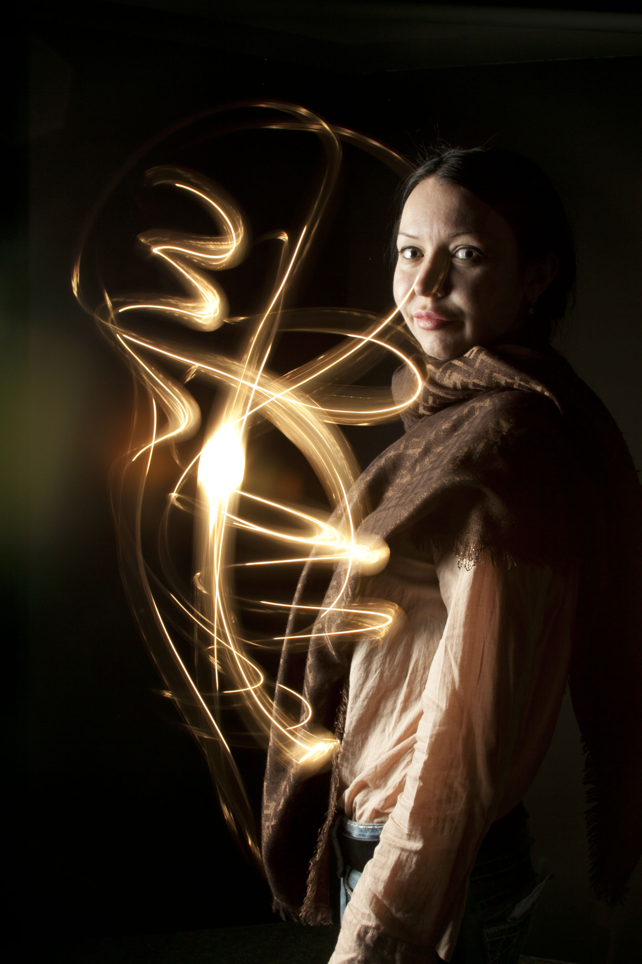
This photo has high contract . The person and moving light pump out on the backlight. Also, it has great balance between the person and light. The person looks straight to the camera.
Filed under Learning Log 7-Painting with Light
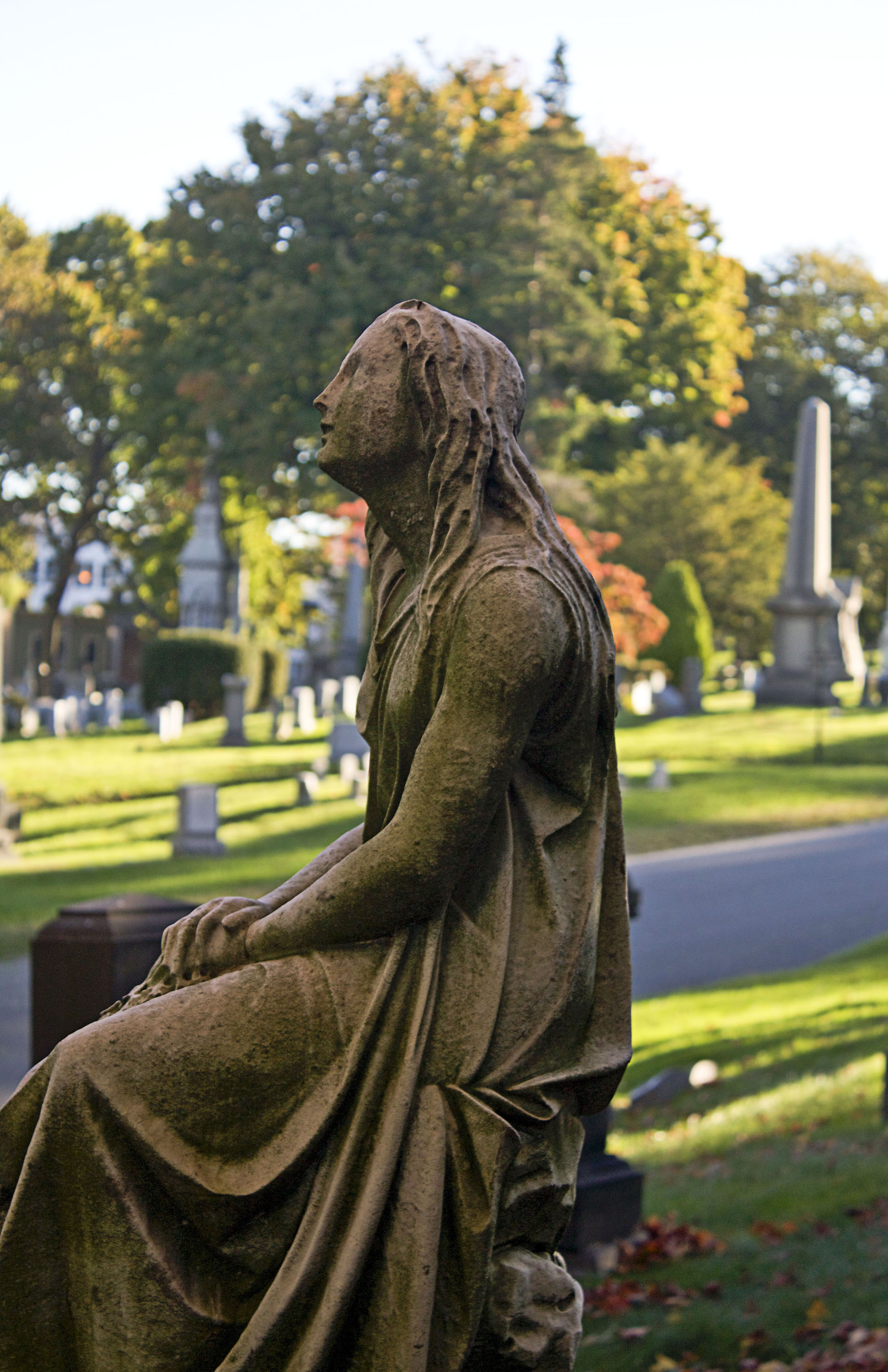
From my trip to Greenwood I learned that one object on the same location can look differently. I took pictures were greatly impacted by angles and in particular the natural lighting. In the first picture taken from a severe side angle, the female subject appears dark and brooding. The shadows that were being cast greatly impacted the tone and tenor of the picture. The shadows seem to cast a background that is suited to the mood of the woman. The viewer would be more likely to see a figure that is sad and literally and figuratively darker. Further, the viewer would be more likely to view the woman as someone who is appealing to a higher power to right a wrong…a woman in mourning. Since the picture of the monument was taken in a cemetery, the subject matter takes on almost a scary or ominous tone. Lastly, the coloring due to the management of light makes the monument appear to be more weathered by the elements and neglected.
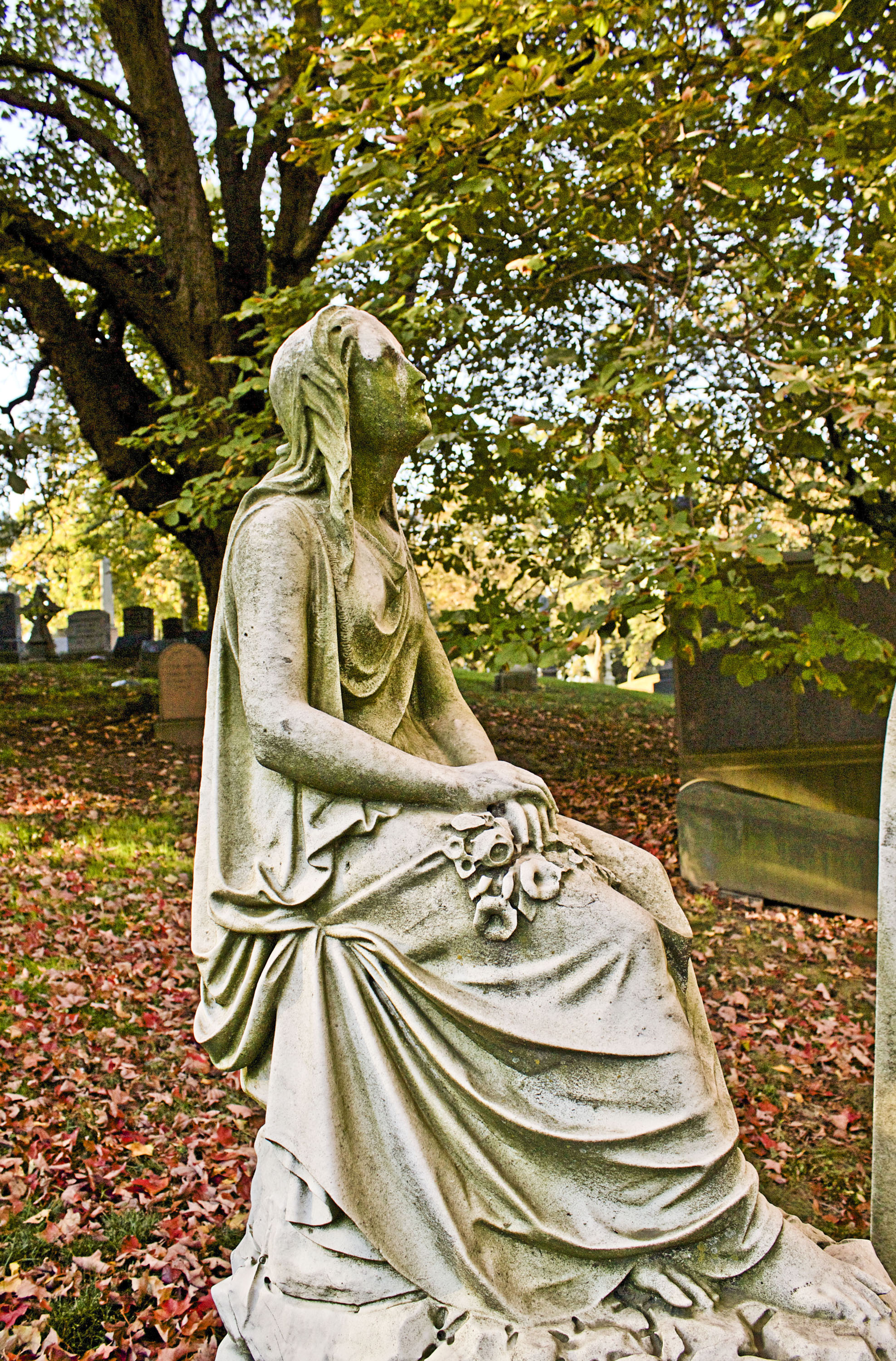
In direct contrast, the second picture is taken from a wider angle and more from a frontward position. The impact of light on the subject matter is great, as the woman is seen in more of an angelic fashion then the darker picture. We see that the natural light has a great impact on the viewer’s perspective and that the coloring of the woman makes her appear to be gazing to a greater being in reverence instead of despair. Additionally, the angle of the picture makes the woman appear to be more hopeful that her prayers will be answered. This representation of the woman seems like it would be more appropriate in a cathedral or church since the subject matter is so much more hopeful
Filed under Learning Log 6-Greenwood
The Brooklyn Historical Sociaty
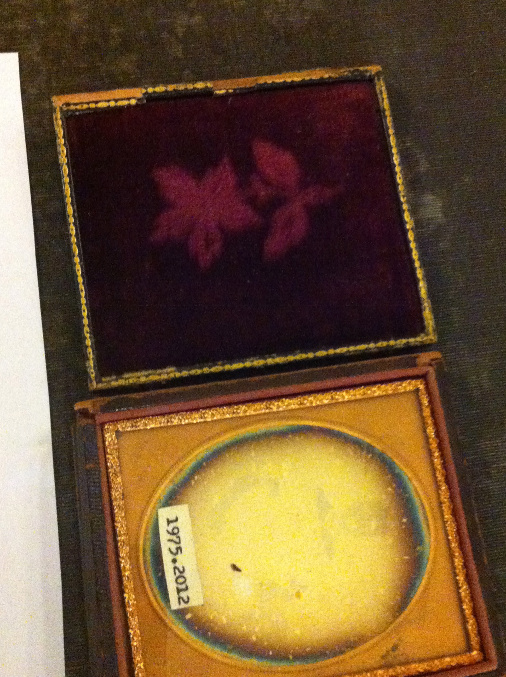
In the following paper, I will make several observations about the significant differences between “Danguerrereotype” picture and a digital photograph.
The “Danguerrereotype” picture does not offer vivid details to the viewer, anywhere close to the level of Digital photography. These pictures are in black and white or solid colors which are in direct contrast to today’s modern digital photography which allows for the full spectrum of color. In fact, in many cases it almost seems to be a cloud and there is an aura around the subject matter of the picture. These qualities do not allow for a completely accurate representation of the person or subject matter, in the same manner that a digital photograph would. However, the same qualities which might make the picture look less representative of the subject matter also add an artistic appeal to the picture. This is especially true when viewing “Danguerreotype” pictures of people. These black and white representations of people seem to capture the soul of the person but not necessarily does the viewer feel like they are looking at the person himself. When a person views a picture of a person that is taken digitally, you can see that person’s outward appearance in plain and sometimes painstaking detail. It is the same as seeing a person in passing on the street or at a restaurant. The “Danguerreotype” picture makes the viewer feel like you are viewing something spectral…”real” but “other worldy”. That is what makes the “type” pictures appeal to me against digital photography. They almost appear haunted the viewer loses the detail of the subject matter and you see the essence.
Conversely, Digital photography is excellent for capturing subject matter that contains vivid colors and detail. I compared a picture of a flower that was done in the respective mediums. The “type” picture feels like the colors bleed and they are not very vivid. When you view the flower, it is pretty but looks more like a smudge on paper then the digital photograph. The best analogy I can make is that the “type” picture has an abstract quality to it which makes it appealing but not necessarily representative. The digital photograph of similar subject matter just pops of the page at the viewer. You can see the color and all of the details of the flower. Each petal is clearly demarcated from the next, you can see all of the different parts of the flower. This compares much more favorably to the “smudge” of the “type” picture. With a digital photograph you can also see other elements of the background very clearly. Thus, the viewer is able to really consume and relate to the subject matter presented in digital photography. The evolution of digital photography has evolved so greatly that if you put a picture of the subject matter next to the subject matter itself, the viewer would not be able to identify the real flower. This is in direct contrast to the “type” pictures that we see.

In summation, both types of representations having redeeming and interesting qualities. The “type” representations just have more of an abstract feel. The digital photography is representative of what a person actually views in real life.
Filed under Learning Logs, Photography Formats
This is my favorite picture that we took today in class. This photo is emphasized texture a lot. It is great colors combination. The background is not in focus that gives amazing look. Light comes from side.

Filed under Learning Logs

I am really enjoying our class today and learning about camera operation. I think we took many great and successful pictures. Playing with lighting ,viewpoint, line and texture even plain and boring chair can look attractive. This is one my favorite picture. We chose low-angel viewpoint that made chair stand up. Light comes from subject and gave mysterious look.
Filed under learning log 1-Composition