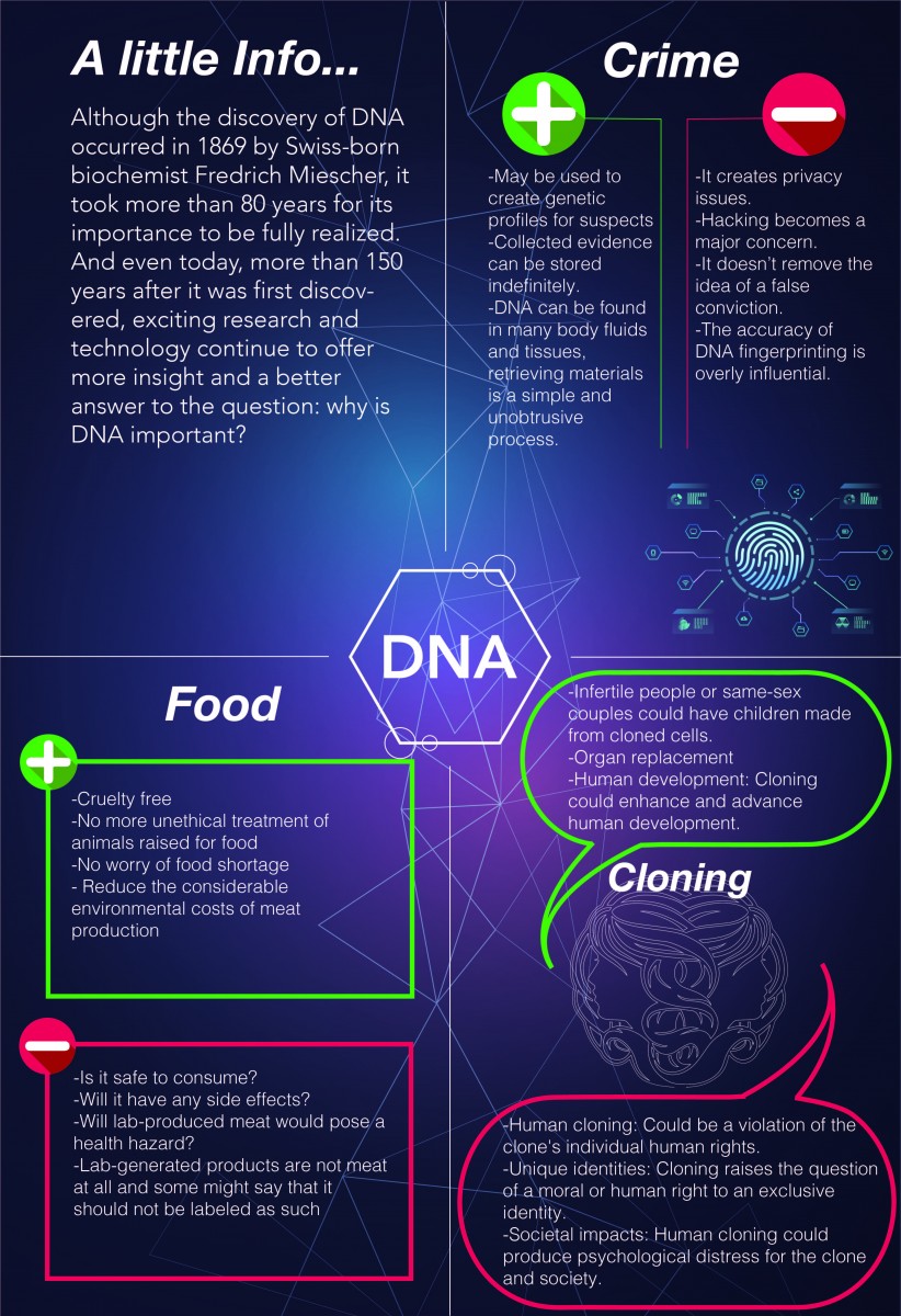
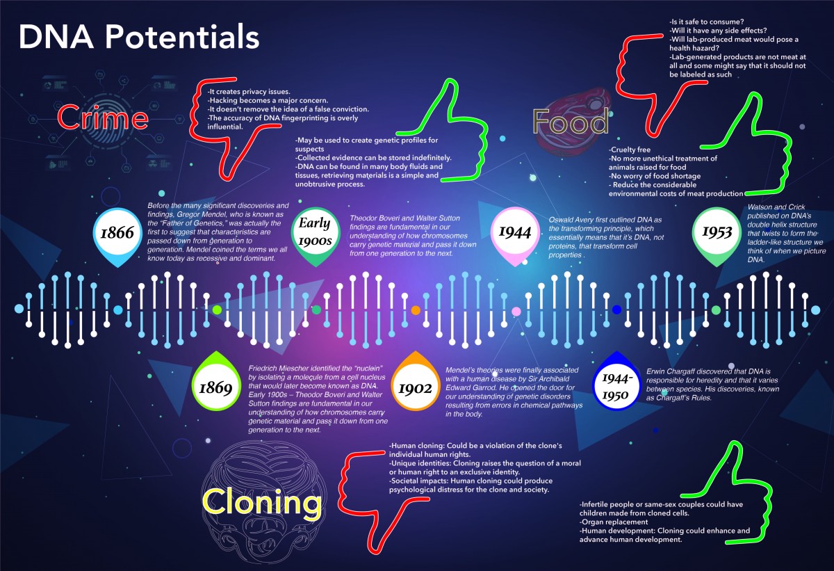

I wanted to give a brief history on DNA and where DNA is heading towards in the future. I wrote the pros and cons. The second one, I made some changes from the sketches which had it it in a vertical position but I realized that I didn’t have room for the time line so I changed it into a horizontal position in order to fit everything and make is look nice.


Your first one vs. your second one, I lean more towards the second one. The way that you display the information clearly has a story flow; used red/green with thumbs up/down for pros and cons are well thought out. The alignment of your elements confuses me a little bit unless you wanted to create it that way. The title ‘DNA Potentials is aligned left, but your other design assets/elements are aligned left.
Your first one vs. your second one, I lean more towards the second one. The way that you display the information clearly has a story flow; used red/green with thumbs up/down for pros and cons are well thought out. The alignment of your elements confuses me a little bit unless you wanted to create it that way. The title ‘DNA Potentials is aligned left, but your other design assets/elements are aligned left.
Hey Daisy,
I think your last poster (“Daisy_P1-Comp2_Ver2.jpg”) works well compare to the rest. There is hierarchy, a clear division between the different topics, and the time-line looks good. I think it is interesting that you are showing the pros and cons of DNA is different topics, which showing the developing of its findings. In the first poster you included “A little info”, I was missing it on the third poster and maybe you can add a small section of what is DNA.
I hope this helps
Daisy – nice! It’s really coming along. I like version 3! Especially terms of the clarity of your information. In general I think vertical layouts are more effective for this type of representation (you might think about shifting).
1. I think you could scale down the size of some of your graphics. The icons on the hands are cute, but feel a little redundant and too demanding in terms of the focal point.
2. I also think you can better break your content down into short digestible blurbs of information by using actual bullets and possibly indenting text a little. Take a look at the ChartDiagram poster again for different possibilites:
https://openlab.citytech.cuny.edu/hitchingscomd3601f2019/files/2019/10/ChartDiagrams.pdf
3. I think you can better highlight your headers by making the title the largest, and then the sub-headers slightly smaller. (I would als0 not italicize the headers.)
4. I think you loose a lot of space by making the DNA strand so large. And I think the white inside the circles of the dates call too much attention to themselves – distracting from the flow and focal point.
And thanks all for the helpful comments!
To be continued (tomorrow).
Hi Daisy!
I love your infographic! Your color choice is great and I really like the way you visualized the timeline.
– The overall message is clear. It shows what DNA is now, how we have come to learn and use DNA and where its headed in the future. I liked how you presented the pros and cons of every feature that DNA can impact in the future. I would say that in the cons of “Food” you have the majority of the points raised as questions. Compared to the rest of the points it might be consistent if those were definitive statements rather than questions.
– I think that your factual information is good – the timeline is a good highlight of that. You state what is important and what we need to know. I like how you corresponded the color of the years to the parts of the DNA. I might benefit from knowing what DNA is. It doesn’t have to be a standard definition but maybe a little bit of text underneath the title might help define the topic and lead us to the sub topics.
– You do an amazing job of showing that timeline! I think it is the attraction to your infographic and it is very well thought out. While there is a hierarchy I think the “Food” part of the infographic looks a bit transparent compared to the other sub topics. That almost made me skip over it but I didn’t! I also think that all of the information is for the most part equal in terms of hierarchy – which works for me! You were trying to emphasize that both parts work together and I like that. Watch out for the text from the right part of the timeline reaching a bit too close to the edge. Make sure it doesn’t go past the margins and you should be golden!
I love your timeline! It will be on my mind when I think about Project 2. I also think you effectively wanted to tell what you wanted to say. Long story short I like it and good job Daisy!
Nice comments Hoa!
Hey Daisy,
I am basing my opinion on the last version I saw in the Google Drive. I think your last version is defiantly an improvement from your first design.
My Suggestions:
Personally I think your title should be more distinguish than the rest of your elements. Although it is on the top of the page, and there is enough white space around it, I would still like to see it in different font/size/ weight/color, SURPRISE ME!
The text for 1920 in the timeline seems smaller than the rest for some reason.
I’d also watch out from ‘widows’; In Crimes section – “collected evidence can be stored indefinitely”, “Hacking becoming a major concern”
Food icon – this is the only icon in color. I’d suggest to turn it into a line work like the rest of the section or make all icons in colors. Cohesiveness is a key!
As I mentioned before, your design is working well. The text is interesting, and the portrait poster was a great choice. I hope my suggestions help, it is a great portfolio piece.
Hey Daisy,
I think your info graphic is so interesting and informative. The information was displayed and organized clearly. I can understand what you were trying to say about your subject. I like how you divided your info graph in two sections, the green and red check marks were also interesting and made everything look cohesive. I feel like you have a good sense of hierarchy, however your title should stand out more it should be the first thing I see and it gets lost. I also think your background and text are clashing with each other making the text hard to read, especially since its white. I suggest using a rectangle as a background and lowering the opacity on it so the text can be more visible, but you also still see the background image. Your headers could also be more bold like your title should be. I also noticed your text on the left is bolder then the text on the right. I’m just curious is there a particular reason you did this? Over all I thought you did an amazing job on this!
Hey Daisy,
Your info graphs are amazing I do like the color schemes you used for the topic as it goes well with it. I noticed where it says Food it’s a little difficult to read maybe trying different colors to see if it’s readable so that it doesn’t blend with the background. I feel the third version is strongest as it guides my eye to what to look at from beginning to end.
Hi Daisy,
I am basing my feedback on the version of your poster that is saved in the google drive folder week 9:
https://drive.google.com/drive/folders/1UhcytU7CE45CH6sr6l13tXW2r3wBCmcw
Well done.
I agree with much of the insightful feedback your received from Hoa, Or, Islam and Amaris.
Overall the mood you are setting and the information flow is working very well. Here are my thoughts:
1. I still think your green and red check and X icons are still too large and strong. They command a lot of attention but they are not meant to be a focal point. They are supportive. I would make them much smaller – maybe even the size of the type and align them to the baseline of the first bullet point. I also think the white within these icons commands too much attention, and possibly giving the white a slight opacity maybe 50% would also tone it down a little.
2. I would say the same for white within the circles of the dates. Too strong. I think an opacity would help there as well.
3. The three headers, Crime, Cloning an Food should be left aligned to the bulleted lists below them.
4. The three images (icons) above the headers, could be a little smaller and I would also align those to the left with headers and bulleted list. I also agree with Or’s comment that they should either all be white, or all in color.
5. All the text for the bulleted lists should be indented, not just the fist line, but any of text that flow to the next line. That should help to make the bulleted list more visible and clear.
6. I agree with Islam about keeping all the body text – bulleted list on the left columns, and timeline text on the right, consistent weight, leading and size. You might bold just the first few words of each of the timeline text. For example: ‘ Erwin Chargaff’
7. I think the dates of the timeline should be smaller, maybe a point or two larger than the actual text below it.
8. Hoa makes a great point about keeping your bulleted list consistent. As she points out:
“I would say that in the cons of “Food” you have the majority of the points raised as questions.” I agree, it would be stronger if you don’t use questions here, especially since you have not done that above.