

Professor Michals
Identify the lighting style used including the angle of view, and lighting pattern: Rembrandt, split, butterfly light, broad, or shot light. How much fill is used to brighten the shadows? How is a background light used to separate the subject from the background? What is the palette? How tight is the framing? What is the angle of view?
Lighting Pattern: Butterfly Light
How much fill is used to brighten the shadows? – There is plenty of amount of fill used to highlight the shadows, especially for the first 2 movie posters since they have the element of the drawn characters behind them.
How is a background light used to separate the subject from the background? – The background light is used to separate the subject from the photo bringing as might light as possible to their face almost as if it wouldn’t matter for the shadows since they are not seen at face value.
How tight is the framing? There is a good use of the rule of thirds within the first two posters however not in the third which is just centered. This is done for the concept of the art upon having the 2D drawing mirror the live-action actors. That is why it uses a full-body shot for every poster.
What is the angle of view? The angle of view from what I can tell is eye level
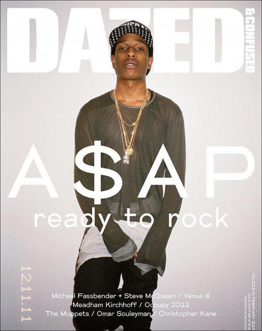
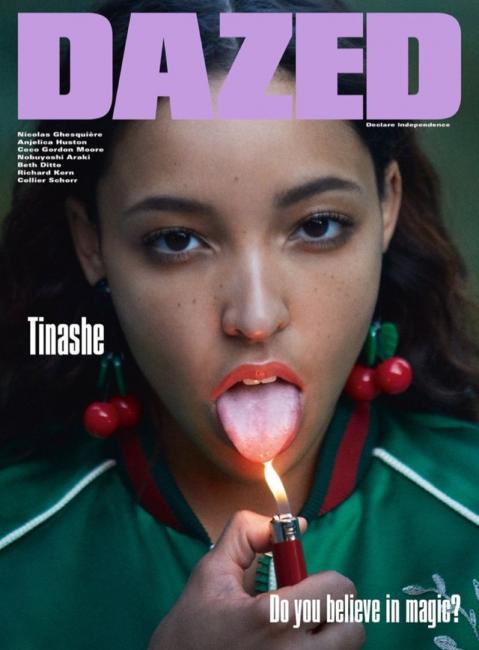
Identify the lighting style used including the angle of view, and lighting pattern: Rembrandt, split, butterfly light, broad, or shot light. How much fill is used to brighten the shadows? How is a background light used to separate the subject from the background? What is the palette? How tight is the framing? What is the angle of view?
Lighting Pattern: Flat light
How much fill is used to brighten the shadows? The fill is used to help neutralize the picture instead of brightening it. Since the background has a lot going on there are no shadows.
How is a background light used to separate the subject from the background? The background light is only evident in the first example where you can see that the model’s hair is backlit other than that the background in other pictures is natural light.
How tight is the framing? The framing is pretty open the pictures have been taken from a further angle where you can see the almost upper half of the body.
What is the angle of view? The angle of view is mostly eye level.
The Vogue Cover is shot using front light. The subject seems to be symmetrically placed in the middle of the cover but in fact, her eyes and lips are off centered giving a view of tallness as her head fills the upper middle of the cover. The look and feel of the subject is one of High Fashion seriousness. The text is linking with the clothing. The view is more of a 180 degree shot.
Wired magazine is using broad light with the subject lit with additional lighting from the back to separate him from the background to give the appearance of a slight halo. The text is linking with the background while the general look and feel is that of quirkiness. The angle of the lighting is diagonal from the right.
AARP at first glance seems to be using butterfly lighting. The subject however is in fact being light from the right at a 90 degree with a softer fill light on the left. The feel and style of the cover is that of confidence and happiness and success. All the subjects for all the covers are smiling. Broad light , front light and butterfly lighting seems to be the general lighting choices for several covers.
© 2024 COMD3330_D039_SP22
Theme by Anders Noren — Up ↑
Recent Comments