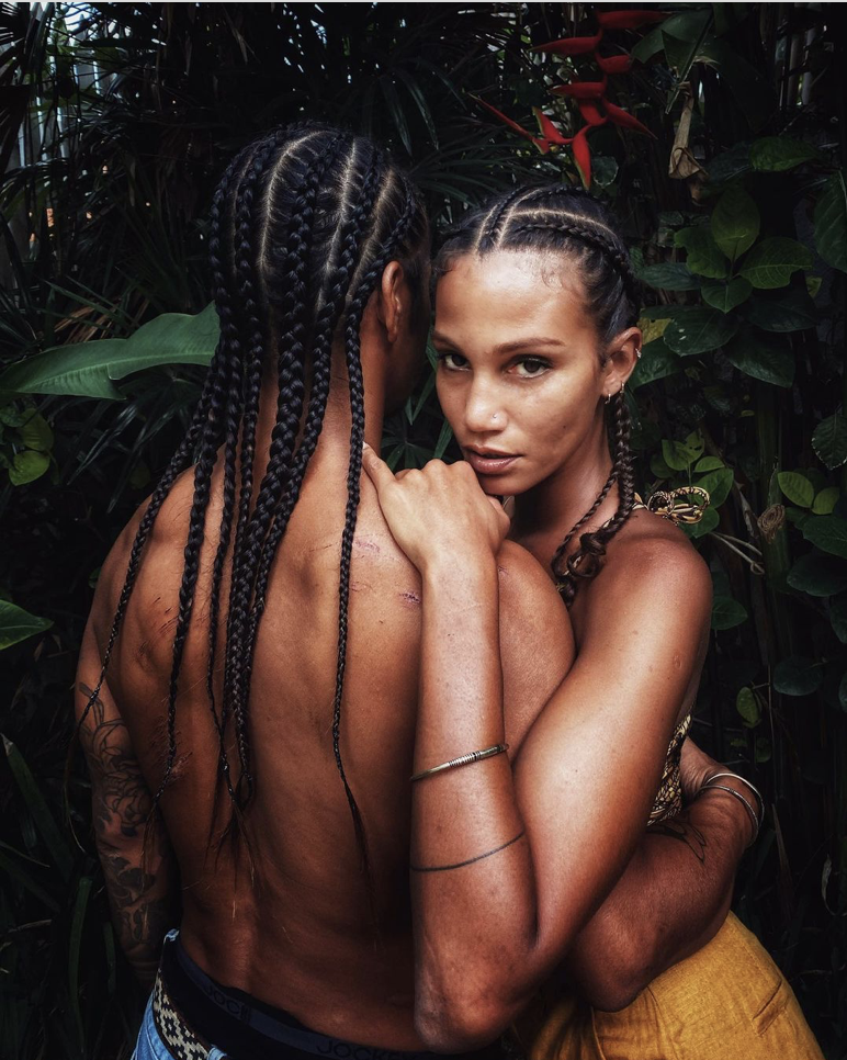
The Vogue Cover is shot using front light. The subject seems to be symmetrically placed in the middle of the cover but in fact, her eyes and lips are off centered giving a view of tallness as her head fills the upper middle of the cover. The look and feel of the subject is one of High Fashion seriousness. The text is linking with the clothing. The view is more of a 180 degree shot.
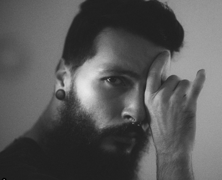
Wired magazine is using broad light with the subject lit with additional lighting from the back to separate him from the background to give the appearance of a slight halo. The text is linking with the background while the general look and feel is that of quirkiness. The angle of the lighting is diagonal from the right.
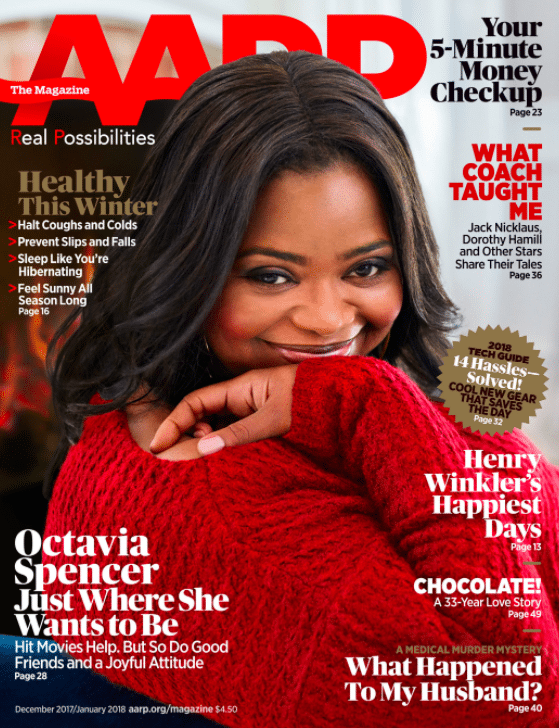
AARP at first glance seems to be using butterfly lighting. The subject however is in fact being light from the right at a 90 degree with a softer fill light on the left. The feel and style of the cover is that of confidence and happiness and success. All the subjects for all the covers are smiling. Broad light , front light and butterfly lighting seems to be the general lighting choices for several covers.


Recent Comments