In the Vibe covers I chose the lighting style is mostly butterfly and Rembrandt. It seems like they used reflectors when the head of the artist is slightly tilt to fill up a little bit the shadows on the side of the face (Usher and Her cover). The background has not be lighted up to separate it from the subject (except for the first cover maybe) infact some shadows on the background are visible, but very light color background such as grey and light brown has been used to make the artists stand out. The framing changes from half body (3/4 shot) or shoulders and up when the artist in the cover is just one and into a full body when there is a group. In Her and Kanye West covers the head and the hair fill up most of the space. One of the constant elements in all Vibe covers is the point of view of the pictures. Most of them are taken at the eye level or under the eye level (at a low angle, to express a monumental or intimidating pose) . The second element is that all the subjects look directly into the camera. The third constant element is the mood and the expression of the artists. They all have really serious and intimidating face (the prison pose typical of rappers).
About This Course
COMD 3330 Photography II
Tuesday 12pm – 3:20pm
Professor Michals
rmichals@citytech.cuny.edu
Class Tools
Sharing
Logged-in faculty members can clone this course. Learn More!
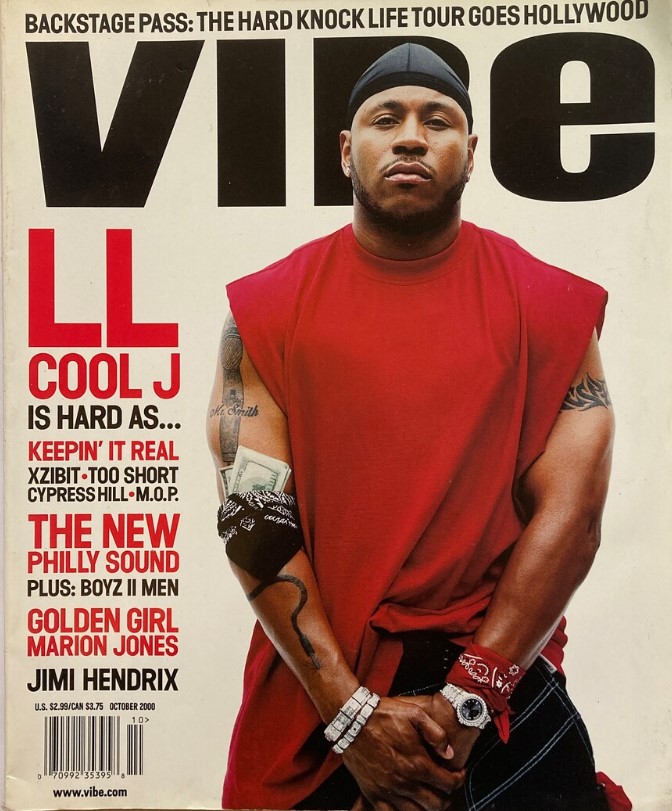
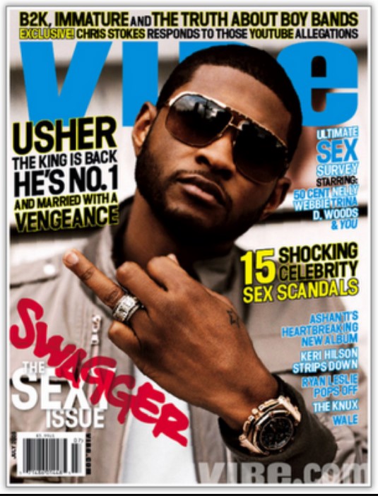
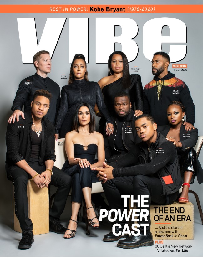
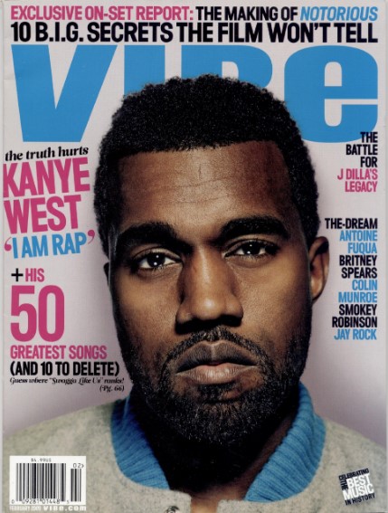



Good analysis. it is interesting to me that sunglasses work for the brand style of vibe. Not too many other magazines would have the subjects wearing sunglasses so that you can’t see the subject’s eyes.