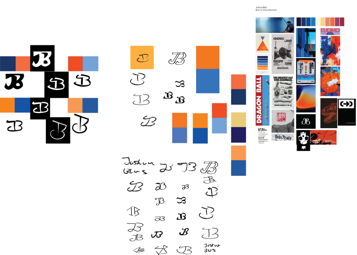
This board is a bit of a mess, but the final 4 logos I chose are on the top left, along with different colors I’d consider for my brand.
Taking into consideration my moodboard, I took a combination of orange and blue for the calming but passionate feel to them, as well as their complementing each other.
I was aiming for an ink and sketch feel for the logo, and I think these 4 matched that pretty well.
Hello everyone my name is Kevin Dewitt and today i wanna talk a little bit about my logo sketches and how I came up with these kinds of ideas. When I think about coming up with a logo I need to make sure that it fits the product that I am promoting. I want to make sure that the fonts match up to the product, I also want to display a logo that gives the viewer a warm fuzzy feeling. When I found what works for me, I look at my mood board and see if it matches and this is because it is very important to follow a criteria when developing these ideas. Now that it is down on paper and works for me it is time to transition them from a mere sketch into the computer and make my ideas come to life. I look at the designs and decide what color palette I will use so I can match those colors to my mood board. The colors I chose are yellow because of it’s brightness and ability to attract and bring the eyes to the design. The Crome is the offset to pull your eyes to view other parts of the logo. Then finally the black is there to outline it all and bring clarity to the project as a whole.
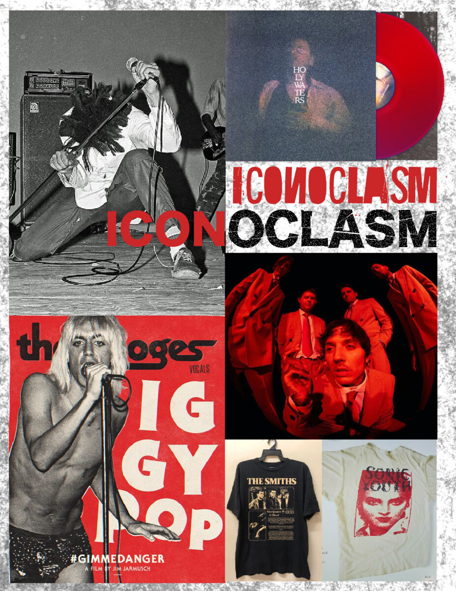
The moodboard created to guide my brand’s identity is meant to encapsulate a focus on musicians that are notably groundbreaking, yet rough around the edges. This balance of grunginess and avant-garde mentality is what I want the brand to feel like, as it is meant to provide visuals for up-and-coming artists and bands that exist on the margins.
The color red has been chosen in order to convey passion, rebelliousness, and aggression (these attributes would attract musicians that value the same traits in their artmaking practices). The black and white image on the top left corner of the layout is of the original lead vocalist of the pioneering hardcore band Bad Brains.
I would want images created by my brand to capture this same level of rawness in the midst of live performances, as well as creating merchandise that feels equally wild. The brand I am imaging is a more grass-roots version of the company Bravado, which handles the design of merchandise and marketing campaigns for big-label artists such as Billie Eilish, 21 Savage, and Ariana Grande. Since Bravado is mainly geared towards A-List acts, I would want my brand, which is tentatively named Iconoclasm, to cater towards indie artists in local scenes. This is part of the reason why a rough-and-tumble approach is a valued aspect of my brand; it conveys a feeling of authenticity and being down-to-earth/approachable


Recent Comments