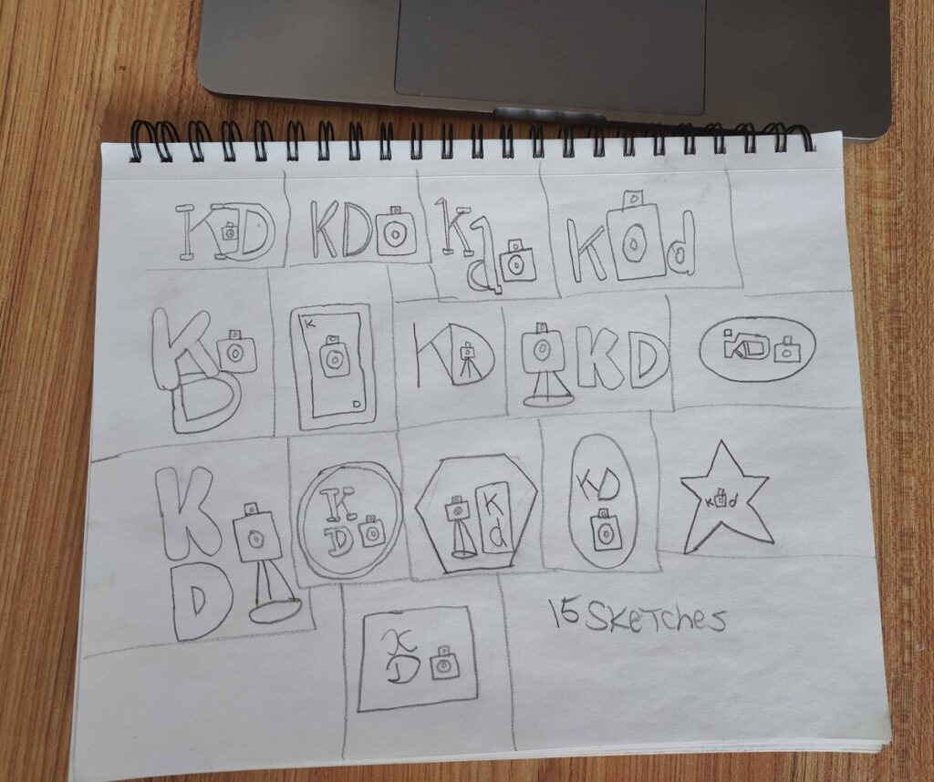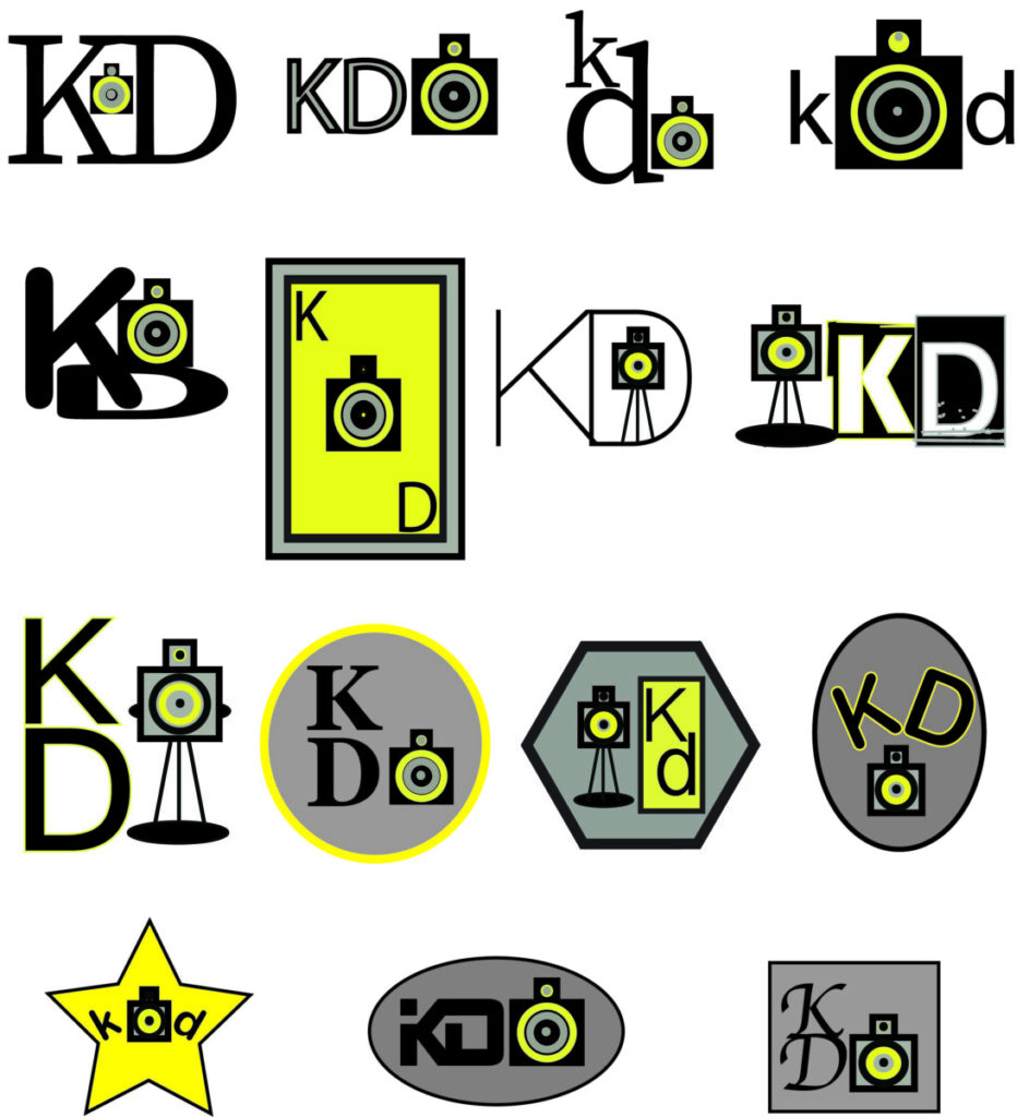

Hello everyone my name is Kevin Dewitt and today i wanna talk a little bit about my logo sketches and how I came up with these kinds of ideas. When I think about coming up with a logo I need to make sure that it fits the product that I am promoting. I want to make sure that the fonts match up to the product, I also want to display a logo that gives the viewer a warm fuzzy feeling. When I found what works for me, I look at my mood board and see if it matches and this is because it is very important to follow a criteria when developing these ideas. Now that it is down on paper and works for me it is time to transition them from a mere sketch into the computer and make my ideas come to life. I look at the designs and decide what color palette I will use so I can match those colors to my mood board. The colors I chose are yellow because of it’s brightness and ability to attract and bring the eyes to the design. The Crome is the offset to pull your eyes to view other parts of the logo. Then finally the black is there to outline it all and bring clarity to the project as a whole.


Leave a Reply