Prof Anmol Dhamrait | COMD2300-E098 | Spring 24

Category: Part B: Personal Branding Moodboard (Page 2 of 3)

Keion Williams | Moodboard

The moodboard for my brand is a collection of things that I think make up a good visual rough draft for my brand’s identity. My color palette is a high contrast of dark muted colors and bright neons, but my main/favorite color is red. I want the images on the board to reflect the lucid eye-catching design of my company and what it does. 

There’s two things of my own creation here which are the red and green sketch and the painted controller. What my company does is related to my painted controller; high quality designs for electronics (phone cases, console wraps,etc) and that design is the type of wild and imaginative energy I want people to associate with my brand. I have logos I admire for their use of negative space. The FedEx logo is well known, but the FW for Fort Worth really impressed me. My preferred typeface is a Sans Serif. I’m using Bebas Neue Pro. I prefer sans serif because they look good in every variation and just feel modern.

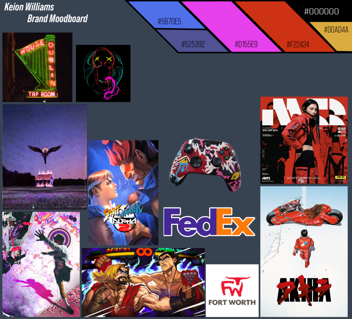
My MoodBoard describes what I want to put out into the world. When it comes to the colors, Music, Patterns, Face expressions… the reason behind every part of my mood board. The color palette in my mood board is 3 elementary but yet calm colors in my opinion. Black red and white are my favorite colors, they represent 3 moods I go through from time to time. Black represents “escape from reality”, White represents “ calm and relaxed” and Red represents “ Satisfaction from affection”. I involved the colors in my logo because what I want to portray is the reasoning behind the color descriptions. 

Music is the only thing that can keep me away from my problems concerning school, work, and boring adult life struggles. God knows what he was doing when it comes to music. I say this because music allows us to block out the sounds around us and tune in within ourselves. When it comes to different genres. When I draw I listen to music all the time and that allows my creativity to burst from within and beautiful work is made. 

Relating to music I use art to be an “easter egg” for others. Let me explain further. As I listen to calm and relaxing music that hits home and touches my heart, I release sadness or happiness… etc. On a piece of paper. I always leave hidden messages in my artwork to explain these emotions, so I used the term “ easter egg “ also known as “ cracking the puzzle” for those who find these hidden gems.

Jazz is one of my favorite music types of all time. I say this because There are no words in Jazz that can distract me, it’s just instrumental. Another reason why I like jazz is because it always has a calm vibe. When I listen to jazz I picture myself at a fireplace, sitting down with a glass of wine. and that same feeling I will put down on paper, and express it through art.

The last thing I want to say about my moldboard, patterns, and cartoon drawings is that they all are technically one. meaning that they all relate to my logo /artwork. music makes my patterns, music makes my mood which relates to my facial expressions in my cartoons and music also contributes to my typeface depending on to mood or message I want to portray.

-TJTEARS

SarahJo’s Mood Board

As mentioned in the first exercise, I wanted to make my logo classy, calm, and coastal. I started my mood board by drawing a seahorse and creating my pattern on the bottom left. I knew I wanted signature patterns as I use pattern and texture in my art. The pattern and colors are both heavily inspired by Art Deco. I wanted it to be instantaneously recognizable.

I originally had a much brighter color pallet, but then I realized those bright colors looked too playful for my intended purpose. I stuck to a muted triad of colors with navy and creme as my two neutrals. I used those same hues with lighter tones later for highlights.

As for my logos, I did a lot of research on art deco logos and illustrative logos. My issue was that most “Art Deco” logos were interpreted as “steam-punk,” which is overdone, cheesy, and plain incorrect for the period. Yes, both include gold, but that’s about it.

My last dilemma was including the deco theme with a coastal theme. How to make it look elevated and versatile. Miami Art Deco inspired me for my choice of colors and illustrative elements in my designs.

The goal company is a high-end cocktail company. I created a few logos I had been playing with to see which I liked more. I like them all for different reasons, but I also enjoy that they are all a part of the same company. I liked that all the logos I came up with could be applied to different parts of the company “Swirls” I created. The idea was to have multiple logos for different applications: a canned cocktail, a bottle of rum, a mixer, and bartending accessories.

Logo Ideas

« Older posts Newer posts »