Author: TJ (Page 4 of 5)
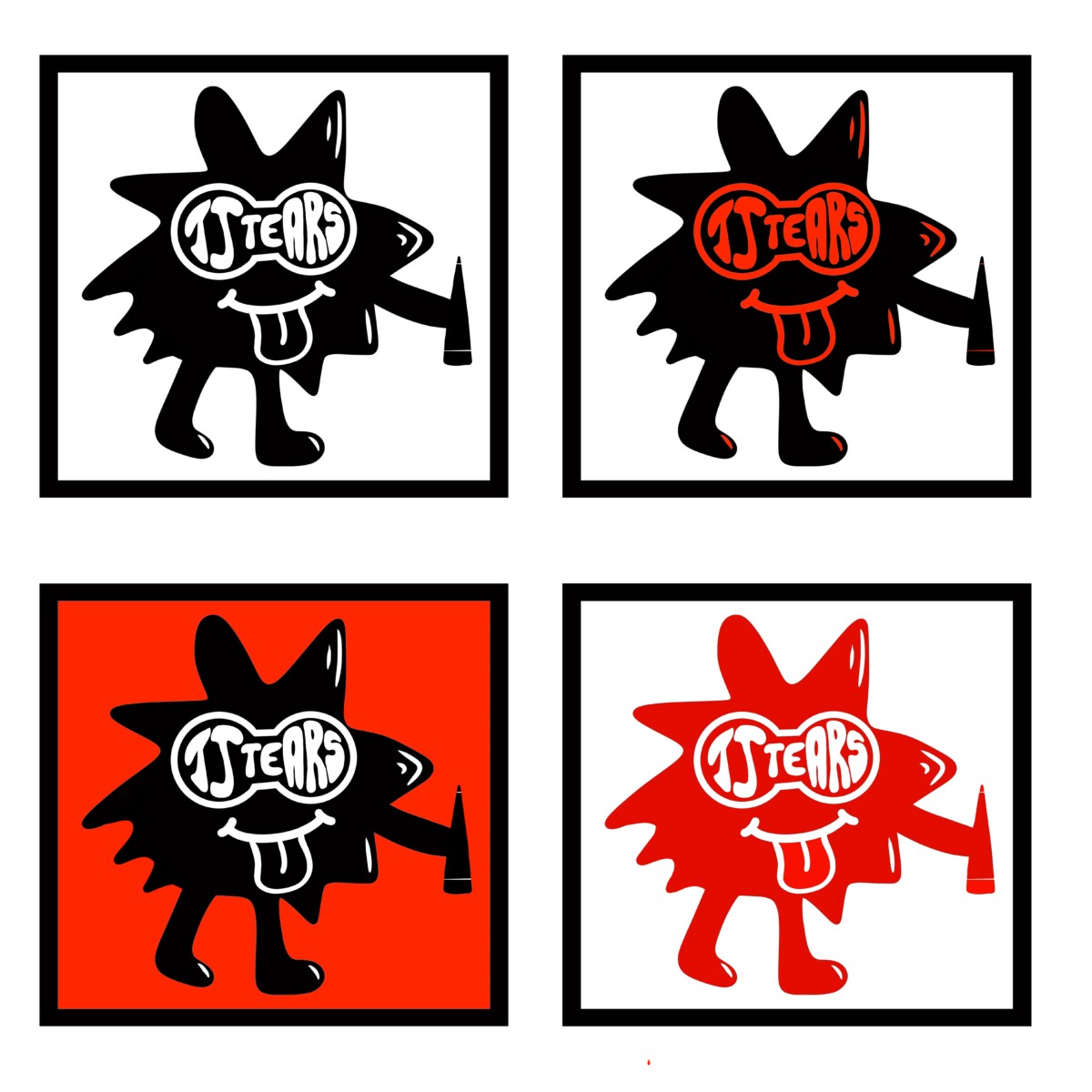
i added red to my logo, and used red in different variations to give an idea of what each logo would look like. i think my favorite logo with color has to be the logo with legs, bottom right. i say this because with this color it makes the figure pop out from the white background giving a great affect onto the eye. i do have a top 3 in this logo, which is also the bottom left and the 3rd row down left. these are my favorite because since red is my favorite color i want to involve it more into my logo.
A classmate gave me advice to use this logo but only to change the logo name ” tjtears” into a pair of goggles so that it would be formed into eyes since i have the mouth. to give it a face feature look. so i listened and it came really well in my opinion.
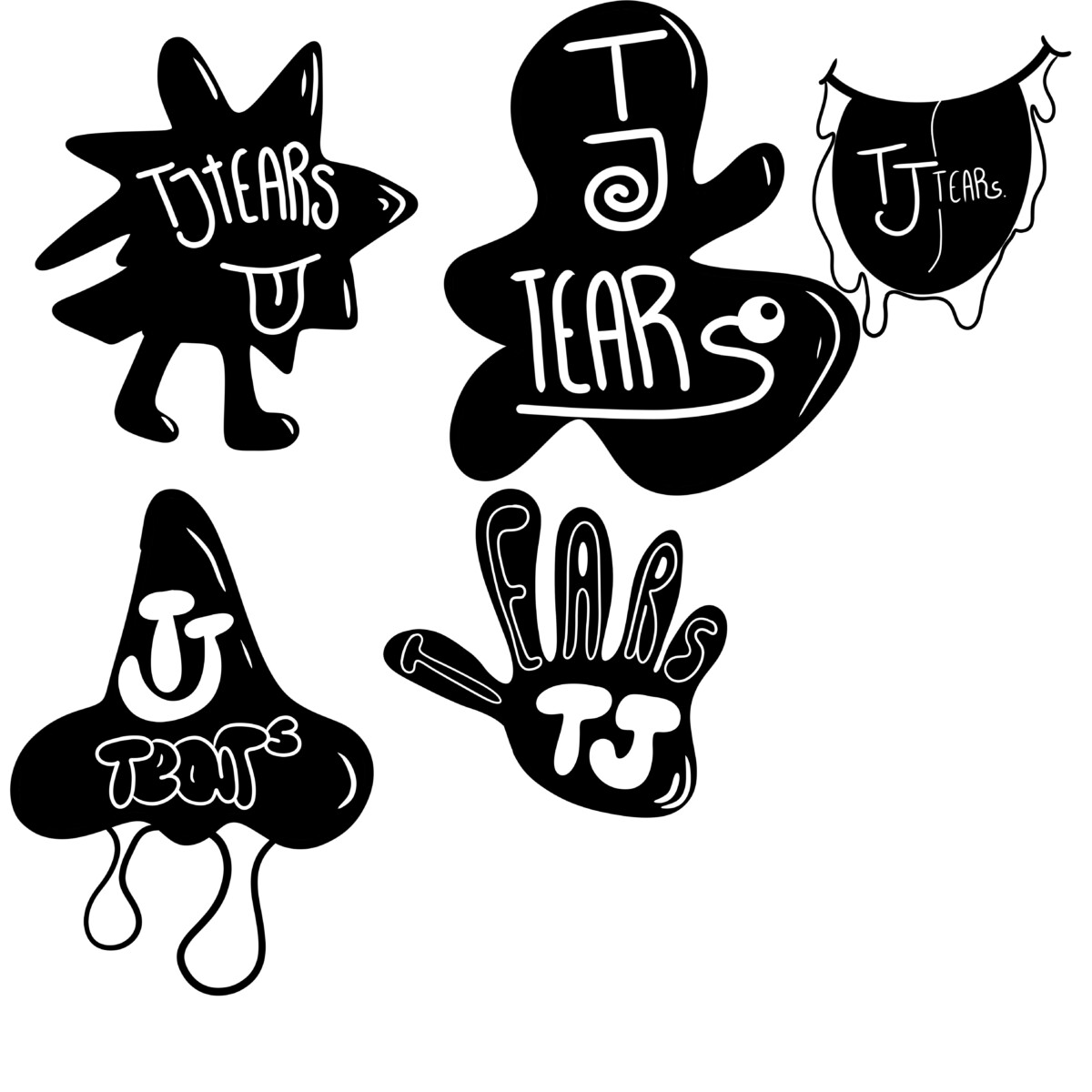
These new logos are completely different from what i previously had because these new logos i tried to involve more characters. i will most likely work on the hand logo and the logo with the two legs because those logos defines what i want to put out into this world.
The logo with the legs is a character that i made and i wanted to involve this in my logo to show my self as a cartoonist. It wasn’t hard for me to figure out this logo because i want a logo to scream out Cartoonist without yelling. this logo looks great in black n white also because as the name ” TJTEARS” is my artist name, the character adds a gentle vibe.
The hand logo is my second option that i would like to use, this logo has a representation of me using my hands to do my art. its more like a originality. its suppose to represent uniqueness. that what i draw and portray out into this world is completely and 100% me.


Recent Comments