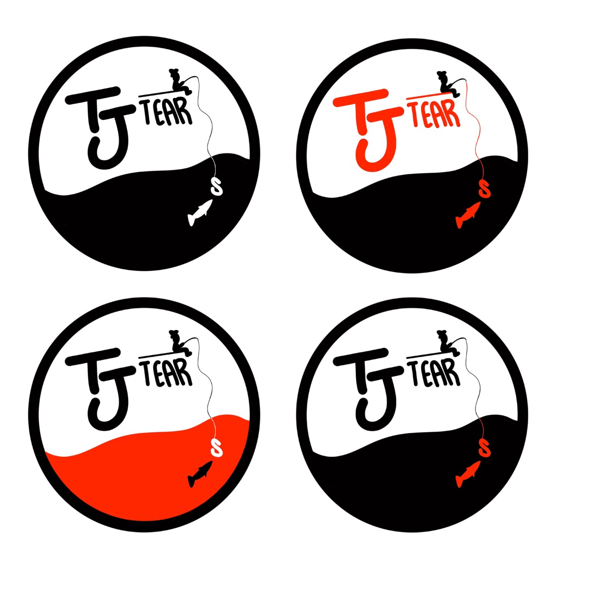
i added red to my logo, and used red in different variations to give an idea of what each logo would look like. i think my favorite logo with color has to be the logo with legs, bottom right. i say this because with this color it makes the figure pop out from the white background giving a great affect onto the eye. i do have a top 3 in this logo, which is also the bottom left and the 3rd row down left. these are my favorite because since red is my favorite color i want to involve it more into my logo.
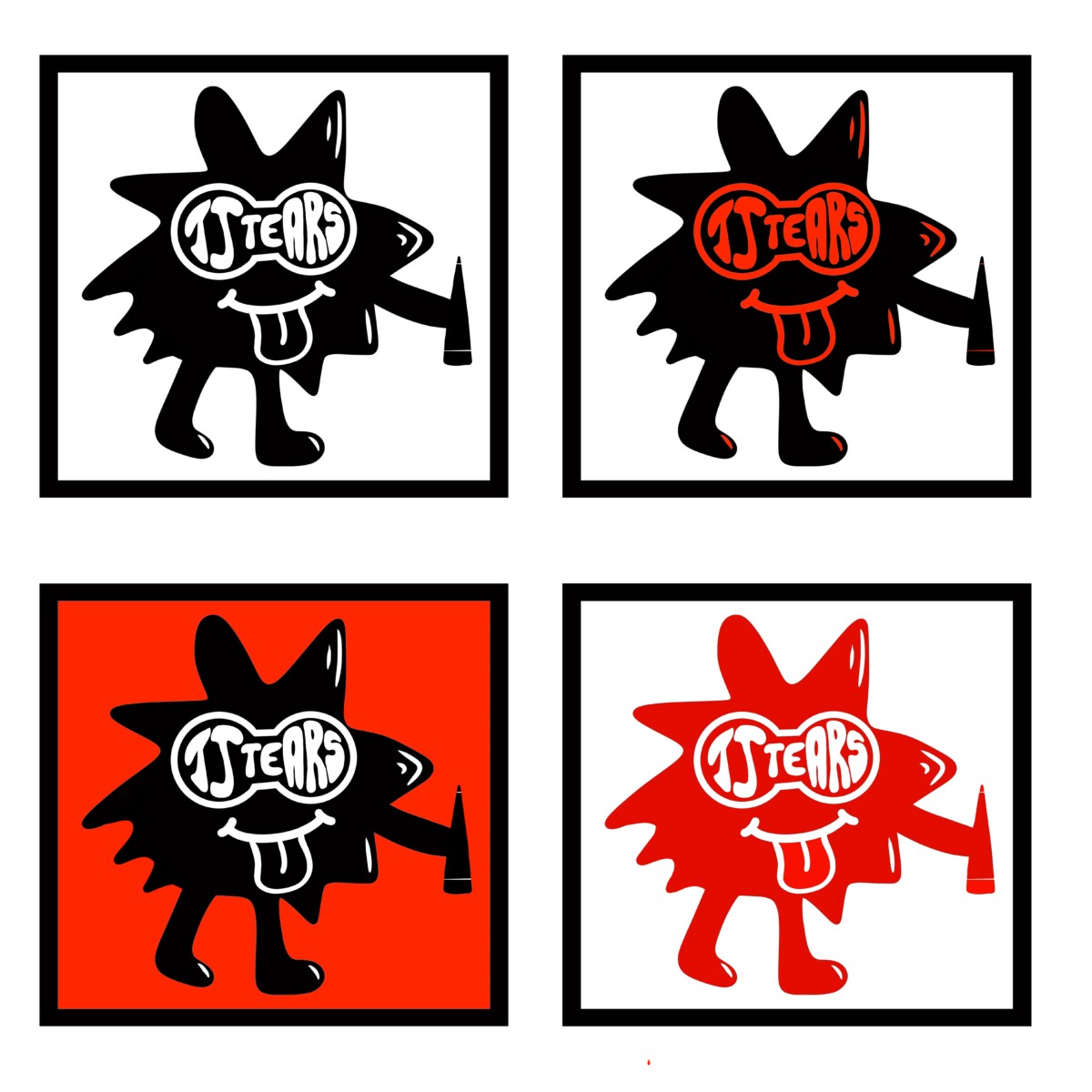
A classmate gave me advice to use this logo but only to change the logo name ” tjtears” into a pair of goggles so that it would be formed into eyes since i have the mouth. to give it a face feature look. so i listened and it came really well in my opinion.


Leave a Reply