Prof Anmol Dhamrait | COMD2300-E098 | Spring 24

Author: Kevin Dewitt (Page 5 of 6)

Kevin Dewitt’s B/W Logos

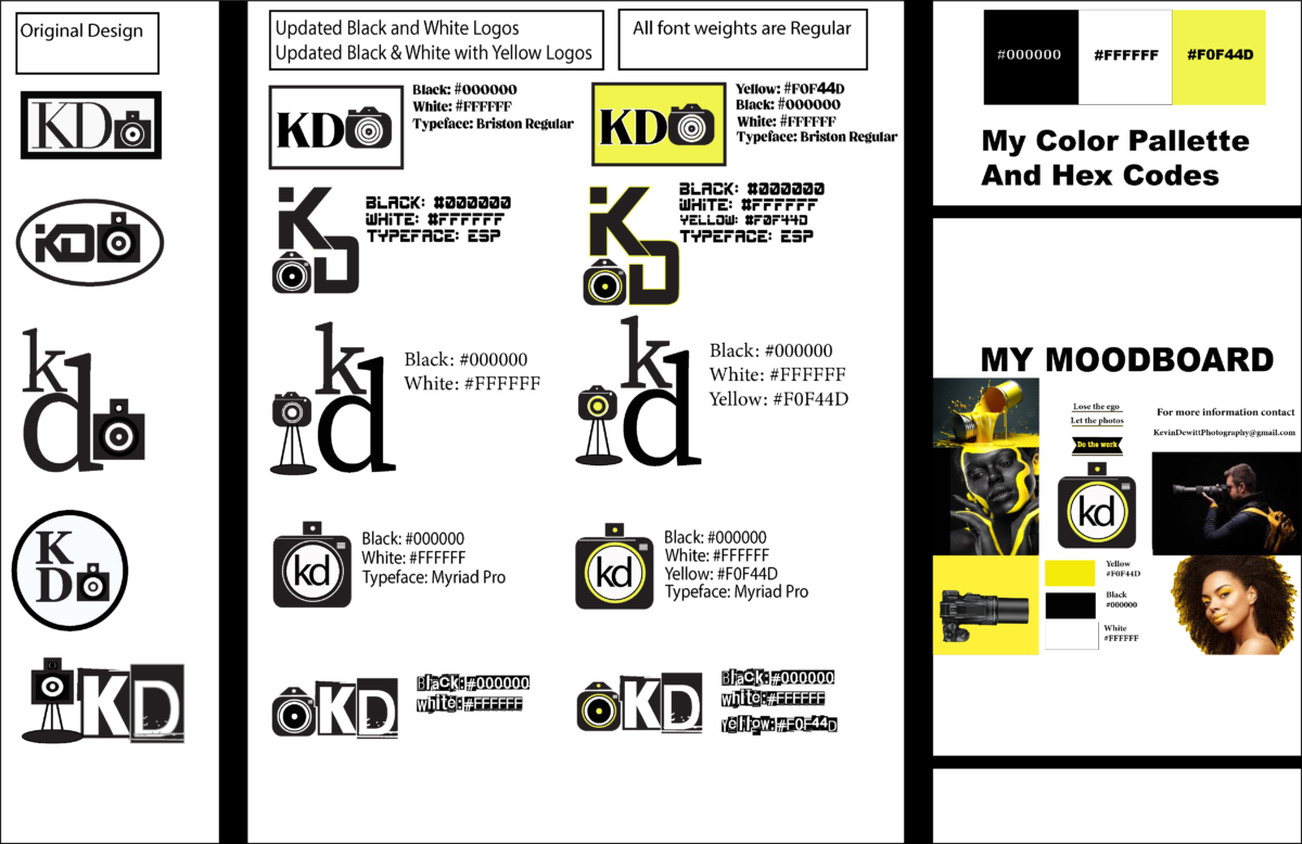
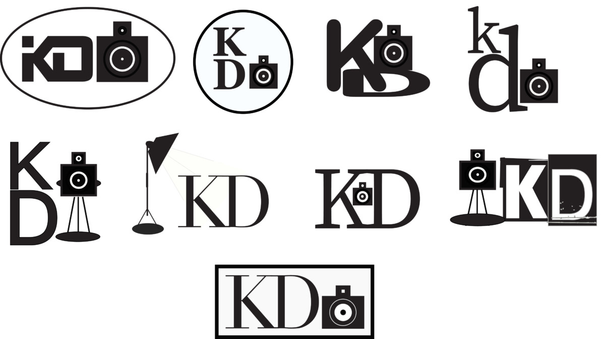
Hello everyone, my name is Kevin Dewitt and today I want to talk a little bit about my logo sketches and how I came up with these kinds of ideas. I put together 9 logos for this week’s assignment and, since these logos have to be black and white, I wanted them to stand out alone without the additional colors. I feel that they are getting strong and each of the logos is different and contains original works. On how they fit with my mood board, I believe that they carry the weight of expectations. They surely can be used without color, but to add color to an amazing logo makes it better in my opinion. I feel the strong points of my logos are the font choice. Strong font selection can make or break a logo easily. So I wanted to put something together that not only jumps out at you but can make a lasting impression.  Besides the fonts, the second most important thing is the wording. Certain words look weird together even if the font is amazing, so as to be able to use without confusion. One must look at adding additional characters to the existing font to better the logo. In my case, I added a camera to my fonts to symbolize I am a photographer.

Kevin Dewitt’s  logo exploration

Hello everyone my name is Kevin Dewitt and today i wanna talk a little bit about my logo sketches and how I came up with these kinds of ideas. When I think about coming up with a logo I need to make sure that it fits the product that I am promoting. I want to make sure that the fonts match up to the product, I also want to display a logo that gives the viewer a warm fuzzy feeling. When I found what works for me, I look at my mood board and see if it matches and this is because it is very important to follow a criteria when developing these ideas. Now that it is down on paper and works for me it is time to transition them from a mere sketch into the computer and make my ideas come to life. I look at the designs and decide what color palette I will use so I can match those colors to my mood board. The colors I chose are yellow because of it’s brightness and ability to attract and bring the eyes to the design. The Crome is the offset to pull your eyes to view other parts of the logo. Then finally the black is there to outline it all and bring clarity to the project as a whole.

« Older posts Newer posts »