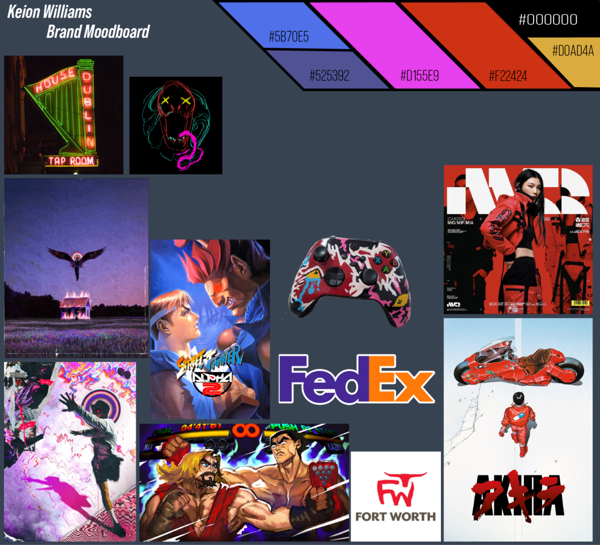
The moodboard for my brand is a collection of things that I think make up a good visual rough draft for my brand’s identity. My color palette is a high contrast of dark muted colors and bright neons, but my main/favorite color is red. I want the images on the board to reflect the lucid eye-catching design of my company and what it does.
There’s two things of my own creation here which are the red and green sketch and the painted controller. What my company does is related to my painted controller; high quality designs for electronics (phone cases, console wraps,etc) and that design is the type of wild and imaginative energy I want people to associate with my brand. I have logos I admire for their use of negative space. The FedEx logo is well known, but the FW for Fort Worth really impressed me. My preferred typeface is a Sans Serif. I’m using Bebas Neue Pro. I prefer sans serif because they look good in every variation and just feel modern.


Leave a Reply