
Before 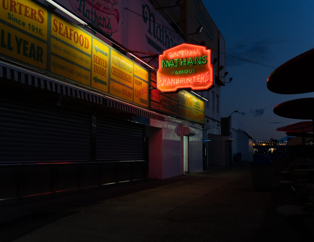
After
For the changes I put down the highlights to show the sign more clearly. Moreover, I added more contrast and put down the whites a little bit.
Robin Michals | COMD 1340 Photography 1 DO97
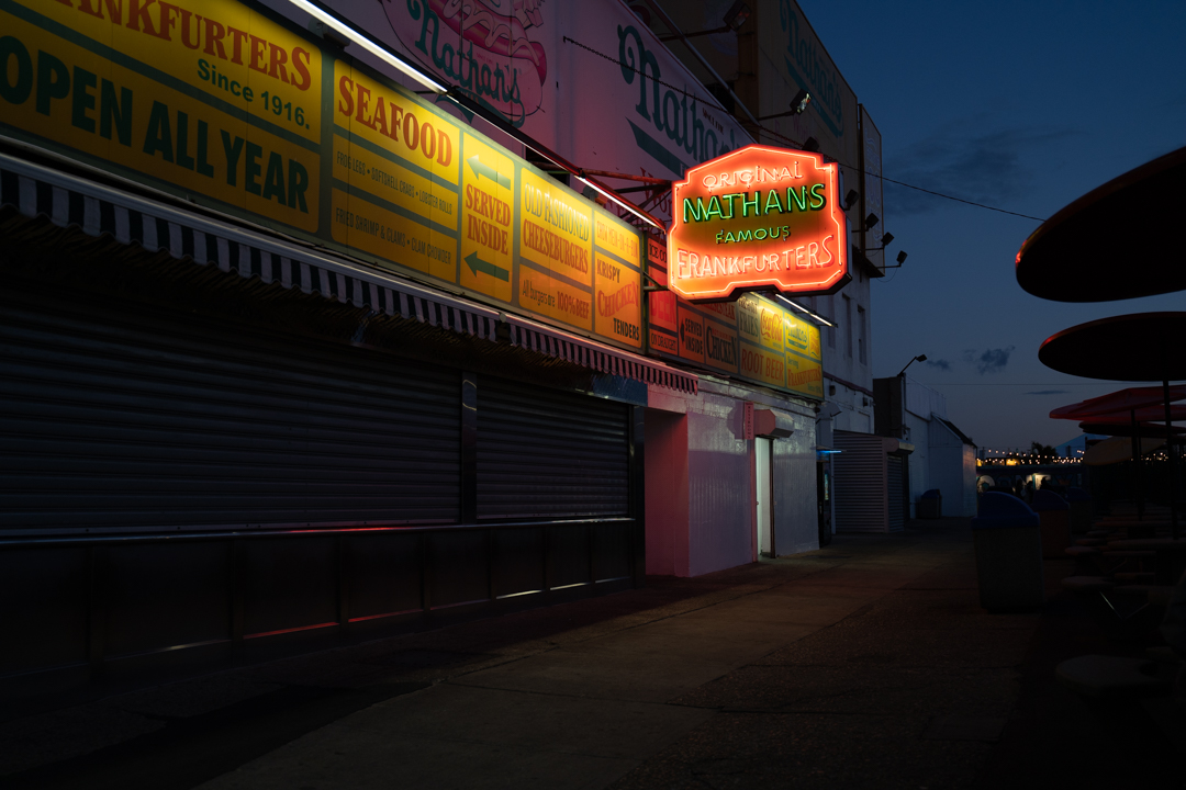

For the changes I put down the highlights to show the sign more clearly. Moreover, I added more contrast and put down the whites a little bit.
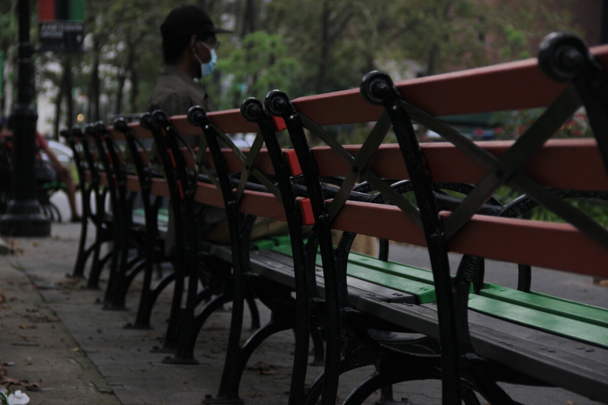
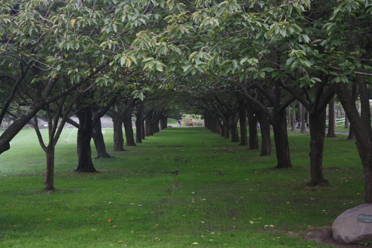
I like who she’s use of the rule of thirds and how she captures diagonals and shallow depth of field for the plants, the branch and for the man that was seated on the bench in this image.

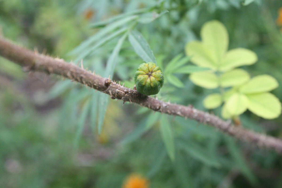
For my before image, I captured a some berries in a bush. At first glance, the mood of this photograph is very dull and dreary. All from the color and lighting of the photo. There are also various colors being used, but I felt that it should give the image a bit of pop to it.
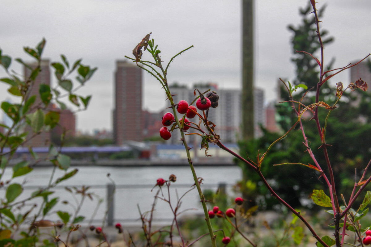
For my after image, there have been many edits that helped changed the mood of my photograph. In Lightroom, I wanted to give my subject, the berries, a bit more color to it. I wanted to increase the hues on my reds in the image so that the series appeared more lively and present. I decreased my exposure slightly, increased the contrast and reduced some of the highlights. I also reduced some of the whites in the image. clarity was also fixed in which I increased it slightly. I also wanted the trees in the background to be more greener, so I also messed around with the green hues within my image. Sharpening, Vibrance and Saturation were also increased slightly.


© 2024 COMD 1340 DO97
Theme by Anders Noren — Up ↑
The OpenLab is an open-source, digital platform designed to support teaching and learning at City Tech (New York City College of Technology), and to promote student and faculty engagement in the intellectual and social life of the college community.


Recent Comments