Robin Michals | COMD 1340 Photography 1

Category: Student Posts (Page 6 of 7)

Suzanne Stein, New York Street Two

The photograph depicts a close-up of hands adorned with silver rings holding a small bird. The image focuses on the interaction between the hands and the delicate bird. The photographer’s intention could be to capture a poignant moment, which symbolizes the connection between humanity and nature, emphasizing themes of fragility, care, and the beauty of the natural world. The name of the work allows us to know that the location of the photograph takes place in a New York setting.Ā  The juxtaposition of urban surroundings with the act of holding a small bird creates a compelling contrast, highlighting the theme of nature within an urban environment. This further evokes a sense of harmony and connection between humanity and nature.

The photographer uses figures to ground, fill the frame, and patterns and repetition in their work. The photograph uses the ā€œfill the frameā€ compositional principle by zooming in closely on the hands and the bird, the photographer eliminates distractions and emphasizes the main subject. The Figure to Ground principle is used to contrast between the hands and the bird against the background. Thus, drawing attention to the central subjects. The patterns and repetition could be seen in the arrangement of the rings on the hands, this could have been used to add visual interest and texture to the image. The use of the formal elements like “Fill the Frame” and “Figure to Ground” also further emphasize the intimacy of the moment by isolating the hands and the bird from their urban surroundings, thus reinforcing the central message of the image. Overall, the photograph conveys a sense of tenderness and stewardship toward the bird. The mood or feeling of the photograph also conveys emotions such as empathy, connection, and a sense of wonder in relation to the natural world.
Mirline Jean_HW 1 Composition

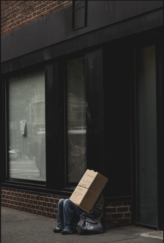
This photograph was taken by Suzanne Stein in the New York Part 2 series in 2017. The reason why I like this photo is because it shows that everything is not what it seems. Initially I saw a homeless person who has a cardboard box covering their face to hide the embarrassment of having to sit on the street and ask strangers for money. But then when I zoomed into the photo, from my perspective, “doesn’t look homeless”. Their clothes look clean as if it’s brand new, not rough around the edges like you would typically a see homeless person in New York. It could be someone pretending to be homeless for attention as a scam which if it was the case takes away from those who are in those situations who truly need the resources. Maybe that’s why they’re covering their face; to hide themselves from the criticism of being found out as a fraud. But it could be interpreted from various angles so I like how it plays with your eyes to believe if this person is truly homeless or not.

3 elements from the Steve McCurry video that are shown in this photo are Rule of Thirds, Diagonals and Figure to Ground. Rule of Thirds is shown by the subject at the bottom leaving the space above which if split into thirds, the person lands on the intersecting line. Diagonal lines from the brick wall and windows naturally give the subject’s body a slant to see their side profile. Figure to Ground would be the subject as the foreground and the reflection on the windows of the busy street as the background.

I think the feeling that Suzanne wanted to portray in this photo is the reality of what loneliness feels like to be homeless; assuming the subject is in that situation. New York’s motto of “mind your business” holds a heavy weight when there’s no busyness happening in your life waiting for a miracle to come by while watching that hustle and bustle of a city moving around you nonstop. The reflection on the window could also be a reflection of that person wishing to be apart of that movement and feeling productive. Giving them a meaning that they have a life with things to do and people to see but that’s not the reality. Being on the streets watching others not paying you any mind, judging you with looks to feel less than, telling you to “get a job” as if it’s easy when you literally have nothing. It’s sad and depressing which would make anyone want to cry if we were in their shoes. But there’s a flip of side of not knowing what or who to believe. There are people who do pretend to be in a less fortunate situations as a selfish come up for themselves once again takes away from those who truly need the resources to survive in this big crazy city.

Marcel Roman_HW1-Compositions

For my assignment, I chose a portrait photograph by Suzanne Stein. Suzanne Stein is aĀ social documentary/street photographer currently in New York City. Through her photography, Suzanne captures the intensity and emotions of those living and suffering with addiction on the streets. The portrait I was drawn to the most was from her ā€˜Kensingtonā€™ project, where Suzanne captured the raw life of Philadelphiaā€™s drug ridden side of the city. The portrait instantly reminded me of a time I lived near the same area of Philadelphia and how I would avoid the ā€˜zombie-landā€™. The photograph I chose, by Suzanne, was one of a subjectā€™s portrait, where I believe their intention is to show a side of beauty even through disasterous circumstances.

Suzanne encapsulates the subjectā€™s beauty with a close-up portrait, in the highlight of a sunny day in Kensington, Philadelphia. This method of portraying the subject creates a tremendous contrast between the subject and their environment. What is key in this photograph is the ability to see these contrasts and understand the difference between a subjective- and objective-view. My biased opinion is that the subject is attractive, whereas some others would see the subject and look at them in distaste for being from the drug infested environment, or even in pity for partaking in such drastic activities.

The photograph depicts a young brunette with European facial features and freckles over the ridge of their nose. The subject holds a sultry gaze over you, with parts of their hair billowing over their face. The photographer chose this subject as part of their ā€˜Kensingtonā€™ photo project, so I am to assume the subject is also one of the unfortunate citizens of the ā€˜zombie-landā€™. In the portrait, the photograph uses a few compositional aspects as once, such as ā€œCenter the Dominant Eyeā€ā€”centering the subjectā€™s eye along an intersectionā€”ā€œFill the Frameā€, where the subject is taking up the entire portrait, and ā€œFigure to Groundā€ā€”using the darkness of the subjectā€™s hair to contrast with their skin tone and face.

Linked below is the photograph, by Suzanne Stein, and their project on ā€˜Kensingtonā€™.

https://www.suzannesteinphoto.com/Kensington/i-Zbw5sVG/A

HW 1 Composition – Alan Castillo Perez

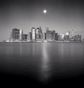
The Photograph below is called, “Moon Over Downtown”, New York City, USA, 2006 by Michael Kenna. This photograph stood out to me because of its scenery and photograph elements. You can clearly see that the main object being focused on it the city in the back. It kind of shows a strong connection towards Manhattan being an island. Showing off the emptiness of the photograph with the ocean then with the city’s bright lights and atmosphere. It gives off a sort of quiet and tense feeling of the city being surrounded by endless ocean. Could also represent the sense of opportunities, where the moon is guiding us by its light path leading to the city. As well as the gloomy or vibrant old style colors with the grays along side the white from the lights.

Some elements within this photograph would be Leading Lines, Figure to Ground & Symmetry. Figure to Ground strongly affects this by the ocean taking up most of the photograph and the city being place in the middle but far into the background. Another would be Symmetry because when you fold this photograph, both sides look very similar to each other thanks to the city being at the center. Lastly, Leading lines with the light from the moon casting off on the ocean showcasing a sort of “path” leading towards the city. Even though its very limited, the moon’s light helps guide my eyes towards the city in the back. Overall if I had to structure the elements by the photo, 1st would be Figure to Ground, 2nd is Symmetry & 3rd would be Leading Lines.

« Older posts Newer posts »